

Another popular pattern starts with a multi-column layout and ends up with a single column layout, dropping columns along the way as screen sizes get narrower. Unlike the Mostly Fluid pattern, the overall size of elements in this layout tend to stay consistent.
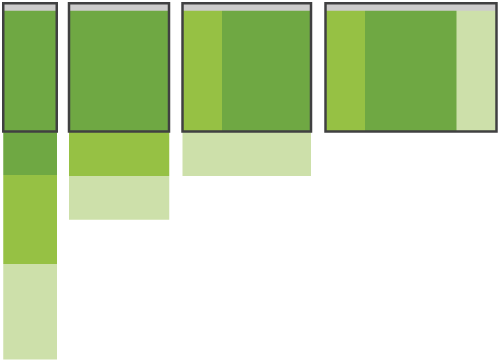
Column drop behaviour illustration Adapting to various screen sizes relies on stacking columns. When and how each column is stacked for each resolution breakpoint will depend on the web design itself.