Last active
February 27, 2025 16:56
-
-
Save 84adam/778354c2f41de3daafca2370557e0383 to your computer and use it in GitHub Desktop.
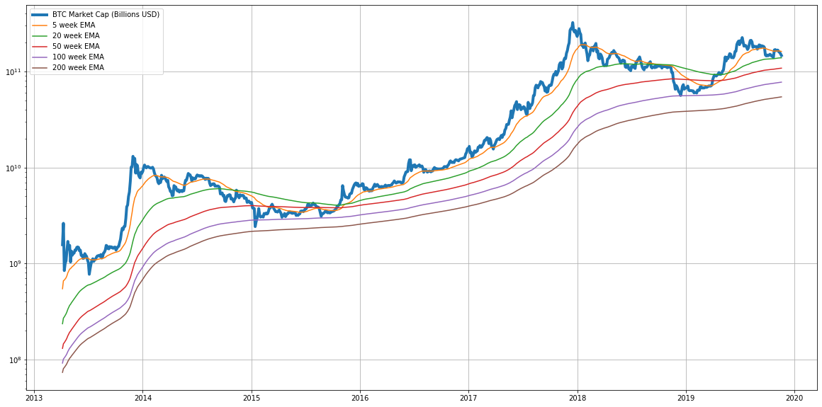
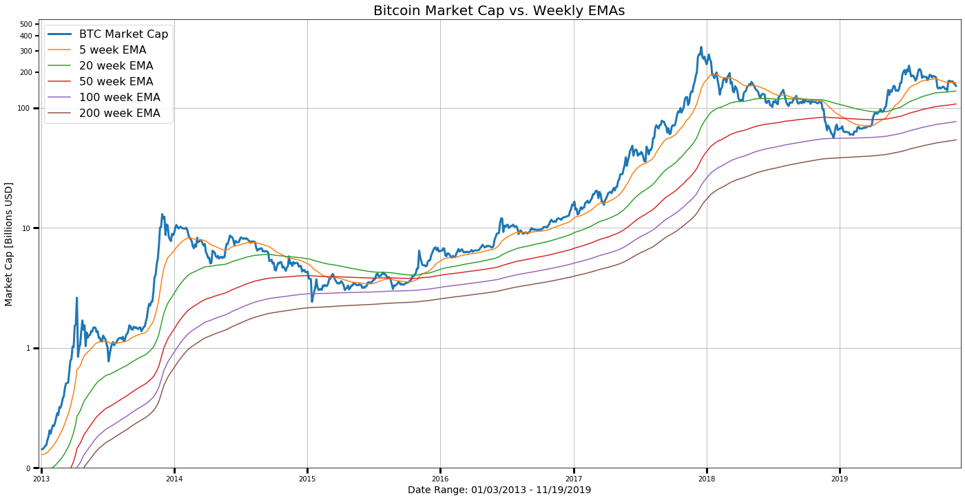
Plot BTC Market Cap Weekly EMAs
This file contains hidden or bidirectional Unicode text that may be interpreted or compiled differently than what appears below. To review, open the file in an editor that reveals hidden Unicode characters.
Learn more about bidirectional Unicode characters
| import datetime as dt | |
| import requests | |
| import io | |
| import pandas as pd | |
| import matplotlib.pyplot as plt | |
| from matplotlib.pyplot import figure | |
| from matplotlib import ticker | |
| from matplotlib.ticker import (MultipleLocator, FormatStrFormatter, AutoMinorLocator) | |
| %matplotlib inline | |
| # function to download CSV file from URL; convert to Pandas DataFrame | |
| def get_csv_from_url(url): | |
| s = requests.get(url).content | |
| df = pd.read_csv(io.StringIO(s.decode('utf-8'))) | |
| return df | |
| if __name__ == '__main__': | |
| # data source: coinmetrics.io - all BTC community data (CSV) | |
| url = "https://coinmetrics.io/newdata/btc.csv" | |
| # download data | |
| print("Downloading data...") | |
| df = get_csv_from_url(url) | |
| # select columns | |
| df = df[['time', 'CapMrktCurUSD']] | |
| # rename columns | |
| df = df.rename(columns={"CapMrktCurUSD": "market cap"}) | |
| # convert 'time' (object series) to timestamp format | |
| df['time'] = df['time'].astype('datetime64[ns]') | |
| # divide market cap by 1 billion | |
| df['market cap'] = df['market cap'] / 1000000000 | |
| # rename for convenience | |
| x = df['time'] | |
| y = df['market cap'] | |
| # calculate Exponential Moving Averages (EMAs) [Periods: 5, 10, 20, 50, 100, 200] | |
| # enter (#-days) per period for EMAs, e.g. '7' = 1 week/period | |
| per = 7 # one week | |
| df['EMA_5p'] = df.iloc[:,1].ewm(span=(5*per),adjust=True).mean() | |
| df['EMA_10p'] = df.iloc[:,1].ewm(span=(10*per),adjust=True).mean() | |
| df['EMA_20p'] = df.iloc[:,1].ewm(span=(20*per),adjust=True).mean() | |
| df['EMA_50p'] = df.iloc[:,1].ewm(span=(50*per),adjust=True).mean() | |
| df['EMA_100p'] = df.iloc[:,1].ewm(span=(100*per),adjust=True).mean() | |
| df['EMA_200p'] = df.iloc[:,1].ewm(span=(200*per),adjust=True).mean() | |
| # rename for convenience | |
| y5 = df['EMA_5p'] | |
| y20 = df['EMA_20p'] | |
| y10 = df['EMA_10p'] | |
| y50 = df['EMA_50p'] | |
| y100 = df['EMA_100p'] | |
| y200 = df['EMA_200p'] | |
| # set starting and ending dates | |
| # start = len(df['time']) - (365*1+1) # one year ago | |
| # start = len(df['time']) - (365*2+1) # two years ago | |
| # start = len(df['time']) - (365*3+1) # three years ago | |
| start = 1308 # market cap >= $100M from this date onwards: '2012-08-03' | |
| end = len(x) - 1 # last date in series | |
| start_date = df['time'][start] | |
| end_date = df['time'][end] | |
| # get start/end market cap values (Billions USD) | |
| start_mc = y[start] | |
| end_mc = y[end - 1] | |
| # set ranges for plotting on chart | |
| x = x[start:end] | |
| y = y[start:end] | |
| y5 = y5[start:end] | |
| y10 = y10[start:end] | |
| y20 = y20[start:end] | |
| y50 = y50[start:end] | |
| y100 = y100[start:end] | |
| y200 = y200[start:end] | |
| # set figure size | |
| plt.figure(figsize=[24,12]) | |
| ax = plt.subplot(1, 1, 1) | |
| # plot values in log scale | |
| ax.semilogy(x, y, label='BTC Market Cap', linewidth=3) | |
| ax.plot(x, y5, label='EMA 5') | |
| ax.plot(x, y10, label='EMA 10') | |
| ax.plot(x, y20, label='EMA 20') | |
| ax.plot(x, y50, label='EMA 50') | |
| ax.plot(x, y100, label='EMA 100') | |
| ax.plot(x, y200, label='EMA 200') | |
| # set y-scale limits: $100 million to $1.4 trillion | |
| ax.set_ylim(0.1, 1400) | |
| # ax.set_ylim(50, 300) | |
| # set x-scale limits: | |
| # start/end dates 10 days before/after specified `start_date`/`end_date` | |
| ax.set_xlim(start_date - dt.timedelta(days=10), end_date + dt.timedelta(days=10)) | |
| # ax.set_xlim(start_date - dt.timedelta(days=5), end_date + dt.timedelta(days=5)) | |
| # set Y-axis tick formats | |
| ax.yaxis.set_major_formatter(ticker.FormatStrFormatter('%.0f')) | |
| ax.yaxis.set_minor_formatter(ticker.FormatStrFormatter('%.0f')) | |
| ax.tick_params(which='major', width=3, length=8) | |
| ax.tick_params(which='minor', width=2, length=5) | |
| # for the minor ticks, show only every 100 billion mark | |
| ax.yaxis.set_minor_locator(MultipleLocator(200)) | |
| plt.grid(True) | |
| plt.legend(loc=2, fontsize=16) | |
| plt.xlabel(f'Date Range: {start_date.strftime("%m/%d/%Y")} (\${start_mc:.2f}B) - {end_date.strftime("%m/%d/%Y")} (\${end_mc:.2f}B)', fontsize=16) | |
| plt.ylabel('Market Cap [Billions USD]', fontsize=16) | |
| plt.title("Bitcoin Market Cap vs. Weekly EMAs - Aug. 2012 to Present", fontsize=21) | |
| plt.show() |
Author
Author
Updated formatting.
Author
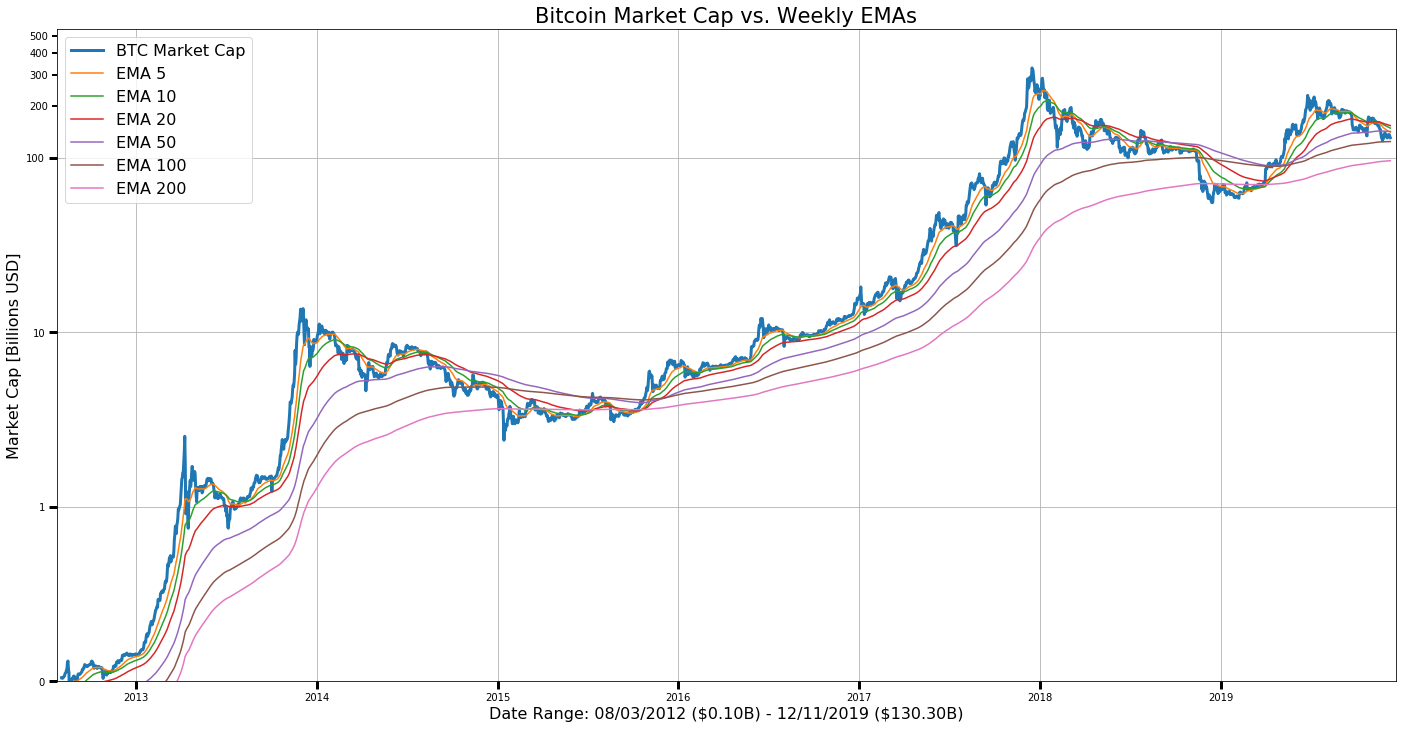
Switch data provider to Coinmetrics.io, add EMA 10, update formatting.
https://coinmetrics.io/data-downloads/
Author
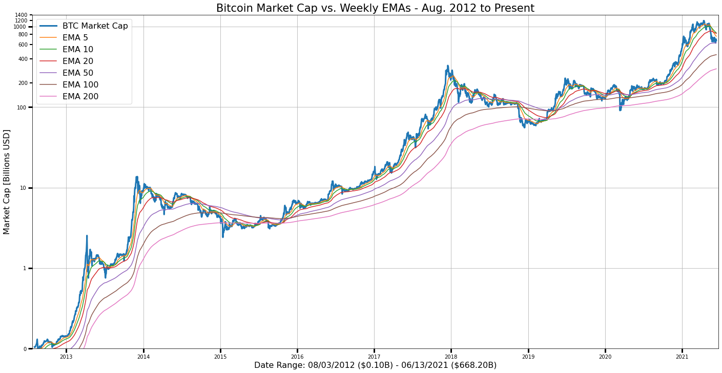
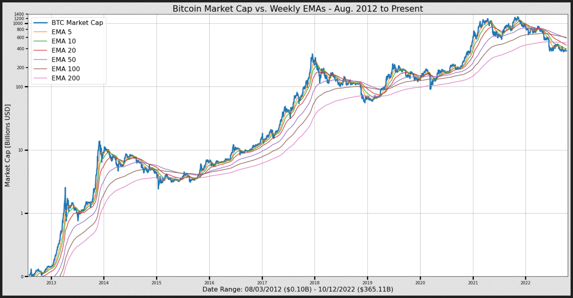
2012 present chart, updated Jun 13, 2021 to reflect higher max market cap:
Author
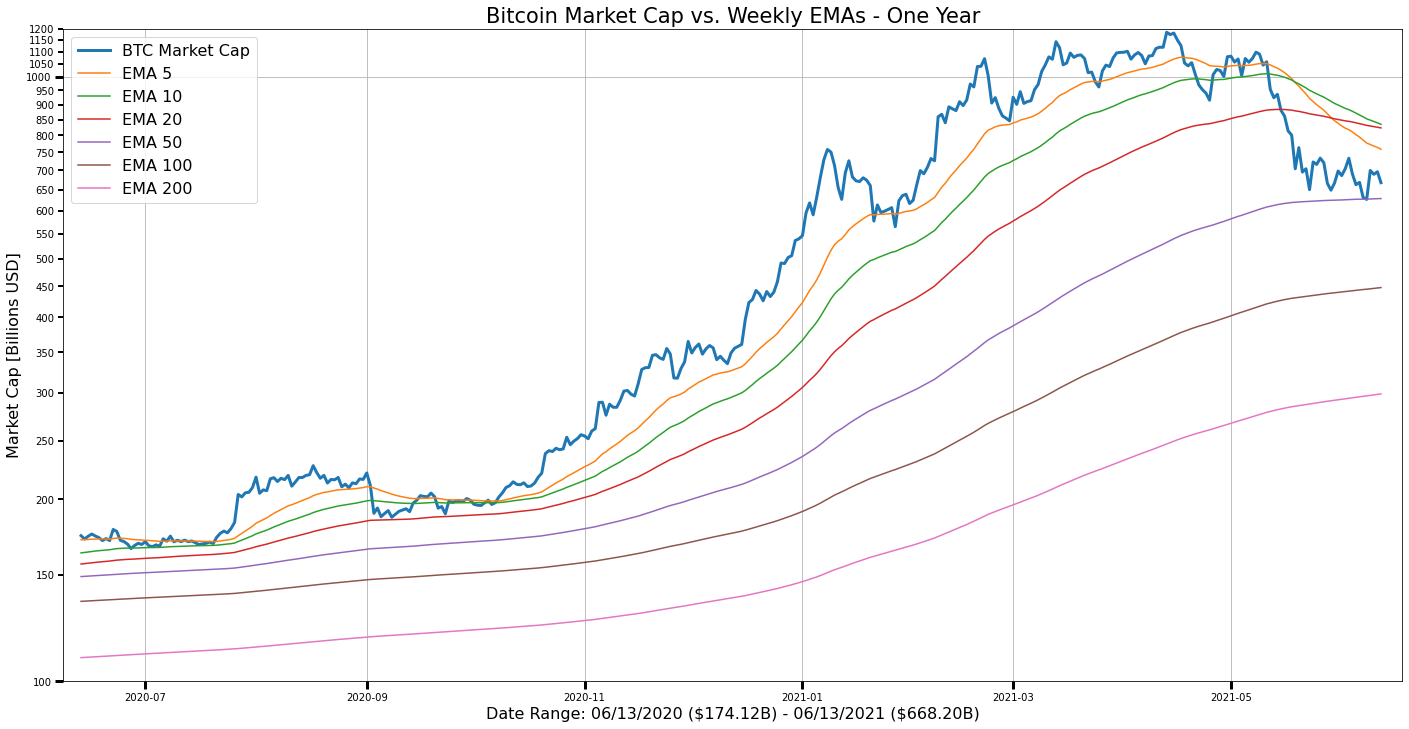
One year chart:
import datetime as dt
import requests
import io
import pandas as pd
import matplotlib.pyplot as plt
from matplotlib.pyplot import figure
from matplotlib import ticker
from matplotlib.ticker import (MultipleLocator, FormatStrFormatter, AutoMinorLocator)
%matplotlib inline

# Author: Adam Anderson, https://github.com/84adam
# Shout Out to: Benjamin Kircher, https://github.com/bkircher for help with formatting, data download

# function to download CSV file from URL; convert to Pandas DataFrame
def get_csv_from_url(url):
    s = requests.get(url).content
    df = pd.read_csv(io.StringIO(s.decode('utf-8')))
    return df

if __name__ == '__main__':
    # data source: coinmetrics.io - all BTC community data (CSV)
    url = "https://coinmetrics.io/newdata/btc.csv"

    # download data
    print("Downloading data...")
    df = get_csv_from_url(url)

    # select columns
    df = df[['date', 'CapMrktCurUSD']]

    # rename columns
    df = df.rename(columns={"CapMrktCurUSD": "market cap"})

    # convert 'date' (object series) to timestamp format
    df["date"] = df["date"].astype('datetime64[ns]')

    # divide market cap by 1 billion
    df['market cap'] = df['market cap'] / 1000000000

    # rename for convenience
    x = df['date']
    y = df['market cap']

    # calculate Exponential Moving Averages (EMAs) [Periods: 5, 10, 20, 50, 100, 200]
    # enter (#-days) per period for EMAs, e.g. '7' = 1 week/period
    per = 7 # one week
    df['EMA_5p'] = df.iloc[:,1].ewm(span=(5*per),adjust=True).mean()
    df['EMA_10p'] = df.iloc[:,1].ewm(span=(10*per),adjust=True).mean()
    df['EMA_20p'] = df.iloc[:,1].ewm(span=(20*per),adjust=True).mean()
    df['EMA_50p'] = df.iloc[:,1].ewm(span=(50*per),adjust=True).mean()
    df['EMA_100p'] = df.iloc[:,1].ewm(span=(100*per),adjust=True).mean()
    df['EMA_200p'] = df.iloc[:,1].ewm(span=(200*per),adjust=True).mean()

    # rename for convenience
    y5 = df['EMA_5p']
    y20 = df['EMA_20p']
    y10 = df['EMA_10p']
    y50 = df['EMA_50p']
    y100 = df['EMA_100p']
    y200 = df['EMA_200p']

    # set starting and ending dates
    start = len(df['date']) - (365*1+1) # one year ago
    # start = len(df['date']) - (365*2+1) # two years ago
    # start = len(df['date']) - (365*3+1) # three years ago
    # start = 1308 # market cap >= $100M from this date onwards: '2012-08-03'
    end = len(x) - 1 # last date in series

    start_date = df['date'][start]
    end_date = df['date'][end]

    # get start/end market cap values (Billions USD)
    start_mc = y[start]
    end_mc = y[end - 1]

    # set ranges for plotting on chart
    x = x[start:end]
    y = y[start:end]
    y5 = y5[start:end]
    y10 = y10[start:end]
    y20 = y20[start:end]
    y50 = y50[start:end]
    y100 = y100[start:end]
    y200 = y200[start:end]

    # set figure size
    plt.figure(figsize=[24,12])
    ax = plt.subplot(1, 1, 1)

    # plot values in log scale
    ax.semilogy(x, y, label='BTC Market Cap', linewidth=3)
    ax.plot(x, y5, label='EMA 5')
    ax.plot(x, y10, label='EMA 10')
    ax.plot(x, y20, label='EMA 20')
    ax.plot(x, y50, label='EMA 50')
    ax.plot(x, y100, label='EMA 100')
    ax.plot(x, y200, label='EMA 200')

    # set y-scale limits: $100 million to $1.2 trillion
    # ax.set_ylim(0.1, 550)
    ax.set_ylim(100, 1200)

    # set x-scale limits:
    # start/end dates 10 days before/after specified `start_date`/`end_date`
    # ax.set_xlim(start_date - dt.timedelta(days=10), end_date + dt.timedelta(days=10))
    ax.set_xlim(start_date - dt.timedelta(days=5), end_date + dt.timedelta(days=5))

    # set Y-axis tick formats
    ax.yaxis.set_major_formatter(ticker.FormatStrFormatter('%.0f'))
    ax.yaxis.set_minor_formatter(ticker.FormatStrFormatter('%.0f'))
    ax.tick_params(which='major', width=3, length=8)
    ax.tick_params(which='minor', width=2, length=5)

    # for the minor ticks, show only every 100 billion mark
    ax.yaxis.set_minor_locator(MultipleLocator(50))

    plt.grid(True)
    plt.legend(loc=2, fontsize=16)
    plt.xlabel(f'Date Range: {start_date.strftime("%m/%d/%Y")} (\${start_mc:.2f}B) - {end_date.strftime("%m/%d/%Y")} (\${end_mc:.2f}B)', fontsize=16)
    plt.ylabel('Market Cap [Billions USD]', fontsize=16)
    plt.title("Bitcoin Market Cap vs. Weekly EMAs - One Year", fontsize=21)
    plt.show()
Author
updated to account for column name change: 'date' to 'time'
Sign up for free
to join this conversation on GitHub.
Already have an account?
Sign in to comment
My matplotlib skills are underdeveloped. How about Altair?