
All charts from Storytelling with Data written by Cole Nussbaumer Knaflic.
Data from the books is provided by the author here.
All charts completed using Highcharts. You can see live demos of simple charts here.
Knaflic mentions that the tool for visiualization doesn't matter as long as you have mastery of the tool. This is an attempt to gain and prove proficiency in recreating work with Highcharts.
When all charts are completed, they will be available to see here:
- My timeline of thanks
- Figure 0.1 - A sampling of ineffective graphs
Figure 0.2 - Example 1 (before): showing data
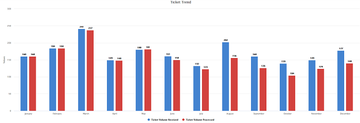
- Figure 0.3 - Example 1 (after): storytelling with data
- Figure 0.4 - Example 2 (before): showing data
- Figure 0.5 - Example 2 (after): storytelling with data
- Figure 0.6 - Example 3 (before): showing data
- Figure 0.7 - Example 3 (after): storytelling with data
- Figure 1.1 - Communiction mechanism continuum
Figure 2.1a - The visuals I use most (Simple text)
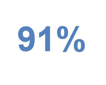
Figure 2.1b - The visuals I use most (Scatterplot)
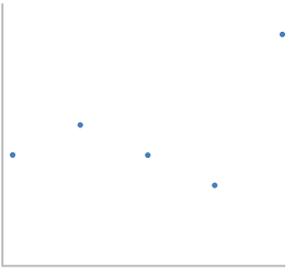
Figure 2.1c - The visuals I use most (Vertical bar)
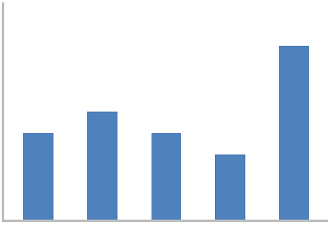
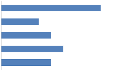
Figure 2.1d - The visuals I use most (Horizontal bar)
- Figure 2.1e - The visuals I use most (Table)
Figure 2.1f - The visuals I use most (Line)
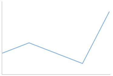
Figure 2.1g - The visuals I use most (Stacked vertical bar)
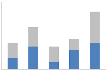
Figure 2.1h - The visuals I use most (Stacked horizontal bar)
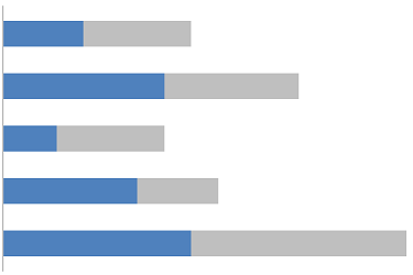
Figure 2.1i - The visuals I use most (Heatmap)
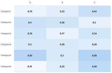
Figure 2.1j - The visuals I use most (Slopegraph)
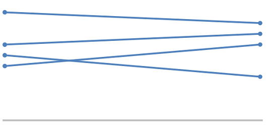
Figure 2.1k - The visuals I use most (Waterfall)
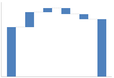
Figure 2.1l - The visuals I use most (Square area)
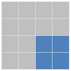
Figure 2.2 - Stay-at-home moms original graph
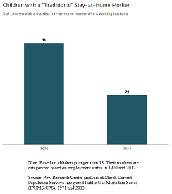
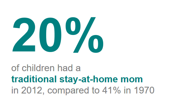
Figure 2.3 - Stay-at-home moms simple text makeover
- Figure 2.4 - Table borders
- Figure 2.5a - Two views of the same data (table)
- Figure 2.5b - Two view of the same data (heatmap)
- Figure 2.6 - Scatterplot
- Figure 2.7 - Modified Scatterplot
- Figure 2.8a - Line graph, single series
- Figure 2.8b - Line graph, two series
- Figure 2.8c - Line graph, multiple series
- Figure 2.9 - Showing average within a range in a line graph