Skip to content

Instantly share code, notes, and snippets.

Show Gist options
  • Select an option

  • Save BlvckBytes/443b58a7b49bfc264249697fb5a03bc9 to your computer and use it in GitHub Desktop.

Select an option

Save BlvckBytes/443b58a7b49bfc264249697fb5a03bc9 to your computer and use it in GitHub Desktop.

Textbox Component (Angular)

A versatile text-input that covers most common use-cases and saves a lot of preliminary work.

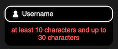
demo

Inputs

  • @Input() placeholder: string Placeholder for this textbox
  • @Input() icon: string Name of SVG icon inside /graphics
  • @Input() type: string Type of textbox, e.g. text, email, ...
  • @Input() volatilePlaceholder: boolean If true, the placeholder disappears when the box holds content, otherwise it'll float on top of the control
  • @Input() dark: boolean Whether or not to display in dark-mode
  • @Input() size: TextboxSize Size of this textbox

Dependencies

There are some auxiliary precautions this component needs.

Modules

  • CommonModule (Angular)
  • ReactiveFormsModule (Angular)

Custom Properties (CSS)

  • --line-height Line height multiplier (e.g. 1.4)
  • --spc-xs Extra small space
  • --spc-sm Small space
  • --ad-md Animation duration medium
  • --br-md Medium border radius
  • --bw-md Medium border width
  • --white White color (light theme)
  • --black Black color (dark mode)
  • --white--d Darkened white color (light theme)
  • --a-success Action success: Success border color (valid)
  • --a-warning Action warning: Warning border color (invalid)
  • --a-warning--d--o Action warning dark opac: Warning background color (invalid)
export type TextboxSize = 'medium' | 'large';
<div [class]="mkClasses('textbox')">
<!-- Icon next to placeholder -->
<img
*ngIf="icon"
class="svg--sm"
[class.svg--light]="!dark"
src="graphics/{{icon}}.svg"
alt="{{icon}}"
>
<div class="textbox__wrapper">
<!-- Actual input -->
<input
[formControl]="control"
class="textbox__input"
type="{{type}}"
placeholder=" "
[email]="type === 'email'"
(blur)="onTouched()"
>
<!-- Artificial placeholder -->
<p class="textbox__placeholder">{{placeholder || 'Placeholder'}}</p>
</div>
</div>
<!-- Only render errors when control has been touched or changed -->
<!-- This helps to not overwhelm the user -->
<div
class="errors"
*ngIf="(control.touched || control.dirty) && control.errors"
>
<!-- Iterate all errors from ctorEnsure (descriptions) -->
<!-- INFO: https://github.com/BlvckBytes/ctor-ensure -->
<p
*ngFor="let error of control.errors?.['ctorEnsure'] || []"
>
<!-- Print error description -->
{{error}}
</p>
</div>
:host {
width: 100%;
transition: margin var(--ad-md) ease;
display: block;
color: var(--white);
&, .textbox {
border-radius: var(--br-md);
}
// Has content in textbox
&.--has-content {
margin-top: 2rem;
// Shift placeholder if input has a value
.textbox__placeholder {
transform: translateY(calc(-100% + -1.3rem - .5rem));
}
}
// Dark themed textbox
&.--dark {
color: var(--black);
.textbox {
border: var(--bw-md) solid var(--black);
}
}
// Placeholder isn't moved but hidden
&.--volatile-placeholder {
// Don't shift down
&.--has-content {
margin-top: 0;
// Hide placeholder
.textbox__placeholder {
display: none;
}
}
}
}
.textbox {
$r: &;
display: flex;
align-items: center;
gap: var(--spc-sm);
border: var(--bw-md) solid var(--white);
&--large {
padding: var(--spc-sm) var(--spc-md);
}
&--medium {
padding: var(--spc-xs) var(--spc-sm);
}
// Wrapper to have placeholder relative to input
&__wrapper {
position: relative;
isolation: isolate;
flex-grow: 1;
display: flex;
}
// Placeholder is behind input
&__placeholder {
position: absolute;
inset: 50% auto auto 0;
z-index: 1;
transform: translateY(-50%);
transition: transform var(--ad-md) ease;
}
// Transparent input
&__input {
position: relative;
border: none;
background: transparent;
z-index: 2;
flex-grow: 1;
font-size: 1rem;
height: calc(1rem * var(--line-height));
&:focus {
// No outline on focus
outline: none;
}
}
// Validation passed
@at-root :host.--valid & {
border: var(--bw-md) solid var(--a-success);
}
// Validation failed
@at-root :host.--invalid & {
border: var(--bw-md) solid var(--a-warning);
background: var(--a-warning--d--o);
}
}
.errors {
text-align: center;
padding: var(--spc-xs) var(--spc-sm);
display: flex;
flex-direction: column;
gap: var(--spc-sm);
}
import { AfterViewInit, ChangeDetectorRef, Component, DoCheck, HostBinding, Input, OnDestroy, OnInit } from '@angular/core';
import { ControlValueAccessor, FormControl, NG_VALUE_ACCESSOR } from '@angular/forms';
import { BehaviorSubject, merge } from 'rxjs';
import { distinctUntilChanged, skip, startWith } from 'rxjs/operators';
import { SubSink } from 'subsink';
import { TextboxSize } from './textbox-size.type';
@Component({
selector: 'app-textbox',
templateUrl: './textbox.component.html',
styleUrls: ['./textbox.component.scss'],
providers: [
{
provide: NG_VALUE_ACCESSOR,
useExisting: TextboxComponent,
multi: true,
}
]
})
export class TextboxComponent implements ControlValueAccessor, AfterViewInit, DoCheck, OnDestroy, OnInit {
@Input() placeholder?: string;
@Input() icon?: string;
@Input() type = 'text';
@Input() size: TextboxSize = 'large';
@Input()
@HostBinding('class.--volatile-placeholder')
volatilePlaceholder = false;
@Input()
@HostBinding('class.--dark')
dark = false;
@HostBinding('class.--has-content')
hasContent = false;
@HostBinding('class.--valid')
isValid = false;
@HostBinding('class.--invalid')
isInvalid = false;
onTouched = () => {};
control: FormControl;
private subs = new SubSink();
private touched$ = new BehaviorSubject(false);
constructor (
private cd: ChangeDetectorRef,
) {
this.control = new FormControl();
}
ngDoCheck() {
// Check if touched has changed
if (this.touched$.value !== this.control.touched)
this.touched$.next(true);
}
ngAfterViewInit() {
this.subs.sink = merge(
// Only call when touched changed
this.touched$.pipe(
startWith(false),
distinctUntilChanged(),
skip(1),
),
// Also call on value or validity changes
this.control.valueChanges,
this.control.statusChanges,
).subscribe(() => this.updateModifiers());
}
ngOnInit(): void {
this.updateModifiers();
}
ngOnDestroy() {
this.subs.unsubscribe();
}
private updateModifiers() {
// Neither empty nor null
this.hasContent = this.control.value !== '' && this.control.value !== null;
// Needs to be touched or have content in order to be applied
this.isValid = (this.control.touched || this.hasContent) && this.control.valid;
this.isInvalid = (this.control.touched || this.hasContent) && !this.control.valid;
this.cd.detectChanges();
}
mkClasses(own = '') {
const pr = "textbox--";
return `${pr}${this.size} ${own}`;
}
writeValue(obj: any): void {
this.control.patchValue(obj);
this.updateModifiers();
}
registerOnChange(fn: any): void {
this.control.valueChanges.subscribe(fn);
}
registerOnTouched(fn: any): void {
this.onTouched = fn;
}
}
Sign up for free to join this conversation on GitHub. Already have an account? Sign in to comment