- 1450: Blackletter (Johannes Gutenberg)
- Roman / Serif (Nicloas Jenson)
- italics (Aldus Manutius)
- 1530s: Old Style (William Caslon): thick serifs, low contrast between thick & theen strokes
- 1750s: Transitional (John Baskerville)
- 1784: Modern (Didot, 1767 "Bodoni", Giambattista Bodoni)
- 1815: Slab Serif (advertising)
- 1816: Sans Serif (William Caslon IV)
- Geometric Sans (1927 "Futura", Paul Renner): simple geometric shapes
- Humanist Sans (1928/6 "Gill Sans", Eric Gill): similar to geometric sans, but with gentler, more natural curves
- Slab serifs: block serifs usually joining the stroke at right angles and of a similar thickness to the stroke itself.
- Geometric: rectilinear and machine-like qualities
- Humanist: curvilinear and scribal qualities usually found in typefaces of the 14th and 15th centuries where the design is clearly imitating lettering as formed by a pen.
- The History of Typography - Animated Short (video)
- History of Western typography (wikipedia)
- Typeface § History (summary of the above)
- Style of typefaces (wikipedia)
- Vox-ATypI classification (wikipedia)
- Typedia: Typeface Classifications
- Adobe Type Library: Type Classifications
- 10 Infographics That Will Teach You About Typography
- Key Moments in the Evolution of Typographic Style
- Family tree-style categorization of type styles
- A Historic Outline of Typeface Design (zoom 1, zoom 2, src)
- A Historic Outline of Typeface Design (a dupe? earlier/later version? in any case, less readable.)
- History of Typography (src)
- Everything You Always Wanted to Know About Typography
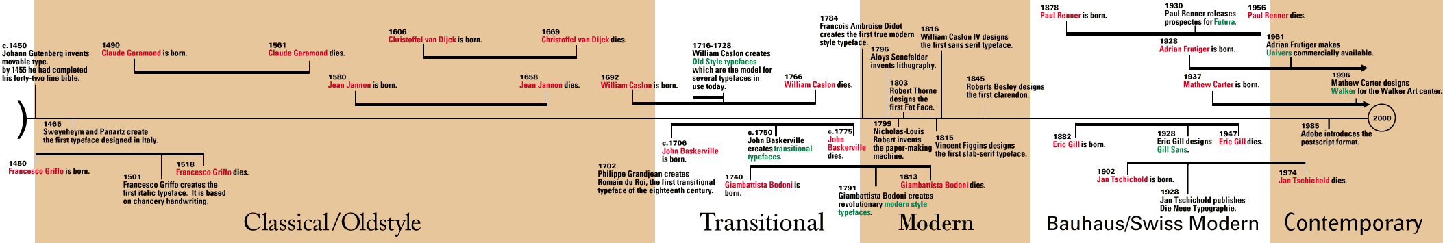
- Typography Timeline (src)
- Garamond - Timeline