This is a good rule to add to a reset that sets the box-sizing of all elements and pseudo elements to border-box. This results in a predictable CSS authoring experience.
  *,
  *::before,
  *::after {
    box-sizing: border-box;
  }
This rule helps us build webpages using the intrinsic styling approach, where the content drives the dimensions of the boxes (elements) that make up the pages.
[data-type='primary' s] { /* the 's' stands for case-sensitive. for case-insensitiviness use 'i'*/
  color: red;
}

/* A href that contains "example.com" */
[href*='example.com'] {
  color: red;
}

/* A href that starts with https */
[href^='https'] {
  color: green;
}

/* A href that ends with .com */
[href$='.com'] {
  color: blue;
}Combinators are operators (+, >, ~) that are placed between simple selectors for fine-grained control over the styling.
p strong {
  color: beige;
}

/* To make the rule above non-recursive. This selects the immediate child that is a strong element for all p elements */
p > strong {
  color: beige;
}.top * + * { /* for me it reads: for all elements with a class 'top', select all elements in it that have an older sibling */
margin-top: 1.5em;
}:checked ~ .toggle__decor {
background: rebeccapurple;
}This rule select elements with the class 'toggle__decor' that are siblings of any element with the pseudo class 'checked'. PS: these siblings cannot come after the first part of the combinator.
.top * + * {
  margin-top: 1.5em;
}
This combinator works as intended when the children of .top have older siblings, but falls apart if these children have children of their own. To solve this problem we can tweak the combinator a bit...
.top > * + * {
  margin-top: 1.5em;
}
By adding '>' we are telling the browser to only apply the declarations to the children of .top that have older siblings while denying the inheritance of the declarations to their children.
a.my-class {
  color: red;
}
These selectors are good for increasing readability and specificity. But it's important not to abuse them, lest you want to end up with a specificity 'hell'. */
This is the order of specificity of CSS by its origin:
- User agent base styles
- Local user styles (OS, and browser extensions)
- Authored CSS
- Authored CSS !important
- Local user styles !important
- User agent !important
These are the specificity scores of each type of selector:
- Universal selector: 0
- Element (type) or pseudo-element selector: 1
- Class, pseudo-class, or attribute selector: 10. Note: the :not pseudo-class itself doesn't add anything to the specificity calculation, but arguments passed to it do
div:not(.my-class) { /* here the .my-class will count towards the overall selector specificity score (which is 11 btw) */
  color: red;
}- ID selector: 100 points
- Inline style attribute: 1000
- !important rule: 10000
Text editors will usually show the specificity score of a rule by using a tuple with three integer values (n, n, n). The first value, going from left to right, is for the ID selectors, the second for the classes, pseudo-classes, and attribute selectors, and the final value represents the element, and pseudo-elements selectors.
Leveraging inheritance helps us in writing less CSS.
The html element does not inherit properties (for obvious reasons). Not all properties can be inherited, and the inheritance process is always from top to bottom. these are all the properties that children elements can inherit from their parents (direct and indirect).
All elements have initial values that are used whenever the authored CSS does not set a specific value to them. To explicitely inherit a value from an authored CSS, use the inherit keyword as the value for the property that has to inherit.
To explicitely use the initial value set by the OS or user agent, use the initial keyword.
The unset property behaves differently if a property is inherited by default or not. If a property is inherited by default, the unset keyword will be the same as inherit. If the property is not inherited by default, the unset keyword is equal to initial.
To inherit/revert to the initial value we can use the all keyword. This is particularly useful if >2 properties have to deviate from the authored CSS rule.
It is a shorthand for the RGB color system, assigning a numeric value to red, green, and blue.
h1 {
  color: #b62451;
}
Despite usually being represented as a 6 digit sequence, through a mix of 0-9 and A-F, hex colors can be represented using a 3 digit sequence (shorthand).
h1 {
  color: #fff; /* same as #ffffff = RGB (255, 255, 255) = white */
}
It can also be an 8 digit sequence where the last 2 represent the alpha value, a percentage of transparency. Because the hex scale is 0-9 and A-F, the transparency values are probably not quite what you'd expect them to be. Here are some key, common values added to the black hex code, #000000:
- 0% alpha—which is fully transparent—is 00: #00000000
- 50% alpha is 80: #00000080
- 75% alpha is BF: #000000BF
h1 {
  color: rgb(183 21 64); /* commas between values were dropped*/
}
These colors are defined using the rgb() function, using either numbers (0-255) or percentages (0%-100%). 0 = 0%, and 255 = 100%. Alpha values (transparency percentage) are also available:
h1 {
  color: rgb(183 21 64 / 0.5);
  color: rgb(183 21 64 / 50%);
}
Or simply use the modern rgba() function, which explicitely communicates the need for an alpha value:
h1 {
  color: rgba(183 21 64 0.5); /* the '/' is dropped since the alpha value is a 'first-class-citizen' in this function*/
}h1 {
color: hsl(344 79% 40%);
}The hue describes the value on the color wheel, from 0 to 360 degrees. 0-360 degrees correspond to the red color, while 180 degrees to the blue color. The saturation represents the vibrance of the hue value with 0% being grayscale (fully desaturated), and 100% being fully saturated. Finally, we have the lightness value, that represents scale from white to black of added light. 100% of lightness will always give you white.
The hsl() function, like the rgb() function, can also take a fourth argument that represents the alpha value (transparency percentage) or we can simply use the hsla() function.
Keep tabs on lab() and lch() color spaces, which allow for even greater color fine tuning.
- transparent
- currentColor: the contextual computed dynamic value of the color property
<p>
  Lorem ipsum dolor sit amet, qui minim labore adipisicing minim sint cillum sint consectetur cupidatat.
</p>
p {
color: cornflowerblue;
border: 1px solid currentColor; /* currentColor = cornflowerblue */
}- system keywords: Background, Highlight, etc
- others (link
- color
- text-shadow
- text-decoration-shadow
- background
- background-color
- linear-gradient
- border-color
- outline-color
- box-shadow
They can be either integers or floats, and their meaning depends on their context. They can be used alongside a unit or kept 'raw'.
p {
  font-size: 24px;
  line-height: 1.5; /* 1.5 is equal to 150% of the element's **computed pixel font size**, which means it's equal to 1.5*24px = 36px. It's recommended to keep the value for the line-height unitless to keep it relative to the font-size*/
}div {
width: 300px;
height: 100px;
}
div p {
width: 50%; /* width is 50% of the parent's width.*/
}Margin and padding, when set as percentages, are relative to the parent's width, regardless of direction.
div {
  width: 300px;
  height: 100px;
}

div p {
  margin-top: 50%; /* calculated: 150px */
  padding-left: 50%; /* calculated: 150px */
}
Transform, when set as a percentage, is relative to element it transforms.
div {
  width: 300px;
  height: 100px;
}

div p {
  width: 50%; /* calculated: 150px */
  transform: translateX(10%); /* calculated: 15px, which is 10% of 150px */
}Whenever a unit is attached to a number, it becomes a dimension. Lengths are dimensions that refere to the distance and they can be either absolute or relative.
Non relative, constant dimensions. Useful for fixed layouts.
div {
  width: 10cm; /* same as 10cm on a ruler */
  height: 5cm;
  background: black;
}
These can be handy to style webpages that are meant to be printed. Here's a conversion table link.
Calculated against a base value, like percentages. But they differ in that relative lengths result of the use of units that refer to specific dimensions as the base. Eg.: ch uses the text size as a basis, while vw uses the viewport's width size (the browser window).
Realtive lengths are useful for responsive web design.
Useful for detecting high resolution screens to serve them higher resolution images.
div {
  background-image: url('a-low-resolution-image.jpg');
}

@media (-webkit-min-device-pixel-ratio: 2), (min-resolution: 192dpi) { /* dpi = dots per inch */
  div {
    background-image: url('a-high-resolution-image.jpg');
  }
}In the early days of the web, designs were constructed using table elements. CSS, especially as we know it now, came later and allowed the separation of concerns regarding markup and styling.
Link to a useful image to learn the key concepts regarding an element's display
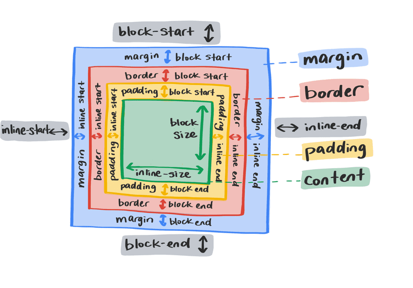
All elements are boxes. The display property determines if the box acts as an inline element or block element.
It makes the element act as a word in a sentence, and it preserves the surrounding whitespace. The element is intrisically sized (you can't set width or height), and block level margin and padding will be ignored by the surrounding elements.
The element will always create a new line for itself and, unless changed by other CSS code, it will expand to the size of the inline dimension (width equal to 100% of the parent). All block margin and padding will be respected.
This property is slightly different from the previous ones since it affects not only the targeted element, but also it's child elements. The child elements became flex items, allowing their parent to control their flow, alignment and order. The target element acts as a block level element.
It's important to know that the flex value excels at creating single-axis layouts.
This property is similar to flex but more suited at creating and controlling multi-axis layouts. By using the grid display many properties became available to allow a more granular and complex control of the behaviour of the elements in the layout.
Unless we use flex or grid values, the elements are displayed in the normal flow. Below you'll find other display methods to alter the normal flow.
Use to create inline elements that respect block margin and padding.
This property indicates the direction the element should "float" towards. Useful to have elements wrap around the target element. It's important to use this property alongside the clear property to control the flow of the elements following the floated element.
These properties must be set at the parent element to control the display of the children. It can be an alternative to the more robust display: grid property.
Allows to determine the behaviour of the element in the normal flow of the document, and how to relates to other elements. Except for position: static (the default value), all values enable the use of the top, right, bottom, and right properties to control the position of the element. A shorthand to set these values is the inset (and all its variants) property.
.my-element {
  position: relative;
  top: 10px;
}
It means position the element relatively to itself. That means that the code above will nudge the element down by 10px according to its position on the document. This position value has another effect: it becomes the containing block of any child elements with position: absolute, making it the reference point, instead of using the topmost relative parent.
.another-element {
    position: absolute;
    bottom: 0;
    right: 0;
    width: 50px;
    height: 50px;
}
It means position the element relatively to the topmost relative element in the document. It breaks the element out of the document flow, enabling position using inset properties, and makes the content surrounding the absolute element reflow to fill the space left by it.
.another-element {
    position: fixed;
    bottom: 0;
    right: 0;
    width: 50px;
    height: 50px;
}
It behaves like position: absolute but with its parent element being the root element (html).
.navigation {
    position: sticky;
    top: 0;
}
Use position: sticky to have the fixed behaviour while honoring the document flow like relative.