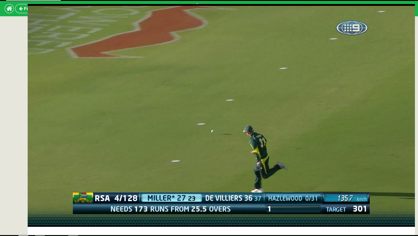
If you signed up for Cricket Australia's digital streaming service this summer you'd be pretty disappointed with the very tiny size of the video stream. For those of us that can't get terrestrial TV for whatever reason and use digital services and paid good money for them this is a terrible decision.
Thankfully, with a bit of CSS-fu it's possible to get an almost full-screen video feed and get rid of all those rubbish ads to boot.
This is version one - mostly because I only did enough to be satisfied watching the first ODI. I'll keep this updated and refine it over the course of the summer.
Download and install the stylish chrome extension
Once that is done open up the style manager and "Write a new style"
Call it whatever you want and then paste the following code into the "code" section.
.mc-advert,
.current-players,
.fat-score,
.stream-switcher,
.MC-streamButtons,
.MC-statsNav {
    display: none;
}

#stream-wrapper { display: none; }

.video {
    position: inherit !important;
    width: 100%;
    height: 100%;
    left: 0px !important;
    right: 0px !important;
    top: 0px !important;
    bottom: 0px !important;
}
In the "applies to" section, choose "URLs on the domain" and then add live.cricket.com.au
Save your config and then reload your video stream, go Fullscreen and there you go, a nice big cricket video stream.
Stick on your cap, grab a coldie and enjoy your cricket like this:

This works better.
This makes it full screen only when your browser is wider than 992px. This way you can still check the stats and other features if you need to by just resizing the browser.
It also fixes the video being hidden at the end of broadcasts when they do the day recap.
If you want the full screen change to take effect at a different minimum browser width, just change "992px" to whatever you prefer.