|
/** |
|
* @name Discord Concept Central Design |
|
* @author Idea by YouTube@ConceptCentral, implementation by github@appleneko2001 |
|
* @version 0.0.2 |
|
* @description Re-imagined design of Discord (alpha, still re-working). Style based on DarkMatter by Tropical#8908 and Hammock#3110 (source: https://github.com/DiscordStyles/DarkMatter/) |
|
*/ |
|
|
|
/* DO-IT-YOURSELF IS BEST */ |
|
/* Hey you! If you want your Discord looks more that you love */ |
|
/* then do not forgot check last line! There you can change some variables to this style setup */ |
|
/* Like customized background, behaviours or etc. */ |
|
|
|
/* or if you want change it DEEPLY... I'll leave it to you, MASTER! */ |
|
|
|
button { |
|
--accentcolor: var(--accent-alt); |
|
} |
|
|
|
/* Root Variables */ |
|
|
|
:root { |
|
--avatar-size: 32px; |
|
--background-solid: #161921; |
|
--background-solid-dark: #101218; |
|
--background-solid-darker: #0c0e12; |
|
--accent: 37, 172, 232; |
|
--accent-alt: 29, 101, 134; |
|
--black: 0, 0, 0; |
|
--white: 255, 255, 255; |
|
|
|
--accentcolor: var(--accent); |
|
--vaccentcolor-hover: rgb(var(--accent)); |
|
--vaccentcolor-active: rgb(var(--accent)); |
|
} |
|
|
|
.theme-dark, |
|
.theme-light { |
|
/* Discord vars */ |
|
--background-primary: var(--background-solid); |
|
--background-mobile-primary: var(--background-primary); |
|
--background-secondary: var(--background-solid); |
|
--background-mobile-secondary: var(--background-secondary); |
|
--background-secondary-alt: var(--background-solid); |
|
--background-tertiary: var(--background-solid); |
|
--background-floating: var(--background-solid); |
|
--background-secondary: var(--background-solid); |
|
--background-accent: var(--background-solid); |
|
--background-message-hover: rgba(var(--black), 0.4); |
|
--channeltextarea-background: transparent; |
|
--activity-card-background: rgba(var(--white), 0.05); |
|
--deprecated-store-bg: transparent; |
|
--background-modifier-hover: rgba(var(--black), 0.3); |
|
--background-modifier-active: rgba(var(--black), 0.3); |
|
--background-modifier-selected: rgba(var(--black), 0.6); |
|
--elevation-low: inset 0 -1px 0 0 rgba(var(--black), 0.3); |
|
--channels-default: rgba(var(--white), 0.3); |
|
--deprecated-quickswitcher-input-background: var(--background-solid); |
|
--header-primary: rgba(var(--white), 1); |
|
--header-secondary: rgba(var(--white), 0.6); |
|
--text-normal: rgba(var(--white), 0.6); |
|
--text-muted: #8a8e94; |
|
--interactive-muted: rgba(var(--white), 0.15); |
|
--interactive-normal: rgba(var(--white), 0.5); |
|
--interactive-hover: rgba(var(--white), 0.75); |
|
--interactive-active: rgba(var(--white), 1); |
|
--deprecated-card-bg: rgba(var(--white), 0.05); |
|
--text-link: rgba(var(--accent), 1); |
|
--focus-primary: rgba(var(--accent), 1); |
|
} |
|
|
|
::selection { |
|
background-color: rgba(var(--accent-alt), 0.5); |
|
} |
|
|
|
/* Scrollbars */ |
|
|
|
::-webkit-scrollbar { |
|
width: 12px !important; |
|
} |
|
|
|
:hover::-webkit-scrollbar { |
|
width: 12px !important; |
|
} |
|
|
|
.scrollableContainer-15eg7h::-webkit-scrollbar { |
|
width: 12px !important; |
|
} |
|
|
|
::-webkit-scrollbar-thumb { |
|
border-radius: 8px !important; |
|
border: 3px solid transparent !important; |
|
background-color: rgba(var(--accent-alt), 1) !important; |
|
} |
|
|
|
::-webkit-scrollbar-track { |
|
visibility: visible !important; |
|
border-radius: 8px !important; |
|
border: 3px solid transparent !important; |
|
background-color: rgba(0, 0, 0, 0.3) !important; |
|
background-clip: padding-box !important; |
|
} |
|
|
|
.none-2Eo-qx::-webkit-scrollbar { |
|
display: none !important; |
|
} |
|
|
|
/* auto vertical scrollable container */ |
|
nav[class*='container-']>[class*='scroller-']{ |
|
overflow: hidden auto !important; |
|
} |
|
|
|
form[class*='form-'] [class*='scrollableContainer-']{ |
|
overflow: hidden overlay !important; |
|
} |
|
|
|
/* Titlebar */ |
|
|
|
div[class*="typeWindows-"] { |
|
--background-modifier-hover: rgba(var(--white), 0.05); |
|
--background-modifier-active: rgba(var(--white), 0.075); |
|
height: 26px; |
|
|
|
--icon-minimize: url("data:image/svg+xml,%3Csvg xmlns='http://www.w3.org/2000/svg' width='26' height='26'%3E%3Cpath stroke-width='2' stroke='currentColor' fill='none' d='M6 18 l13 0'/%3E%3C/svg%3E"); |
|
--icon-restore: url("data:image/svg+xml,%3Csvg xmlns='http://www.w3.org/2000/svg' width='26' height='26'%3E%3Cpath stroke-width='2' stroke='currentColor' fill='none' d='M6 9 l10 0 l0 10 l-10 0 l0 -10z m3 -3 l10 0 l0 10'/%3E%3C/svg%3E"); |
|
--icon-maximize: url("data:image/svg+xml,%3Csvg xmlns='http://www.w3.org/2000/svg' width='26' height='26'%3E%3Cpath stroke-width='2' stroke='currentColor' fill='none' d='M6 6 l13 0 l0 13 l-13 0 l0 -13 z'/%3E%3C/svg%3E"); |
|
--icon-close: url("data:image/svg+xml,%3Csvg xmlns='http://www.w3.org/2000/svg' width='26' height='26'%3E%3Cpath stroke-width='2' stroke='currentColor' fill='none' d='M6 6 l13 13 m0 -13 l-13 13'/%3E%3C/svg%3E"); |
|
} |
|
|
|
div[class*="typeWindows-"]>div:first-child { |
|
display: none; |
|
} |
|
|
|
div[class*="typeWindows-"]>div[role="button"] { |
|
height: 30px; |
|
width: 36px; |
|
} |
|
|
|
div[class*="typeWindows-"]::before { |
|
content: ''; |
|
background: var(--title-bar-background); |
|
display: block; |
|
position: absolute; |
|
top: 0; |
|
left: 0; |
|
right: 0; |
|
height: 30px; |
|
z-index: -2; |
|
pointer-events:none; |
|
} |
|
|
|
div[class*="typeWindows-"]::after { |
|
content: ''; |
|
position: absolute; |
|
padding: 0 12px; |
|
top: 0; |
|
left: 0; |
|
width: 80px; |
|
height: 30px; |
|
background-image: url("data:image/svg+xml,%3Csvg xmlns='http://www.w3.org/2000/svg' fill='%23aaa' viewBox='0 0 52.99 10'%3E%3Cpath d='M3.58.14H0v4.09L2.38 6.4V2.43h1.28c.81 0 1.2.4 1.2 1.04V6.5c0 .63-.37 1.05-1.2 1.05H0v2.3h3.58c1.91.02 3.71-.95 3.71-3.19V3.4C7.3 1.13 5.5.14 3.58.14zm18.75 6.53V3.33c0-1.21 2.13-1.5 2.78-.28l1.97-.81A3.54 3.54 0 0 0 23.72 0c-1.92 0-3.81 1.13-3.81 3.33v3.34c0 2.21 1.9 3.33 3.77 3.33 1.2 0 2.65-.6 3.44-2.18l-2.1-1c-.52 1.35-2.69 1.03-2.69-.15ZM15.8 3.78c-.74-.16-1.24-.43-1.27-.9.04-1.13 1.76-1.16 2.76-.09l1.58-1.24A3.9 3.9 0 0 0 15.6 0c-1.76 0-3.46 1-3.46 2.91 0 1.86 1.4 2.85 2.94 3.09.79.1 1.66.42 1.64.98-.07 1.04-2.18.99-3.14-.2l-1.51 1.46A4.2 4.2 0 0 0 15.32 10c1.75 0 3.7-1.03 3.78-2.91.1-2.4-1.6-3-3.3-3.3ZM8.6 9.86H11V.14H8.6ZM49.28.14h-3.57v4.09l2.38 2.17V2.43h1.27c.8 0 1.2.4 1.2 1.04V6.5c0 .63-.37 1.05-1.2 1.05H45.7v2.3h3.57C51.2 9.88 53 8.9 53 6.67V3.4C53 1.13 51.2.14 49.29.14ZM31.74 0c-1.99 0-3.96 1.1-3.96 3.34v3.32c0 2.23 1.98 3.34 3.98 3.34 1.98 0 3.95-1.1 3.95-3.34V3.34c0-2.23-2-3.34-3.97-3.34Zm1.55 6.66c0 .7-.78 1.06-1.54 1.06-.78 0-1.56-.35-1.56-1.06V3.34c0-.72.76-1.1 1.51-1.1.79 0 1.59.35 1.59 1.1zm11.07-3.32c-.05-2.29-1.58-3.2-3.55-3.2h-3.83v9.73h2.45v-3.1h.43l2.22 3.09h3.01l-2.6-3.34c1.16-.37 1.87-1.38 1.87-3.18zm-3.51 1.31h-1.42V2.43h1.42c1.53 0 1.53 2.22 0 2.22z'/%3E%3C/svg%3E"); |
|
background-position-x: 8px; |
|
background-position-y: center; |
|
background-repeat: no-repeat; |
|
background-size: 80px; |
|
z-index: -1; |
|
pointer-events:none; |
|
} |
|
|
|
/* Titlebar: caption buttons */ |
|
div[class*="typeWindows-"]>[class*='winButton-']>svg{ |
|
display:none; |
|
} |
|
div[class*="typeWindows-"]>[class*='winButton-']:after{ |
|
mask-repeat: no-repeat; |
|
mask-position: center; |
|
mask-size: 22px; |
|
-webkit-mask-repeat: no-repeat; |
|
-webkit-mask-position: center; |
|
-webkit-mask-size: 22px; |
|
background-color: white; |
|
display:block; |
|
content:''; |
|
width:32px; |
|
height:32px; |
|
} |
|
|
|
div[class*="typeWindows-"]>[class*='winButtonClose-']:after{ |
|
-webkit-mask-image: var(--icon-close); |
|
mask-image: var(--icon-close); |
|
} |
|
div[class*="typeWindows-"]>[class*='winButtonMinMax-']:after{ |
|
-webkit-mask-image: var(--icon-maximize); |
|
mask-image: var(--icon-maximize); |
|
} |
|
div[class*="typeWindows-"]>[class*='winButtonMinMax-']:is(:last-child):after{ |
|
-webkit-mask-image: var(--icon-minimize); |
|
mask-image: var(--icon-minimize); |
|
} |
|
|
|
/* Guilds */ |
|
|
|
ul[data-list-id='guildsnav'] { |
|
--background-secondary: var(--background-solid); |
|
--background-primary: rgba(var(--white), 0.1); |
|
background: var(--guild-bar-background); |
|
} |
|
|
|
ul[data-list-id='guildsnav'] ::-webkit-scrollbar { |
|
display: none; |
|
} |
|
|
|
ul[data-list-id='guildsnav']>div[dir] { |
|
padding-top: 18px; |
|
} |
|
|
|
ul[data-list-id='guildsnav'] [class^="pill-"], |
|
ul[data-list-id='guildsnav'] [class^="pill-"]>div { |
|
height: 40px !important; |
|
} |
|
|
|
ul[data-list-id='guildsnav'] div[style*="height: 56"], |
|
ul[id^="folder-items-"] { |
|
height: auto !important; |
|
} |
|
|
|
ul[data-list-id='guildsnav'] [class^="pill-"] span { |
|
margin-left: -5px; |
|
border-radius: 20px; |
|
} |
|
|
|
[data-list-id='guildsnav'] [class^="pill-"] span[style^="opacity: 1; height: 40"] { |
|
--header-primary: rgba(var(--accent), 1); |
|
} |
|
|
|
span[class^="expandedFolderBackground-"] { |
|
--background-secondary: rgba(var(--black), 0.25); |
|
border-radius: 14px; |
|
width: 40px; |
|
left: 16px; |
|
} |
|
|
|
.wrapper-28eC3z, |
|
[data-list-id='guildsnav'] [data-dnd-name] > div, |
|
[data-list-id='guildsnav'] svg[width="48"] { |
|
width: 40px; |
|
height: 40px; |
|
} |
|
|
|
div[class^="unreadMentionsIndicatorBottom-"] { |
|
bottom: 70px; |
|
} |
|
|
|
div[data-list-item-id="guildsnav___create-join-button"], |
|
div[data-list-item-id="guildsnav___guild-discover-button"] { |
|
transition: 150ms ease; |
|
opacity: 0.5; |
|
background-color: var(--background-solid) !important; |
|
color: rgba(var(--white), 0.3) !important; |
|
border: 1px dashed rgba(var(--white), 0.3); |
|
border-radius: 50px; |
|
} |
|
|
|
div[data-list-item-id="guildsnav___create-join-button"]:hover, |
|
div[data-list-item-id="guildsnav___guild-discover-button"]:hover { |
|
opacity: 1; |
|
} |
|
|
|
/* TODO: Merge those rules into above section (Guilds) */ |
|
/* .container-1eFtFS - ROOT APPLICATION LAYOUT */ |
|
|
|
/* GUILD BAR AND APP ROOT */ |
|
.container-1eFtFS{ |
|
background: transparent; |
|
display: flex; |
|
flex-direction: column; |
|
} |
|
.container-1eFtFS > [class*='base-']{ |
|
background: var(--app-background); |
|
} |
|
.container-1eFtFS > nav[class*='guilds-'] { |
|
min-height: 56px; |
|
width: initial; |
|
} |
|
.container-1eFtFS > nav[class*='guilds-']::before { |
|
content:''; |
|
position: absolute; |
|
top:0;left:0;right:0;bottom:0; |
|
/* This will make guild bar "DIFFERENT" |
|
It will no more guild bar, it will be "ANOTHER TITLEBAR" |
|
You will no longer to use this bar to change view to other server. |
|
and it will move window only |
|
-webkit-app-region: drag;*/ |
|
z-index:-5001; |
|
} |
|
.container-1eFtFS > nav[class*='guilds-'] > ul > [class*='scroller-'] { |
|
padding-top: 0; |
|
overflow: scroll hidden !important; |
|
display: flex; |
|
flex-direction: row; |
|
} |
|
.container-1eFtFS > nav[class*='guilds-'] > ul > [class*='scroller-'] > * { |
|
width: initial; |
|
display: flex; |
|
flex-direction: row; |
|
} |
|
|
|
.container-1eFtFS > nav[class*='guilds-'] > ul > [class*='scroller-'] > .listItem-3SmSlK > [class*='guildSeparator-'] { |
|
width: 2px; |
|
height: 32px; |
|
background-color: #FFF; |
|
} |
|
|
|
.pill-L_aLMQ{ |
|
top:unset; |
|
} |
|
|
|
ul[data-list-id='guildsnav'] [class^="pill-"], ul[data-list-id='guildsnav'] [class^="pill-"]>div{ |
|
transform: rotate(270deg); |
|
position: unset; |
|
} |
|
|
|
.pill-2RsI5Q,.pill-1NRFie{ |
|
overflow-x: visible; |
|
overflow-y: visible; |
|
width: 8px; |
|
height: 40px; |
|
position:unset; |
|
left:unset; |
|
top:unset; |
|
bottom: unset; |
|
} |
|
|
|
.pill-1NRFie > .wrapper-z5ab_q{ |
|
overflow: visible; |
|
} |
|
|
|
.tutorialContainer-1pL9QS > div > [class*='pill-']{ |
|
bottom: 0; |
|
} |
|
|
|
.wrapper-38slSD{ |
|
width: initial; |
|
} |
|
.wrapper-38slSD > span[class^='expandedFolderBackground-']{ |
|
width: initial !important; |
|
height: 40px !important; |
|
top: 8px; |
|
right: 8px; |
|
left: 8px; |
|
} |
|
|
|
.listItem-3SmSlK { |
|
width: initial ; |
|
padding: 0 8px ; |
|
padding-top: 8px; |
|
flex-direction: column-reverse !important; |
|
align-items: center !important; |
|
justify-items: center; |
|
|
|
display:grid !important; |
|
grid-template-rows: 40px 8px; |
|
} |
|
|
|
.listItem-3SmSlK > [class*='pill-'] { |
|
grid-row:2; |
|
} |
|
|
|
/* TODO: ONLY CHANGE "DISCOVER GUILDS" |
|
.scroller-3X7KbA > .listItem-3SmSlK { |
|
height: 80px; |
|
}*/ |
|
|
|
.container-1eFtFS > nav[class*='guilds-'] > ul > [class*='scroller-'] > :not([class]) > [class*='wrapper'] { |
|
display: grid; |
|
grid-template-columns: 1fr; |
|
grid-auto-flow: column; |
|
} |
|
|
|
.container-1eFtFS > nav[class*='guilds-'] > ul > [class*='scroller-'] > :not([class]) > [class*='wrapper'] > ul{ |
|
display: flex; |
|
} |
|
|
|
/* Sidebar */ |
|
|
|
.platform-win [class^="sidebar-"] { |
|
border-radius: 0; |
|
} |
|
|
|
div[class^="sidebar-"] nav, |
|
#private-channels { |
|
background-color: transparent; |
|
--background-tertiary: rgba(var(--black), 0.05); |
|
} |
|
|
|
div[class^="sidebar-"]>nav>div[class^="searchBar"] { |
|
height: 54px; |
|
} |
|
|
|
/* members wrapper */ |
|
.container-2o3qEW { |
|
--background-secondary: rgba(var(--black), 0.4); |
|
--background-modifier-hover: rgba(var(--white), 0.07); |
|
--background-modifier-active: var(--background-modifier-hover); |
|
--background-modifier-selected: rgba(var(--white), 0.07); |
|
} |
|
|
|
div[data-list-id^="members-"] [class*="placeholder"] { |
|
--backgorund-primary: var(--text-normal); |
|
} |
|
|
|
div[class^='nowPlayingColumn'] { |
|
--background-secondary: transparent; |
|
--background-primary: rgba(var(--black), 0.5); |
|
--background-modifier-hover: rgba(var(--white), 0.075); |
|
} |
|
|
|
#channels div[class^="unread-"] { |
|
--interactive-active: rgba(var(--accent), 1); |
|
} |
|
|
|
/* Sidebar Header */ |
|
|
|
nav[aria-label]>div>header { |
|
display: flex; |
|
flex-direction: column; |
|
justify-content: center; |
|
height: 54px; |
|
--background-accent: rgba(var(--accent), 1); |
|
--background-modifier-hover: rgba(var(--black), 0.25); |
|
} |
|
|
|
/* Workaround: Ignore background to all container by default */ |
|
main[class*="container-"] { |
|
background-color: rgba(0,0,0,0); |
|
} |
|
|
|
main[class*="container-"] [class*="container-"] { |
|
background: rgba(0,0,0,0); |
|
} |
|
|
|
/* Outer containers */ |
|
/* Application styles */ |
|
|
|
body { |
|
background: var(--window-background) center/cover no-repeat; |
|
} |
|
|
|
#app-mount { |
|
background-color: transparent; |
|
--background-tertiary: transparent; |
|
--background-secondary: transparent; |
|
} |
|
|
|
#app-mount>div[class^="appDevToolsWrapper-"] { |
|
background: #00000000; |
|
--background-primary: transparent; |
|
--background-tertiary: transparent; |
|
--background-secondary: rgba(var(--black), 0.7); |
|
} |
|
|
|
div[class^='base-']>div, |
|
section[class*="themed-"] { |
|
--background-secondary: rgba(var(--black), 0.7); |
|
--background-tertiary: rgba(var(--white), 0.05); |
|
--background-primary: rgba(var(--black), 0.8); |
|
} |
|
|
|
#app-mount>div:not([class^="appDevToolsWrapper-"]), |
|
.autocomplete-1vrmpx { |
|
--background-primary: var(--background-solid); |
|
--background-secondary: var(--background-solid-dark); |
|
--background-secondary-alt: var(--background-solid-darker); |
|
--background-tertiary: var(--background-solid-darker); |
|
} |
|
|
|
/* Header */ |
|
|
|
section[class*="themed-"] { |
|
height: 54px; |
|
/*box-shadow: var(--elevation-low);*/ |
|
--background-secondary: rgba(var(--white), 0.1); |
|
} |
|
|
|
section>div>a[href="https:https://support.discord.com"] { |
|
display: none; |
|
} |
|
|
|
section[class*="themed-"]::before, |
|
section[class*="themed-"] ::after { |
|
content: none; |
|
} |
|
|
|
section div[class^="toolbar"]>div[role] { |
|
margin: 0 4px; |
|
transition: 150ms ease; |
|
display: flex; |
|
align-items: center; |
|
justify-content: center; |
|
border-radius: 3px; |
|
width: 28px; |
|
height: 28px; |
|
} |
|
|
|
section div[class^="toolbar"]>div[role] svg { |
|
width: 22px; |
|
} |
|
|
|
section div[class^="toolbar"]>div[role][class*="selected-"] { |
|
background-color: rgba(var(--white), 0.1); |
|
} |
|
|
|
/* Panels */ |
|
|
|
div[class^='sidebar-']>section { |
|
--background-primary: rgba(var(--white), 0.07); |
|
--background-secondary: rgba(var(--white), 0.1); |
|
--background-secondary-alt: rgba(var(--black), 0.95); |
|
} |
|
|
|
/* Content */ |
|
|
|
div[class^='chat'] { |
|
--background-floating: rgba(var(--black), 0.5); |
|
} |
|
|
|
div[class^="container-"][id^="chat-messages-"] { |
|
--background-modifier-hover: var(--background-solid-dark); |
|
} |
|
|
|
div[class^='chat'] main form { |
|
margin-top: 0; |
|
} |
|
|
|
div[class^='chat'] main form::before { |
|
content: none; |
|
} |
|
|
|
div[data-list-id="chat-messages"] { |
|
--background-primary: transparent; |
|
--background-secondary: rgba(var(--white), 0.05); |
|
--background-accent: rgba(var(--white), 0.1); |
|
} |
|
|
|
div[class^="channelTextArea-"] { |
|
--background-secondary: transparent; |
|
background-color: #00000040; |
|
transition: 250ms ease; |
|
margin-bottom: 8px; |
|
margin-top: 12px; |
|
border-radius: 5px; |
|
} |
|
|
|
div[class^="channelTextArea-"]:focus, |
|
div[class^="channelTextArea-"]:hover { |
|
background-color: #00000080; |
|
} |
|
|
|
div[id^="chat-messages-"]+div:not([id]):last-child { |
|
height: 8px; |
|
} |
|
|
|
div[id^="chat-messages-"][class*="cozy-"] { |
|
padding-left: calc(var(--avatar-size) * 2); |
|
} |
|
|
|
div[id^="chat-messages-"] { |
|
margin-left: 8px; |
|
margin-right: 8px; |
|
border-radius: 4px; |
|
} |
|
|
|
div[id^="chat-messages-"]>div[class^="buttonContainer-"] { |
|
transform: scale(.85); |
|
top: 1px; |
|
} |
|
|
|
div[id^="chat-messages-"] { |
|
--background-primary: rgba(var(--black), 0.5); |
|
} |
|
|
|
div[id^="chat-messages-"]>div>[class^="avatar-"] { |
|
margin-top: 6px; |
|
width: var(--avatar-size); |
|
height: var(--avatar-size); |
|
} |
|
|
|
div[id^="chat-messages-"][class*="cozy-"] div::before { |
|
--gutter: 13px; |
|
} |
|
|
|
.mention { |
|
transition: 150ms ease; |
|
color: rgba(var(--accent), 1) !important; |
|
background-color: rgba(var(--accent), 0.3); |
|
padding: 3px 5px; |
|
border-radius: 5px; |
|
} |
|
|
|
.mention:hover { |
|
background-color: rgba(var(--accent), 0.3) !important; |
|
} |
|
|
|
#app-mount .container-2cd8Mz { |
|
background: var(--background-primary); |
|
} |
|
|
|
div[class*="barBase-"] { |
|
padding-bottom: 0; |
|
background-color: rgba(var(--accent-alt), 0.9); |
|
} |
|
|
|
/* Messages */ |
|
[class^='message-']:hover{ |
|
background-color: var(--background-message-hover); |
|
} |
|
.message-2CShn3{ |
|
border-radius: 8px; |
|
margin-left: 8px; |
|
margin-right: 4px; |
|
padding-top: 4px !important; |
|
padding-bottom: 4px !important; |
|
} |
|
|
|
/* Message input form */ |
|
.form-3gdLxP{ |
|
padding-left: 8px; |
|
} |
|
|
|
/* Codeblocks */ |
|
|
|
html pre { |
|
border-radius: 0; |
|
background: transparent; |
|
border-color: rgba(255, 255, 255, 0.1); |
|
} |
|
|
|
pre code.hljs { |
|
border: none; |
|
background-color: rgba(var(--white), 0.1); |
|
color: rgba(var(--white), 0.7); |
|
padding: 1em; |
|
} |
|
|
|
html code.inline, |
|
html code.inline { |
|
background: rgba(var(--white), 0.1); |
|
color: rgba(var(--white), 0.7); |
|
padding: 0.3em 0.6em; |
|
border-radius: 3px; |
|
} |
|
|
|
/* Settings */ |
|
|
|
#app-mount [class*='app-'] [class*='layers-'] > [class*='layer-']:not([class*='baseLayer-']){ |
|
background: var(--settings-background); |
|
} |
|
|
|
div[aria-label*="_SETTINGS"], |
|
div[aria-label*="_DEBUG"] { |
|
--background-primary: transparent; |
|
--background-secondary: rgba(var(--black), 0.7); |
|
} |
|
|
|
.sidebarRegionScroller-FXiQOh{ |
|
background: var(--settings-sidebar-background); |
|
} |
|
div[class^="sidebarRegionScroller-"]>nav { |
|
--background-secondary: transparent; |
|
} |
|
|
|
div[class^="contentRegion-"] { |
|
background: var(--settings-content-background); |
|
--background-primary: rgba(var(--black), 0.8); |
|
} |
|
|
|
div[class^="contentRegion-"] div[style^="overflow: hidden scroll"] { |
|
background-color: transparent; |
|
--background-primary: rgba(var(--black), 0.1); |
|
--background-secondary: rgba(var(--black), 0.2); |
|
--background-secondary-alt: rgba(var(--black), 0.25); |
|
--background-tertiary: rgba(var(--white), 0.1); |
|
} |
|
|
|
div[aria-label*="_SETTINGS"] aside>div { |
|
--background-primary: transparent; |
|
} |
|
|
|
div[aria-label*="_SETTINGS"] aside>div::-webkit-scrollbar-track { |
|
visibility: hidden !important; |
|
} |
|
|
|
.bd-addon-list { |
|
--background-secondary: var(--background-solid); |
|
--background-secondary-alt: var(--background-solid-dark); |
|
} |
|
|
|
/* Settings: My account */ |
|
.background-3d_SjE > [class*='fieldList-']{ |
|
background: #00000000; |
|
} |
|
|
|
/* Tab Bar */ |
|
|
|
div[class*="topPill"], |
|
nav>div[role="tablist"], |
|
.bd-tab-bar { |
|
--background-accent: rgba(var(--accent)); |
|
--background-modifier-hover: rgba(var(--white), 0.05); |
|
--background-modifier-active: rgba(var(--white), 0.075); |
|
--background-modifier-selected: rgba(var(--accent), 0.25); |
|
} |
|
|
|
/* Server Discovery */ |
|
/* NO THANKS ITS TOO DARK */ |
|
/* I LEAVE CHOICE TO USERS */ |
|
/* LET THEM THINK WHICH BACKGROUND SHOULD BE IN SERVER DISCOVERY PAGE */ |
|
|
|
div[class^="sidebar"]+[class^="pageWrapper"] { |
|
/*--background-secondary: rgba(var(--black), 0.8);*/ |
|
background-color: transparent;/*var(--background-secondary)*/ |
|
} |
|
|
|
/* Crash Page */ |
|
|
|
div[class*="errorPage"] { |
|
--background-secondary: rgba(var(--black), 0.7) !important; |
|
} |
|
|
|
/* Tooltips */ |
|
|
|
div[class^="tooltip-"] { |
|
--background-floating: rgba(var(--accent-alt), 1); |
|
--text-normal: #e0e0e0; |
|
} |
|
|
|
/* Buttons */ |
|
|
|
button[class*="button-"][class*="color"], |
|
.bd-button { |
|
--vaccentcolor: var(--accent-alt); |
|
} |
|
|
|
.bd-button { |
|
--bd-blue: rgba(var(--accent-alt), 1); |
|
} |
|
|
|
/* Context Menu */ |
|
|
|
div[role="menuitem"] { |
|
--vaccentcolor: var(--accent-alt); |
|
} |
|
|
|
div[role="menuitem"]:active { |
|
--vaccentcolor: var(--accent); |
|
} |
|
|
|
/* Login Page */ |
|
|
|
div[class^="splashBackground"] canvas, |
|
div[class^="splashBackground"] img { |
|
display: none; |
|
} |
|
|
|
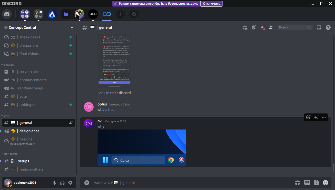
/* Streamer mode notification */ |
|
/* PS: I stole idea from newer iOS (yea the fkin pill-shaped notch) */ |
|
[class*='notice-'][class*='colorStreamerMode-']{ |
|
position: fixed; |
|
top: 3px; |
|
left: 50%; |
|
padding: 0; |
|
line-height: 0; |
|
display: flex; |
|
align-items: center; |
|
border-radius: 4px; |
|
z-index: 3005; |
|
transform: translateX(-50%); |
|
box-shadow: black 0 0 3px; |
|
overflow: hidden; |
|
white-space: nowrap; |
|
} |
|
[class*='notice-'][class*='colorStreamerMode-']>button[class*='button-']{ |
|
top:unset; |
|
} |
|
[class*='notice-'][class*='colorStreamerMode-']>[class*='closeButton-']{ |
|
width:24px; |
|
height:24px; |
|
position:unset; |
|
top:unset; |
|
right:unset; |
|
justify-content: center; |
|
margin-right:4px; |
|
border-radius:4px; |
|
} |
|
[class*='notice-'][class*='colorStreamerMode-']>[class*='closeButton-']:hover{ |
|
background-color:#FFFFFF30; |
|
} |
|
|
|
/* USRBG */ |
|
|
|
/* |
|
* USRBG User-Popout Implimentation |
|
* |
|
* This source code is licensed under the MIT license found in the |
|
* LICENSE file in the root directory of this source tree. |
|
*/ |
|
|
|
.userPopout-3XzG_A { |
|
overflow: hidden; |
|
transform: translateZ(0) !important; |
|
--USRBG-banner-height: 60px; |
|
} |
|
|
|
.userPopout-3XzG_A[style*="-user-"] { |
|
--USRBG-banner-height: 120px; |
|
--USRBG-avatar-offset: 76px; |
|
} |
|
|
|
.userPopout-3XzG_A[style*="-user-"] .profileBanner-33-uE1 { |
|
background-size: cover; |
|
background-repeat: no-repeat; |
|
background-position: var(--user-popout-position, center) center; |
|
background-image: var(--user-background); |
|
} |
|
|
|
.userPopout-3XzG_A[style*="-user-"] .profileBanner-33-uE1 { |
|
height: var(--USRBG-banner-height, 120px); |
|
} |
|
|
|
.userPopout-3XzG_A[style*="-user-"] .avatarWrapperNormal-2tu8Ts { |
|
top: var(--USRBG-avatar-offset, 76px); |
|
} |
|
|
|
.userPopout-3XzG_A:not([style*="-user-"]) .avatar-22FtUu, |
|
.userPopout-3XzG_A:not([style*="-user-"]) .avatarHint-1E3LMl{ |
|
z-index: 1; |
|
} |
|
|
|
.userPopout-3XzG_A:not([style*="-user-"]) .avatar-22FtUu::after { |
|
content: ''; |
|
position: fixed; |
|
top: 0; |
|
left: 0; |
|
width: 100%; |
|
z-index: -1; |
|
height: var(--USRBG-banner-height, 60px); |
|
pointer-events: none; |
|
background-size: cover; |
|
background-repeat: no-repeat; |
|
background-position: var(--user-popout-position, center) center; |
|
background-image: var(--user-background); |
|
} |
|
|
|
/* TODO: Merge */ |
|
|
|
nav+div[class^='base-']{ |
|
max-width: initial; |
|
max-height: calc(100% - 56px); |
|
} |
|
|
|
.sidebar-1tnWFu{ |
|
width: 320px; |
|
} |
|
|
|
.sidebar-1tnWFu > .container-1NXEtd [class*='animatedContainer-']{ |
|
height: 180px !important; |
|
} |
|
|
|
.sidebar-1tnWFu > .container-1NXEtd [class*='bannerImage-']{ |
|
width: 320px !important; |
|
height: 180px !important; |
|
} |
|
|
|
.sidebar-1tnWFu > .container-1NXEtd [class*='bannerImage-'] img{ |
|
width: 320px !important; |
|
height: 180px !important; |
|
} |
|
|
|
.sidebar-1tnWFu > .container-1NXEtd > [class*='scroller-'] > [class*='content-'] > div:first-child[aria-hidden='true']:not([style*='0px']){ |
|
margin-top: 48px !important; |
|
} |
|
|
|
.container-YkUktl{ |
|
justify-content: space-between; |
|
padding-right: 2px; |
|
} |
|
|
|
.communityInfoContainer-1dMVpU{ |
|
top: 40px; |
|
} |
|
|
|
/* POPUP LAYOUTS */ |
|
.emojiPicker-6YCk8a{ |
|
border-top-left-radius: 0; |
|
border-top-right-radius: 0; |
|
} |
|
|
|
#emoji-picker-tab-panel [class*='scroller-']{ |
|
overflow: hidden overlay !important; |
|
} |
|
|
|
.main-jX9p1r, |
|
.root-g14mjS, |
|
.root-g14mjS .footer-31IekZ{ |
|
background: var(--app-background) !important; |
|
} |
|
|
|
/* TODO: Merge */ |
|
/* STYLES */ |
|
|
|
/* |
|
svg.homeIcon-r0w4ny > path { |
|
fill: var(--home-icon-color); |
|
}*/ |
|
|
|
main[class*="container-"] [class*='searchBar-']{ |
|
background: rgba(0,0,0,40%); |
|
} |
|
|
|
div[class^='sidebar-']>section>div:last-child{ |
|
min-height:36px; |
|
} |
|
|
|
div[class^='sidebar-']>section>div:last-child, |
|
div[class^='sidebar-']>section>div[class*='activityPanel-'] { |
|
height: unset; |
|
padding: 4px 8px; |
|
margin: 8px; |
|
border-radius: 4px; |
|
background: transparent; |
|
background-color: rgba(0,0,0,0.4); |
|
border-bottom: 0; |
|
} |
|
|
|
div[class^='sidebar-']>section>div[class*='activityPanel-'] { |
|
padding: 8px; |
|
} |
|
|
|
button.searchBarComponent-3N7dCG { |
|
background-color: rgba(0,0,0,0.5) !important; |
|
} |
|
|
|
section[class*="panels-"] { |
|
background: transparent; |
|
} |
|
|
|
.container-ZMc96U.themed-Hp1KC_, |
|
.container-2o3qEW{ |
|
background: 0; |
|
} |
|
|
|
/* TODO: Merge */ |
|
/* Private guild: chats sidebar (friends, DMs, etc.) */ |
|
.chat-2ZfjoI, .container-2cd8Mz, div[class^='sidebar-']{ |
|
background: 0 !important; |
|
} |
|
.member-48YF_l, .members-3WRCEx { |
|
--background-secondary: transparent; |
|
} |
|
|
|
.channel-1Shao0{ |
|
max-width: unset; |
|
} |
|
|
|
.divider-IqmEqJ, .divider-2rZFJK{ |
|
border-top-color: var(--divider-color); |
|
} |
|
|
|
.divider-IqmEqJ > .content-3spvdd{ |
|
background: var(--divider-pill-color); |
|
color: var(--divider-pill-color-text); |
|
padding: 4px 12px; |
|
} |
|
|
|
.wrapper-38slSD > span[class^='expandedFolderBackground-']{ |
|
border-top-right-radius: 20px; |
|
border-bottom-right-radius: 20px; |
|
} |
|
|
|
/* ME TRYING TO HIDE BLOCKED MESSAGES LOL |
|
.blockedSystemMessage-3FmE9n{display:none;}*/ |
|
|
|
/* Workarounds (Post-initials) */ |
|
|
|
/* Titlebar overlap overlay objects (guild tooltip) */ |
|
.layerContainer-2v_Sit{ |
|
z-index: 3002; |
|
} |
|
/* Remove Platform-Win correction */ |
|
.platform-win .bg-1QIAus{ |
|
top: 0; |
|
} |
|
/* Restore right buttons position of text input line */ |
|
form[class*='form-'] [class*='scrollableContainer-']>[class*='inner-']>[class*='buttons-'] { |
|
margin-right: 4px; |
|
} |
|
/* Ignore private chats sidebar background */ |
|
.scroller-WSmht3{ |
|
background-color:transparent; |
|
} |
|
/* LOOOL Pill under server discovery is rotated I have to correct it */ |
|
/* I REALLY WANT PICK IT DIRECTLY BUT ONLY THIS WAY, OR I COULD JUST BREAK OTHER ELEMENTS SETUP */ |
|
ul[data-list-id='guildsnav']>[class^='scroller-']>[class^='listItem-']>[class^='pill-']>[class^='wrapper-']{transform:none;} |
|
|
|
.scroller-29cQFV{ |
|
background-color:transparent; |
|
} |
|
|
|
/* |
|
* HOLY CRAP |
|
* WHY THEY NEEDS A LOT BACKGROUND DEFINITIONS IN APP LOL |
|
* THOSE SETUP ARE SUCKS |
|
* REACT APPLICATION DEVELOPMENT BE LIKE: |
|
*/ |
|
|
|
/* Variables */ |
|
/* Preset: Semi-Transparented */ |
|
:root { |
|
/* |
|
--font-primary: sans-serif; |
|
--font-display: var(--font-primary) !important;*/ |
|
|
|
/* Those variables might be deprecated and re-designed. */ |
|
--home-icon-color: rgb(var(--accent)); |
|
--avatar-size: 32px; |
|
--background-solid: #151515; |
|
--background-solid-dark: #131313; |
|
--background-solid-darker: #0a0a0a; |
|
|
|
/* Accent color. */ |
|
--accent: 133, 155, 229; |
|
|
|
/* Alt Accent color. It used as tooltip color (afaik) */ |
|
--accent-alt: 47, 88, 158; |
|
|
|
/* Divider style (in chat, for example, first message of date and time) */ |
|
--divider-color: #fff; |
|
--divider-pill-color: #000; |
|
--divider-pill-color-text: #fff; |
|
|
|
/* Top-level background*/ |
|
--window-background: #000000C0; |
|
|
|
/* Window title bar background */ |
|
--title-bar-background: #191B1ED0; |
|
|
|
/* Guilds bar background */ |
|
--guild-bar-background: #282B30D0; |
|
|
|
/* Main application view background */ |
|
--app-background: #40444CE0; |
|
|
|
/* Settings view background */ |
|
--settings-background: #40444CE0; |
|
--settings-sidebar-background: #00000000; |
|
--settings-content-background: #00000000; |
|
} |