From the Add New Layer modal, I searched for the Madrid subway stations dataset in my account since I already knew I had it.
- Realized that the “by name, description, or tag” copy has a poor legibility

- Once I added the layer (and taking into account that I didn’t change the airbnb listings layer styling in the previous exercise) I noticed that the points from both layers blended together since they have the same default styling. A few months ago, when Mamata and I defined these new defaults, we discussed the possibility of changing the default geometry styling for each new layer. Just like there’s an array of colors for new layers.
- I added a dataset with the subway lines too (had it in my account)
I decided to change the styling to differentiate them better.
-
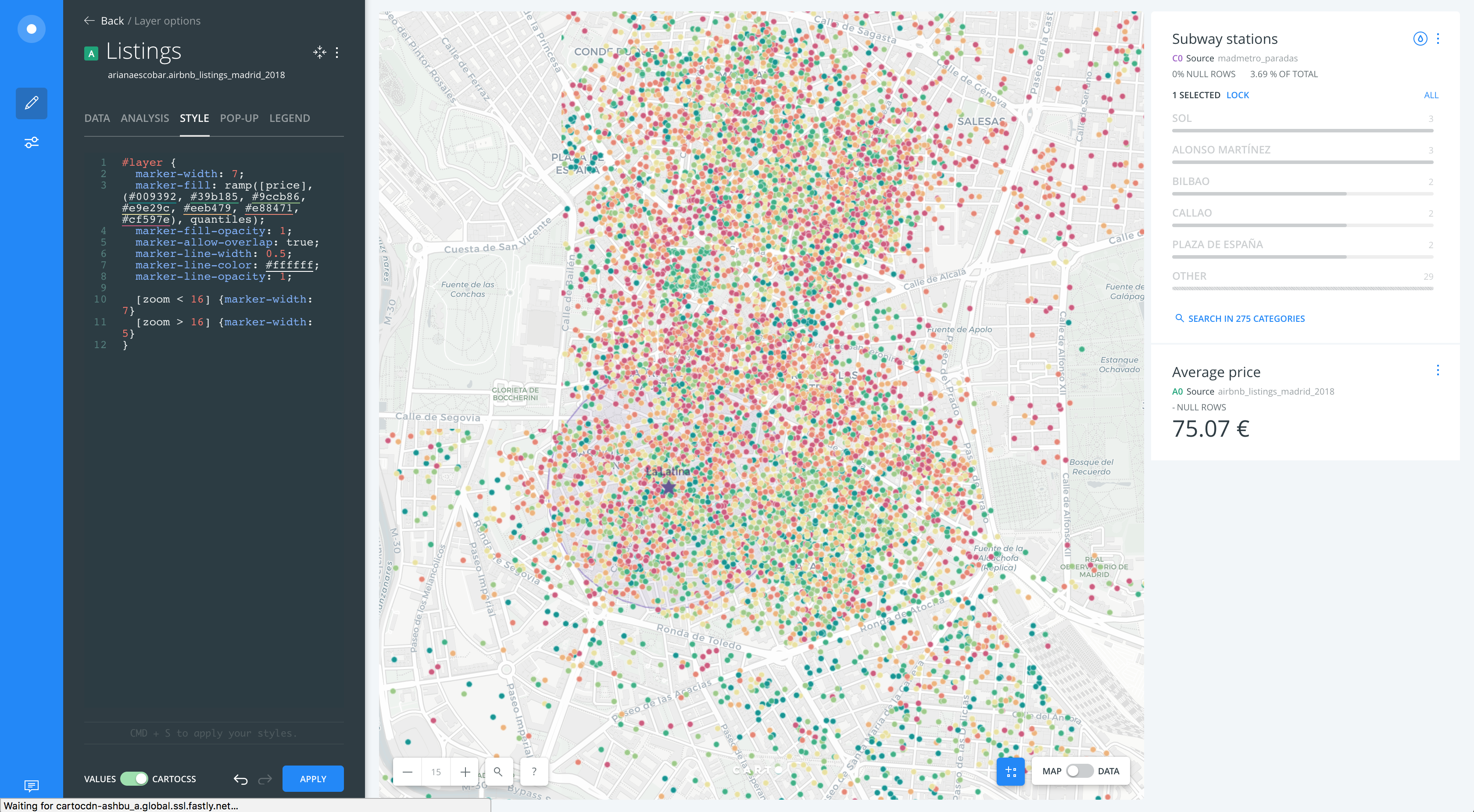
I styled the listings by their
pricevalue and chose a diverging scheme -
For the subway stations I added an icon and came across a few issues:
- The horizontal navigation inside the dropdown to look for icons is somewhat annoying and requires a lot of precision
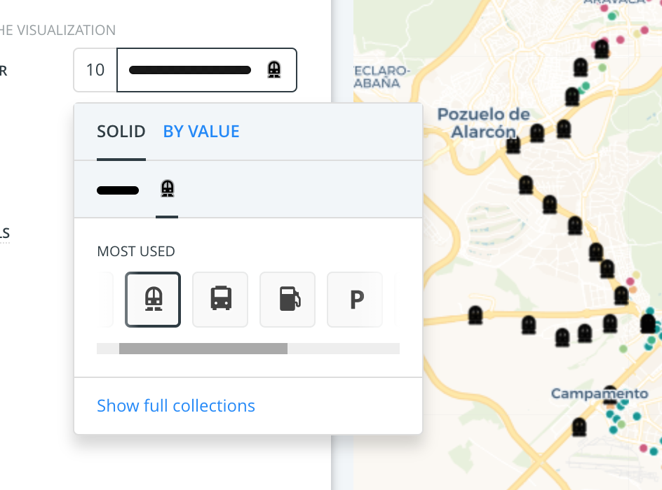
- Icons with small details render poorly, even on large sizes.
- When I hover over the icon input, it hovers the color as well and the tooltip only references the color and not the icon.
- After I chose my icon, I decided to color them by the
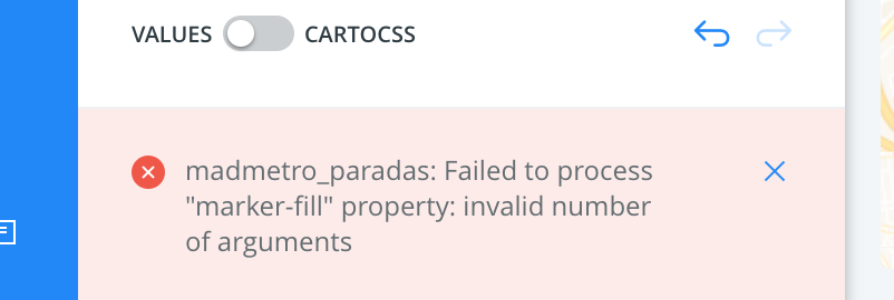
linevalue and once I selected the column, the icon was removed. I expected the icons to stay and take different colors per category but looks like we can’t style color by value and use icons at the same time (is that intended?) - I tried a second time and got the following error:
- I tried a third time and my icon was overridden by the style by value again.
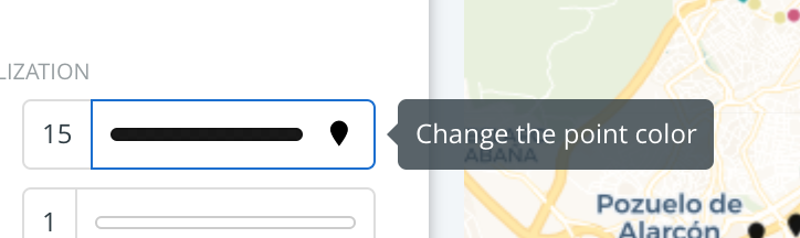
- Finally I decided to keep the icon and use the same solid color for every point
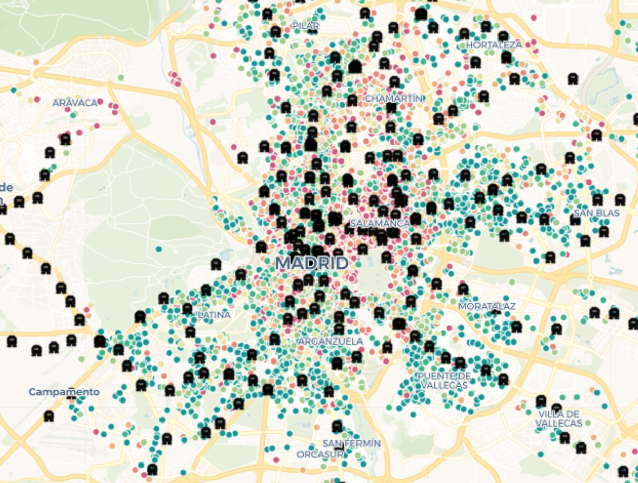
I applied an AOI analysis to the Subway station layer with the 500 meters required
- Since the analysis transformed my points to polygons, it removed my styling (with the icon). I understand the logic but its annoying that I have to redo it.
I created a new layer out of the source node of the Subway stations layer, in order to recover the stations points.
- I was surprised to see that it had the same styling I had applied before (color, size, icon…) which was great.
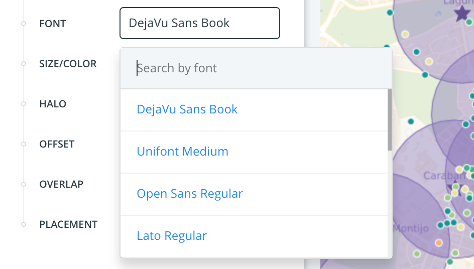
- I added labels with the subway station names and styled them. When selecting the font I would’ve expected to see how the actual fonts looked on the dropdown.
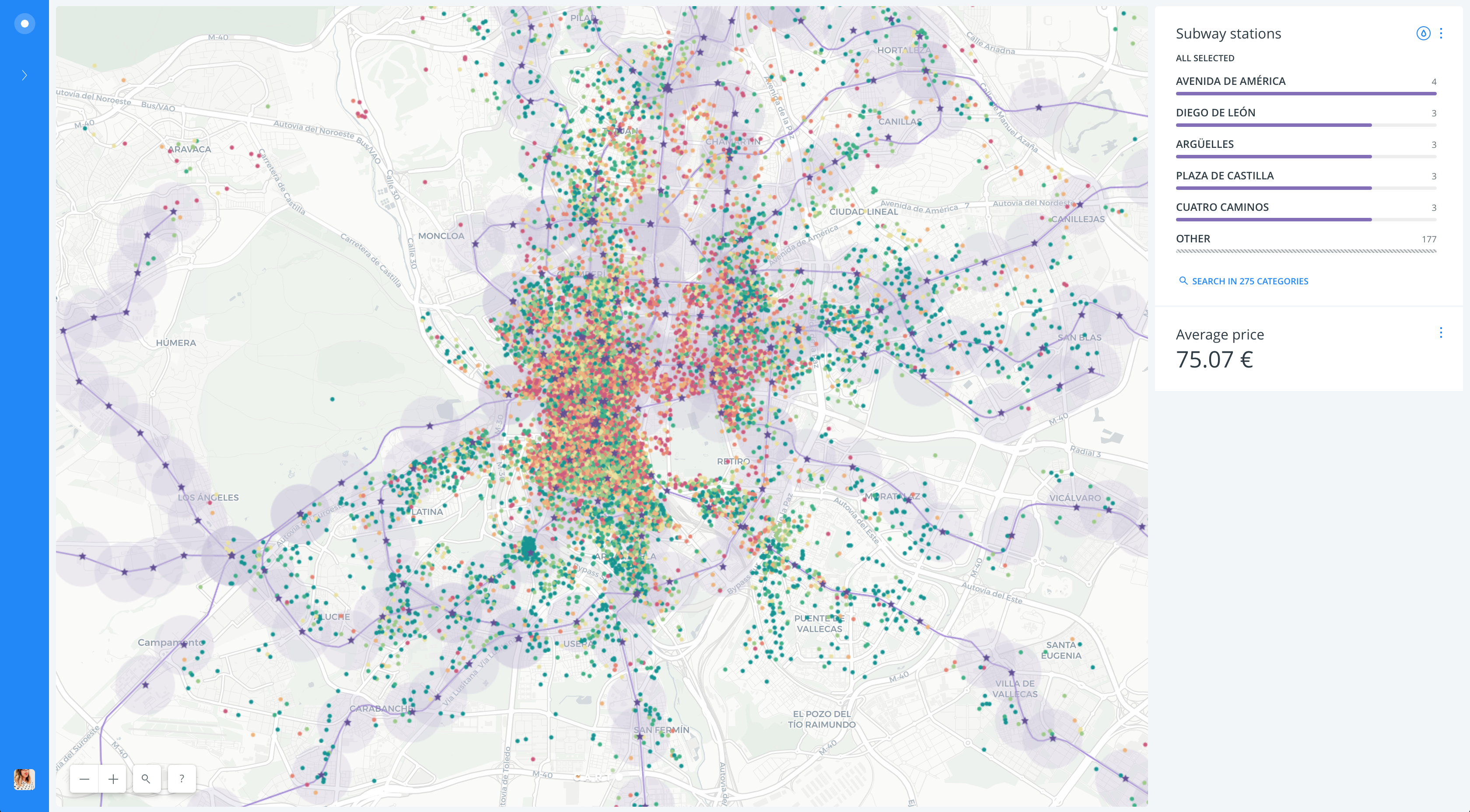
I changed the basemap to labels below to improve the cartography.
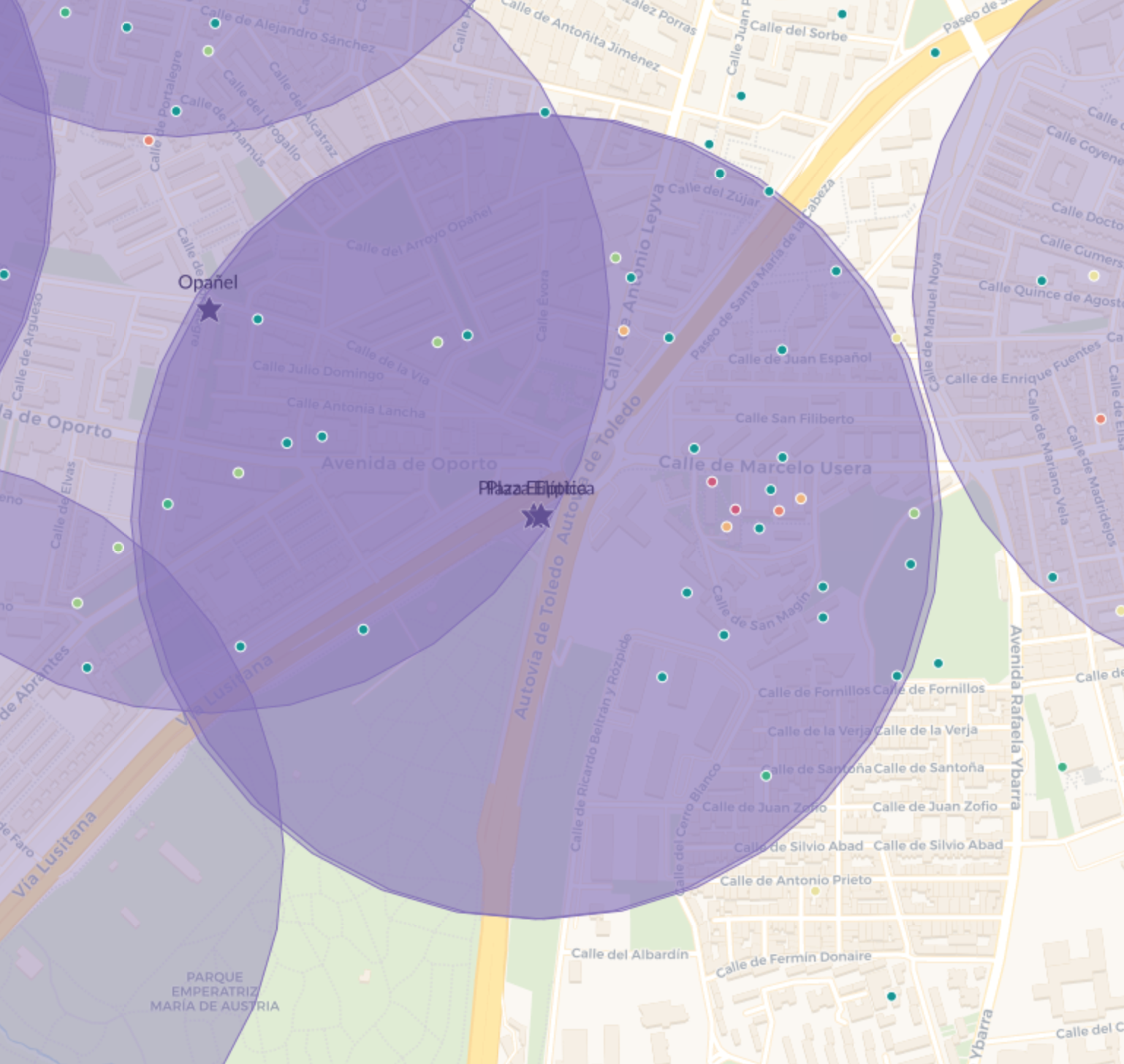
Taking a look at the map I saw some duplicated buffers for a few subway stations.
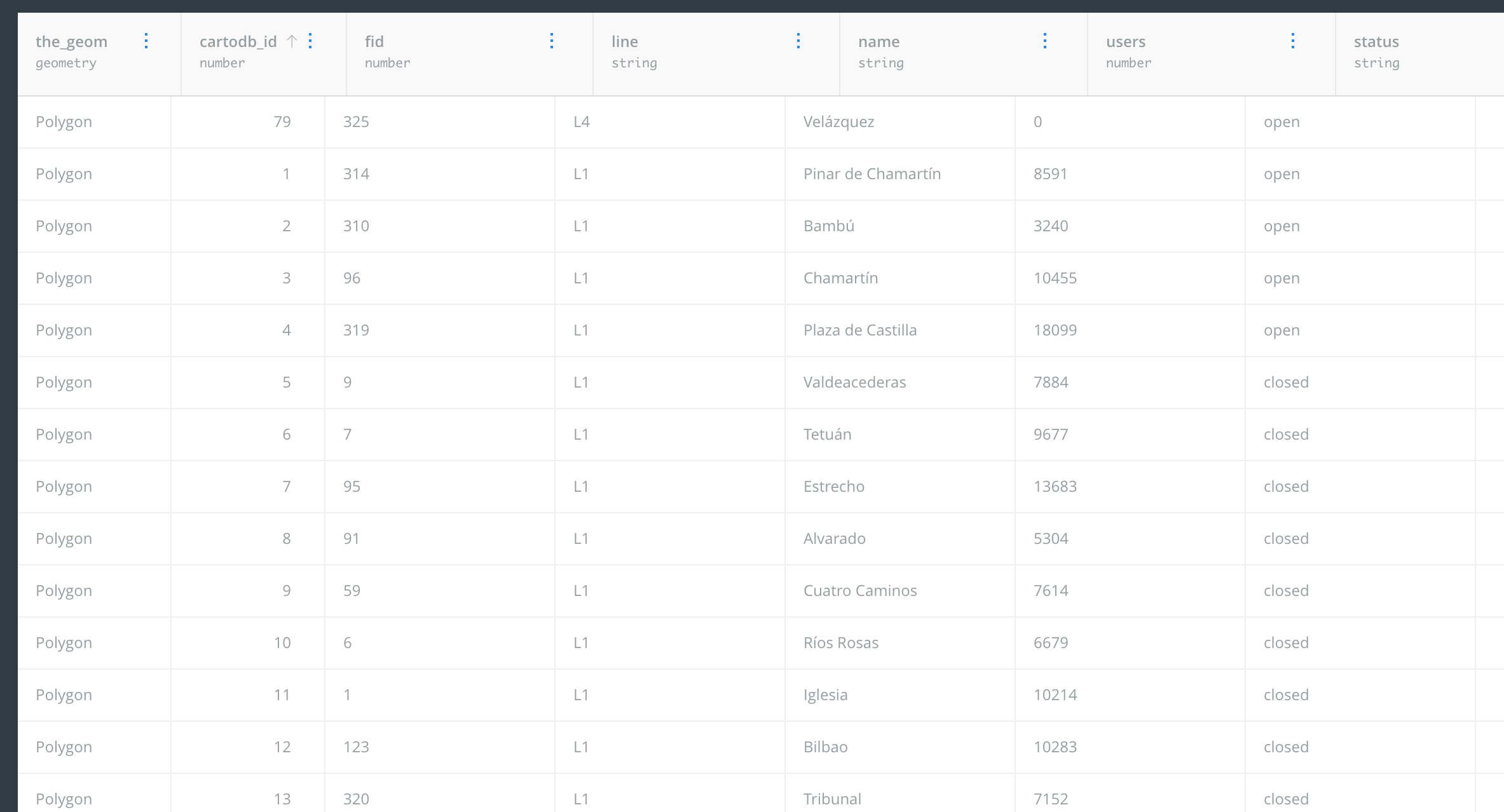
- I took a look at the Data view and saw this bug in the table (columns alignment):
- I realized the AOI analysis made different buffers for each separate line per station.
- At this point, inside Builder, I’m not sure how to filter it so there’s only one of each.
- I also saw the were some closed stations.
I added a Filter by column value analysis to only show the open stations
- My style settings got reset. Annoying.
I added a Category widget with the name column in order to explore the map better.
- It only filters the buffers. I want the widget to filter the listings as well. I know I can do it through a Filter by layer analysis but in my current data I don’t have similar columns to relate them by. Maybe I could do something like augmenting both layers with the
Municipioor something through the Data Observatory but somehow seems like an overkill. It should be easier.
I wasn’t happy with the cartography so I did some changes in CartoCSS so I could make some changes by zoom level.
- A link to the CartoCSS documentation from the CartoCSS editor would've been nice.
- Improving the cartography by zoom took me a while. I'm still not 100% happy about it but it's definitely better.
- Tiles weren’t loading so I reloaded the browser while on the advanced mode of CartoCSS and the left panel loaded with an incorrect width (bug).
 https://team.carto.com/u/arianaescobar/builder/0aa5fd6d-9865-4ddf-ae52-ef5aed66c1b6/embed
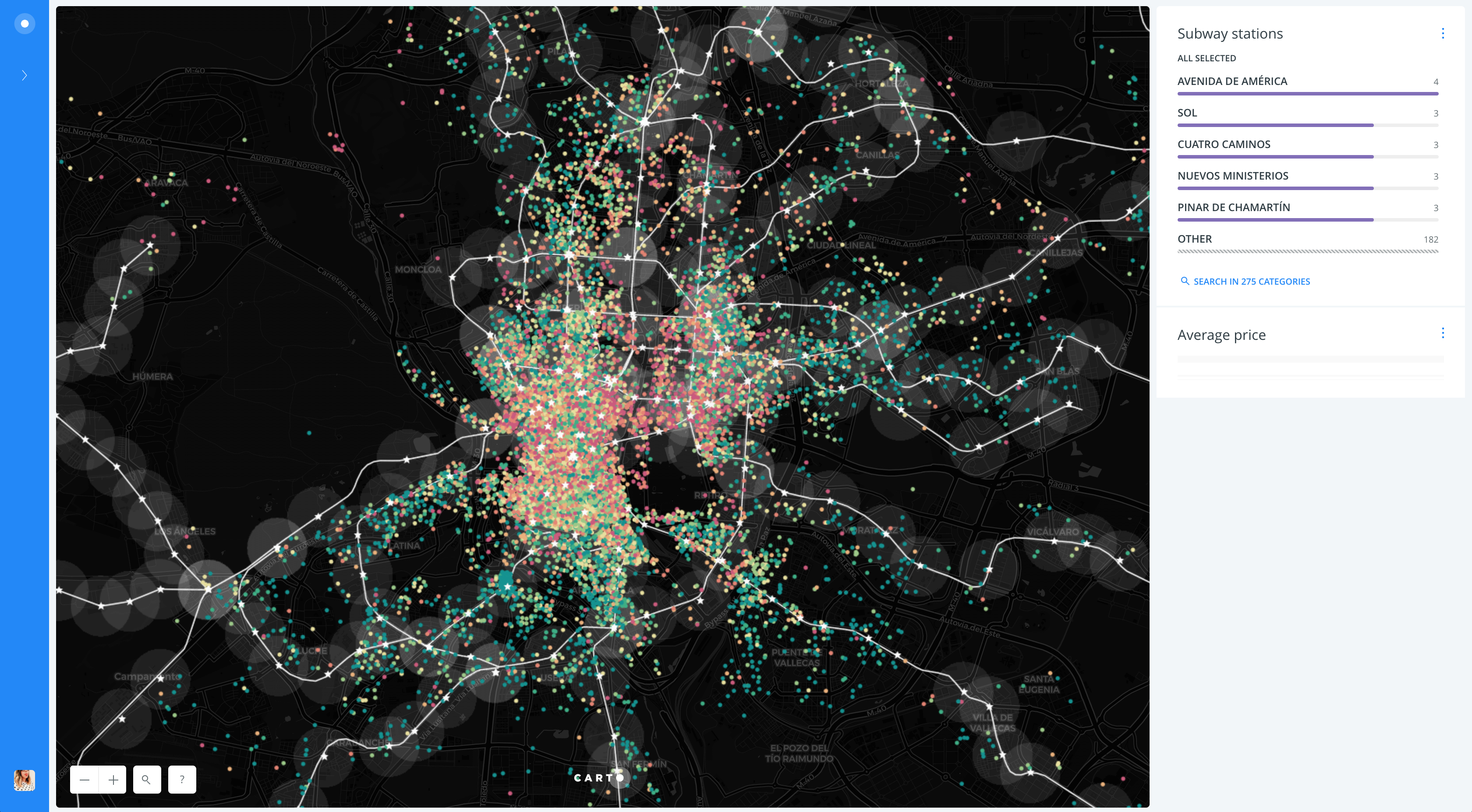
I also did a dark version 🙃
 https://team.carto.com/u/arianaescobar/builder/743901d6-dc89-4509-b781-c7fbb84c0490/embed
- I reordered the layers a few times and every time I did it, I accessed the layer I moved without me trying to. Quite annoying.
- Tiles took a lot of time to load at the end when I was doing changes in CartoCSS