It has been some time now since I started any UI focused project from scratch. Being interested in type training, I noticed that these training apps have become more modern, with clean UIs providing a really good user experience. Had the idea for some time now, to see how we could make type training more code focused, for example being able to load a specific programming language and practicing with that language.
After having a couple days of focus time and some ideas, it was a good opportunity to try and build a prototype. Obviously I needed to do some research to find out what the newest framework, build tools and libraries, that people were recommending for building a web project in 2022, were.
After following some interesting topics on Twitter and reading some blogposts, I decided to take a more basic approach and use a mixture of tried and tested libraries like Preact combined with TypeScript as well as popular new approaches like Vite (for the tooling part).
As developers we would want to spend less time with setting and wiring up the underlying machinery and focus more on getting an idea out and interacting with it. This was the plan, get the idea to run and see what pitfalls and blockers come along the way. Now of course we want to look for tools that helps us with getting there, reducing the complexity and work but there is also a delicate trade-off. These tools might help with solving one problem but introduce a different complexity somewhere else, so one has to be cautious when making these decisions.
There are plenty of libraries and more than enough discussion about the pros and cons when it comes to UI development. To make things easier, one approach was to write down what the application should be able to do and what it will never do. This helped to narrow down the selection process. Choosing Preact for example made sense from the standpoint that the code written should be declaritive and lightweight. Also, the ability to interop with the React eco-system ensures the possibility of more options in the future. Further more having experience with React and Preact and understanding the possibilities and limitations, it narrowed down other options extensively.
Same with TypeScript, although not perfect because you have to do some manual work and need discipline, it made sense from a stability perspective. Especially in combination with io-ts, we can gain some confidence once the code evolves.
This all might read boring, but you could also read this as that there is some stability in UI development. Which is good, because these building blocks help us to set up a useful foundation for getting our ideas out. Also read Choose Boring Technology, which describes this approach and thinking behind it much better, than I could do here.
One out of the box win from a DX perspective is how clear it was to start a project in vite, by using create vite my-app --template preact-ts. The previous commands scaffolds a Preact app with TypeScript configured already. Was quite surprised to see how flawlessly the scaffolding worked out, enabling to fully focus on the application and it's logic.
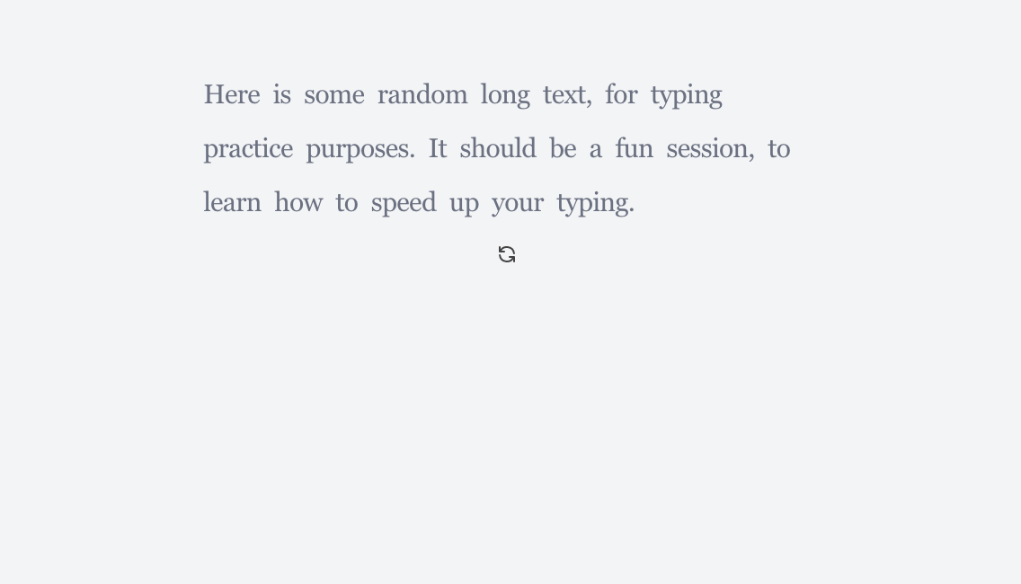
Dependency wise it was all kept to a minimum, only installing some preact add-ons like preact-router as well as the aforementioned io-ts, for handling the interactions with the local storage. With that out of the way, I quickly had a minimal screen up and running, just some hard coded text and an event listener handling key presses and comparing the provided with the expected input. Here is a screenshot from the very first iteration:
For styling the application I needed to see what the recommendations were and while some people seemed to favour the css only route, I added Tailwind due to extensive documentation and examples. It suits the requirements and always liked the ideas in Tachyons. Furthermore it helped with learning some modern CSS, due being able to inspect the actual CSS of a class name.
With all the basics in place, the main work revolved around introducing the mechanics to handle different text and code examples and how to generate them. The data itself is just a simple string that gets split into single characters and every time a key event is triggered a single function compares the input with the expected next character. This already existed in the original quick prototype and remained the base mechanism. This enabled to add a text generator that creates a training session on the fly and passes the string to that base component.
Adding the settings was handled via context and retrieving and persisting them to local storage. Almost everything else was handled by using plain and simple useState. Most of the code is jsx, while most logic is handled independent of Preact and can be wrapped inside a hook when needed.
One interesting part of the code is the following:
const writeSettings = (settings: Settings) => {
  localStorage.setItem(setttingsKey, JSON.stringify(settings));
};

const readSettings = (): Settings | null => {
  const settings = localStorage.getItem(setttingsKey);
  if (settings) {
    try {
      const result = t
        .type({
          darkMode: t.boolean,
          showLiveStats: t.boolean,
          showKeyboard: t.boolean,
          stopOnError: t.boolean,
          enableBackspace: t.boolean,
          showKeyboardCursor: t.boolean,
          focusMode: t.boolean,
        })
        .decode(JSON.parse(settings));

      if (result._tag === "Left") {
        console.warn(PathReporter.report(result).join("\n"));
        return null;
      } else {
        return result.right;
      }
    } catch (err) {
      console.warn(err);
      return null;
    }
  }
  return null;
};
Inside LocalStorage.ts we can ensure that data is valid and this how everything I/O related is handled, i.e. loading statistics or persisting a custom training text.
Every feature added to the app is handled in the same way:
Is it local? handle it with useState.
Is it global? handle it via the context.
This is not general advice, this is what works for this specific type training application and works very well.
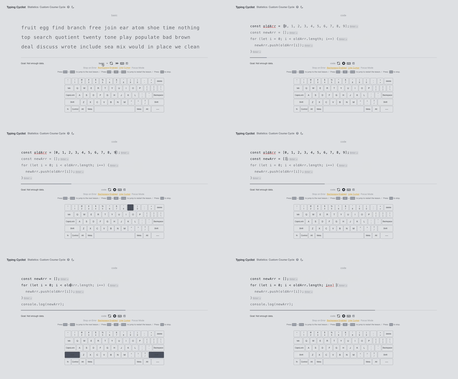
Over time, taking this approach, adding more modes (like basic, advanced, code mode) or settings (like stopping when an error occurs) were quick to implement. Here is a demo of the current code mode in action:
This is the current state of the application and can be tested here. Currently extending the application with Stefan Oestreicher to become even more developer focused.
This might read like building UIs is a simple task, which it definitely isn't. But it can help a lot to think about what an application should do and what it shouldn't. Another take-away is that many of the tools we have at our disposable are well tested and can help us to get faster from product to idea. We never have enough time anyway, the decision revolves around how much time do I want to invest in trialing the hottest tools and how much time can I invest getting the idea to something functioning. Summarized:
- UI development and the tooling around it is very solid.
- Make deliberate decisions around your technology choices, everything is a trade-off.
The type training application can be tried out here: https://typing-cyclist.vercel.app


