Layout: Grid system | Responsive breakpoints
Example of grid:
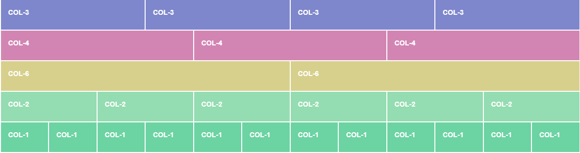
Content & components : Typography | Colors | Buttons | Forms | Navbar | and so much more...
index.html
style.css
Example of grid:
index.html
style.css
| <!doctype html> | |
| <html lang="en"> | |
| <head> | |
| <!-- Required meta tags --> | |
| <meta charset="utf-8"> | |
| <meta name="viewport" content="width=device-width, initial-scale=1, shrink-to-fit=no"> | |
| <!-- Bootstrap CSS --> | |
| <link rel="stylesheet" href="https://stackpath.bootstrapcdn.com/bootstrap/4.4.1/css/bootstrap.min.css" integrity="sha384-Vkoo8x4CGsO3+Hhxv8T/Q5PaXtkKtu6ug5TOeNV6gBiFeWPGFN9MuhOf23Q9Ifjh" crossorigin="anonymous"> | |
| <!-- Custom CSS --> | |
| <!-- When linking CSS files, always link your app’s custom CSS last. That way you can override CSS provided by libraries like Bootstrap. --> | |
| <link rel="stylesheet" href="style.css"> | |
| <title>Hello, world!</title> | |
| </head> | |
| <body> | |
| <!-- Fluid Container --> | |
| <!-- Width: 100% of the viewport or of the parent container --> | |
| <div class="container-fluid"> | |
| <h1>Fluid container</h1> | |
| </div> | |
| <!-- Fixed container --> | |
| <!-- Has always a max-width that changes depending on the breakpoint, and is centered on the page --> | |
| <div class="container"> | |
| <h1>Fixed container</h1> | |
| </div> | |
| <br> | |
| <hr> | |
| <br> | |
| <!-- Bootstrap divides the space in the screen in columns ― up to 12 in each row. Each column width varies according to the size of viewport they’re displayed in. Content should be placed within columns, and only columns may be immediate children of rows. --> | |
| <div class="container"> | |
| <h1>Bootstrap Grid</h1> | |
| <!-- here our elements will take up the space of 6 colums from small screens and upwards; below the breakpoint of small screens, the elements will stack on top of each other --> | |
| <div class="row" id="first-row"> | |
| <div class="col-sm-6">col-sm-6</div> | |
| <div class="col-sm-6">col-sm-6</div> | |
| </div> | |
| <!-- here our elements will take up the space of 6 colums from medium screens and upwards; below the breakpoint of medim screens, the elements will stack on top of each other --> | |
| <div class="row" id="second-row"> | |
| <div class="col-md-6">col-md-6</div> | |
| <div class="col-md-6">col-md-6</div> | |
| </div> | |
| <!-- We can create different layout combinations depending on the size of the screen: for example here, we want our elements to take up the space of 6 columns from small screens and upwards (until medium screens), and of 3 columns from large screens and upwards --> | |
| <div class="row" id="third-row"> | |
| <div class="col-sm-6 col-lg-3">col-sm-6 col-lg-3</div> | |
| <div class="col-sm-6 col-lg-3">col-sm-6 col-lg-3</div> | |
| <div class="col-sm-6 col-lg-3">col-sm-6 col-lg-3</div> | |
| <div class="col-sm-6 col-lg-3">col-sm-6 col-lg-3</div> | |
| </div> | |
| <!-- If no size is specified, columns are shown by default from extra small devices screens and upwards --> | |
| <div class="row" id="fourth-row"> | |
| <div class="col-4">col-4</div> | |
| <div class="col-4">col-4</div> | |
| <div class="col-4">col-4</div> | |
| </div> | |
| </div> | |
| <br> | |
| <hr> | |
| <br> | |
| <div class="container"> | |
| <!-- Bootstrap typography --> | |
| <h1>Another fixed container</h1> | |
| <p class="h1">I'm a paragraph styled like an H1</p> | |
| <p class="text-white bg-danger">Game over, written in white on a red background</p> | |
| <!-- Alert components --> | |
| <div class="alert alert-danger">GAME OVER</div> | |
| <div class="alert alert-success">WOOON</div> | |
| </div> | |
| <br> | |
| <hr> | |
| <br> | |
| <!-- Button components --> | |
| <div class="container"> | |
| <button type="button" class="btn btn-primary">Primary</button> | |
| <button type="button" class="btn btn-secondary">Secondary</button> | |
| <button type="button" class="btn btn-success">Success</button> | |
| <button type="button" class="btn btn-danger">Danger</button> | |
| <button type="button" class="btn btn-warning">Warning</button> | |
| <button type="button" class="btn btn-info">Info</button> | |
| <button type="button" class="btn btn-light">Light</button> | |
| <button type="button" class="btn btn-dark">Dark</button> | |
| </div> | |
| <br> | |
| <hr> | |
| <br> | |
| <!-- Responsive images with rounded squares / in a circle --> | |
| <div class="container"> | |
| <div class="row text-center"> | |
| <div class="col-6"> | |
| <img src="http://placekitten.com/g/400/400" alt="" class="rounded img-fluid"> | |
| </div> | |
| <div class="col-6"> | |
| <img src="http://placekitten.com/g/400/400" alt="" class="rounded-circle img-fluid"> | |
| </div> | |
| </div> | |
| </div> | |
| <!-- Optional JavaScript --> | |
| <!-- jQuery first, then Popper.js, then Bootstrap JS --> | |
| <script src="https://code.jquery.com/jquery-3.4.1.slim.min.js" integrity="sha384-J6qa4849blE2+poT4WnyKhv5vZF5SrPo0iEjwBvKU7imGFAV0wwj1yYfoRSJoZ+n" crossorigin="anonymous"></script> | |
| <script src="https://cdn.jsdelivr.net/npm/[email protected]/dist/umd/popper.min.js" integrity="sha384-Q6E9RHvbIyZFJoft+2mJbHaEWldlvI9IOYy5n3zV9zzTtmI3UksdQRVvoxMfooAo" crossorigin="anonymous"></script> | |
| <script src="https://stackpath.bootstrapcdn.com/bootstrap/4.4.1/js/bootstrap.min.js" integrity="sha384-wfSDF2E50Y2D1uUdj0O3uMBJnjuUD4Ih7YwaYd1iqfktj0Uod8GCExl3Og8ifwB6" crossorigin="anonymous"></script> | |
| </body> | |
| </html> |
| .container-fluid { | |
| background-color: lightgreen; | |
| } | |
| .container h1 { | |
| background-color: lightgray; | |
| } | |
| #first-row { | |
| background-color: lightblue; | |
| } | |
| #second-row { | |
| background-color: lightpink; | |
| } | |
| #third-row { | |
| background-color: lightyellow; | |
| } | |
| #fourth-row { | |
| background-color: lightcyan; | |
| } | |
| .row div { | |
| border: 1px solid; | |
| } |