Skip to content

Instantly share code, notes, and snippets.

@carolineschnapp
Last active August 5, 2024 10:32
Show Gist options
  • Save carolineschnapp/ed47c42d48ae4100f7be to your computer and use it in GitHub Desktop.
Save carolineschnapp/ed47c42d48ae4100f7be to your computer and use it in GitHub Desktop.
Add Color swatches to #Brooklyn theme. Use hexadecimal values or images.

What we want

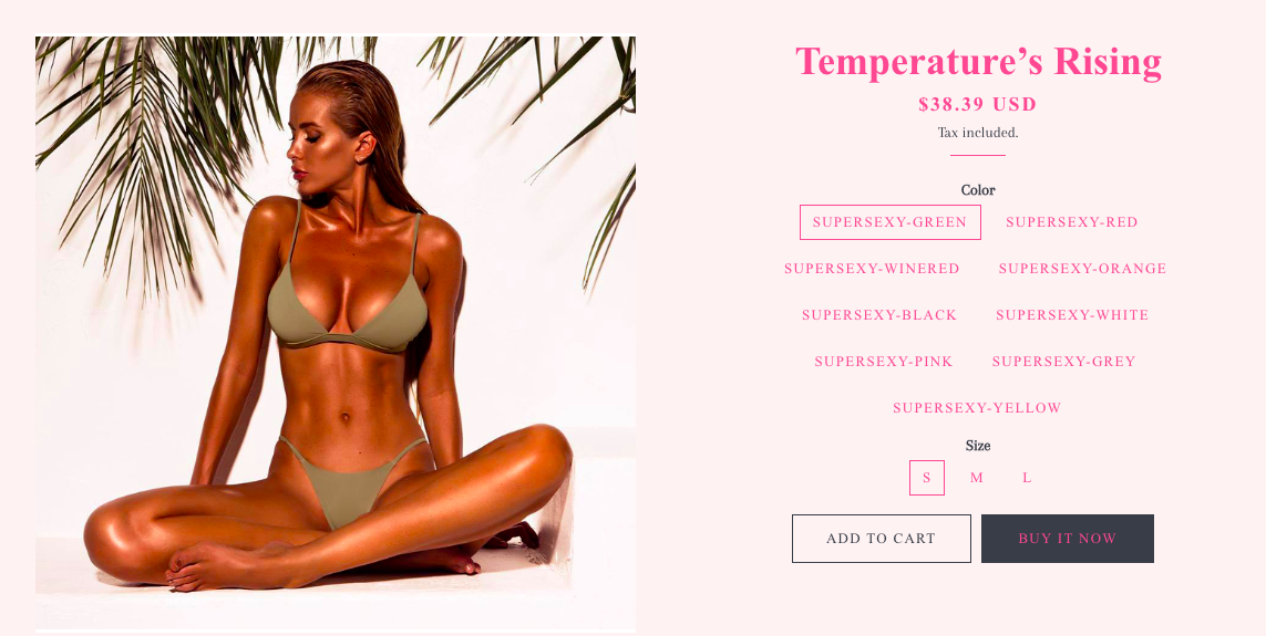
We want to go from this:

Alt text

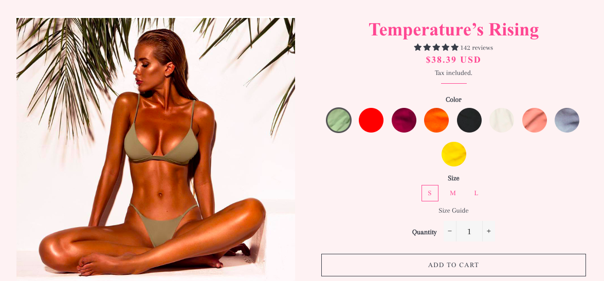
... to that:

Alt text

How to get there

  1. Start compiling all the names of your colors store-wide. Add to a text file. By color names, we mean these:

Alt text

Note

The name of the product option does not need to be Color. This tutorial can work with any product option.

  1. Find the proper hexadecimal value for each color. Use this tool: http://www.color-hex.com/ Add the hex value next to each color in your text file.

  2. Time to write some CSS! Open your theme.scss.liquid stylesheet in the online code editor. At the very bottom of the file, define your colors, following this very strict format:

$colors: ( 
  'Color-Hot-Pink'     #FE4365, 
  'Color-Vieux-Rose'   #FC9D9A,
  'Color-Old-Paper'    #F9CDAD,
  'Color-Faded-Green'  #C8C8A9,
  'Color-Green'        #83AF9B
);

Notes

  • We are writing Sassy CSS here. We are defining a comma-separated list of space-separated lists. A list of lists. Alas, the version of Sass used by Shopify is too old for us to use a map object, which would have made our code more succinct.
  • The name of each color must match this pattern: <Option Name>-<Option Value>. Use the same case as in your Admin. Except replace white space with a dash. So if you have a 'Color' option, and one of its values is 'Faded Green', use 'Color-Faded-Green', not 'Color Faded Green' nor 'color-Faded-green'. Accents are allowed.
  • There ought be no comma between the color name and the hex value.
  • There ought to be a comma at the end of each color definition except the last one.
  1. Right below that, add this CSS:
@each $color in $colors {
  $colorName: nth($color, 1);
  $bgColor:   nth($color, 2);

  #ProductSelect-option-#{$colorName} + label {
    background-color: $bgColor;
    color: $bgColor;
    width: 50px;
    height: 50px;
    overflow: hidden;
    border-radius: 25px;
    margin: 5px;
    text-indent: 100%;
    white-space: nowrap;
  }

  #ProductSelect-option-#{$colorName}:checked + label {
    border-color: #555;
    border-width: 3px;
  }
}

That's it!

What we want

We want to go from this:

Alt text

... to that:

Alt text

How to get there

  1. Start compiling the names of all our options store-wide. Add to a text file. By “options”, we mean these things:

Alt text

Note: The name of the product option label does not need to be Color nor Finish. This tutorial can work with any product option.

  1. Upload to your theme assets an image that will illustrate the option. Write down the filename next to the option name in your text file. Repeat for all options.

  2. Time to write some CSS! Open your theme.scss.liquid stylesheet in the online code editor. At the very bottom of the file, define your options, following this very strict format:

$options: ( 
  'Finish-Walnut'      'swatch_walnut.png', 
  'Finish-Gold'        'swatch_gold.png',
  'Finish-Graphite'    'swatch_graphite.png'
);

Notes

  • We are writing Sassy CSS here. We are defining a comma-separated list of space-separated lists. A list of lists. Alas, the version of Sass used by Shopify is too old for us to use a map object, which would have made our code more succinct.
  • The name of each option must match this pattern: <Option Name>-<Option Value>. Use the same case as in your Admin. Except replace white space with a dash. So if you have a 'Finish' option, and one of its values is 'Marbled Green', use 'Finish-Marbled-Green', not 'Finish Marbled Green' nor 'finish-Marbled-green'. Accents are allowed.
  • There ought be no comma between the option name and the filename.
  • The filename can be anything, there's no naming convention to follow here.
  • There ought to be a comma at the end of each option definition except the last one.
  1. Right below that, add this CSS:
$url_prefix: '{{ '*' | asset_url | split: '*' | first }}';
$url_suffix: '{{ '*' | asset_url | split: '*' | last }}';

@each $option in $options {
  $optionName: nth($option, 1);
  $bgImage:    nth($option, 2);

  #ProductSelect-option-#{$optionName} + label {
    background-image: url( $url_prefix + $bgImage + $url_suffix );
    background-size: cover;
    color: transparent;
    width: 50px;
    height: 50px;
    overflow: hidden;
    border-radius: 25px;
    margin: 5px;
    text-indent: 100%;
    white-space: nowrap;
  }
  
  #ProductSelect-option-#{$optionName}:checked + label {
    border-color: #555;
    border-width: 3px;
  }
}

That's it!

@AmyZealand
Copy link

AmyZealand commented Jul 25, 2017

Thank you Caroline, this works beautifully for one-word variants (eg, Blue). But it won't work for two word variants (eg, Fiery Red). Or variants with special characters (eg Mist/Magnolia). I'm using the latest version of Brooklyn. And have tried both including and excluding a hyphen. I have also checked the case. Unfortunately, the variant names are being imported from POS software so I am unable to change them. Any ideas what I can do here? Any help would be hugely appreciated.
https://wools-of-wanaka.myshopify.com/collections/scarves/products/0255ribscarf, pw: hiezau

@AmyZealand
Copy link

AmyZealand commented Jul 31, 2017

Anyone asking about tooltips, I managed by using css from this page (https://www.w3schools.com/css/css_tooltip.asp), and editing product-template.liquid:
<div class="tooltip"> <input type="radio" {% if option.selected_value == value %} checked="checked"{% endif %} {% unless variant_label_state %} disabled="disabled"{% endunless %} value="{{ value | escape }}" data-index="option{{ option_index }}" name="{{ option.name }}" class="single-option-selector__radio{% unless variant_label_state %} disabled{% endunless %}" id="ProductSelect-option-{{ option.name }}-{{ value | escape }}"> <label for="ProductSelect-option-{{ option.name }}-{{ value | escape }}"{% unless variant_label_state %} class="disabled"{% endunless %}>{{ value | escape }} </label> <span class="tooltiptext">{{ value | escape }}</span> </div>

Hope this helps!

@kpierce236
Copy link

@AmyZealand Can you tell me where exactly in product-template you put your code, and where exactly you put the other css code.
Thanks.

@Marketingguru
Copy link

Does anyone know how to automatically use the variant image as the swatch?

@artecodetbr
Copy link

@veejaa tks so much, I was having problems and after I add the same intend spaces (from Caroline code) between option name and option value, make it works perfectly. I also need to remove an accent from one of my color name, it did not allow accents for me but hey, I will leave ;-)

Copy link

ghost commented Mar 28, 2018

Followed this guide which was awesome i am sure before Brooklyn turned into Sectioned but maybe the awesome Caroline will post an update for Sections Brooklyn :)

Always appreciate your code sharing!

@philnind
Copy link

For those looking for a fix for Brooklyn Sectioned...

On the list of colours you need to make sure the word 'color' has a lower case C

$colors: ( 'color-White' #FFFFFF, 'color-Red' #FC9D9A, 'color-Black' #000000, 'color-Teal' #C8C8A9, 'color-Green' #83AF9B );

Copy link

ghost commented Apr 29, 2018

Thanks, @philnind - I forgot all about this until we came back to do this today. You were right, the only other thing i needed to do was Capitalize the color names in the CSS colors collection to match my variants but it's awesome now.
:)

@redsensor
Copy link

If anyone still has an issue with spaces just add '' before the space. Changing capital 'C' to little 'c' might be required as well.

Example:
'color-Baby\ Blue' #EEE0AE, 'color-Neon\ Yellow' #DADE35

@Paddleski
Copy link

Anyone have feedback on the radio buttons thing? I did the "Add Color Swatches using images.md" method as the variances are fabrics and not colors. But Im just getting radio buttons - See attached:
image

@leroywan
Copy link

@Paddleski If you have the radio buttons showing your SCSS might not be compiling. Check your developer console Right Click => Inspect on Chrome and click the top tab Console. If you see an error talking about MIME types and things related to the stylesheet, you can fix it by taking a closer look at your code to see if there's any syntax error - for me I had an extra comma, but it could be other things as well.

You can also chuck your code into a tool like https://www.sassmeister.com/ to see if your code compiles to make sure that your SCSS works.

@varshagupta22s
Copy link

varshagupta22s commented Jun 4, 2019

Thank you so much. This works great on product pages.
But when I'm adding those same products as featured products on the homepage (brooklyn theme), the radio buttons are not appearing and color options are appearing in the default form. Please help!
Homepage-Featured Product
Product Page

@delsdev
Copy link

delsdev commented Jan 7, 2020

@carolineschnapp can you use both hex and also swatch image? I would like to use both options for my variants. When I tried, it doesn't seem to pickup the swatch image ones.

@Rythmes98
Copy link

Someone know how to display the name of the Color or Variant ?

@benjamincano
Copy link

I can confirm this still works but you have to replace the 'Color-Hot-Pink' for 'color-Hot-Pink' from a capital C to a lowercase c and it will work just fine. The label is lowercase on the Brooklyn theme html.

@24HW-nosteam
Copy link

24HW-nosteam commented Aug 5, 2020

Thank you for sharing the code! Germans struggling with the first code? - maybe this can help:

Since I am so new to coding I struggled an hour with the code & I thought why keep my realization to myself.
I had to remove the spaces and then it worked fine in english - so you need to change color to farbe... sounds easy - took me long enough.

$colors: (
'farbe-Hotpink' #FE4365,
'farbe-Vieuxrose' #FC9D9A,
'farbe-Oldpaper' #F9CDAD,
'farbe-Fadedgreen' #C8C8A9,
'farbe-Green' #83AF9B
);

@each $farbe in $colors {
$colorName: nth($farbe, 1);
$bgColor: nth($farbe, 2);

#ProductSelect-option-#{$colorName} + label {
background-color: $bgColor;
color: $bgColor;
width: 50px;
height: 50px;
overflow: hidden;
border-radius: 25px;
margin: 5px;
text-indent: 100%;
white-space: nowrap;
}

#ProductSelect-option-#{$colorName}:checked + label {
border-color: #555;
border-width: 3px;
}
}

@lisantwi
Copy link

@varshagupta22s were you able to fix the issue of the buttons not appearing on the featured products page?

@24HW-nosteam
Copy link

@lisantwi i could fix that with changing "#ProductSelect-option" to the handle of the featured product on my main page. You just need to inspect one color element (on your website, scroll to your featured product, right click on e.g. "blue", inspect element, and then you should find something starting with "ProductSelect-option" and going on with "featured product" or something like that. This is what you need to copy and insert instead of the "ProductSelect-option".

So you would just add the two last paragraphs - something like this (unfortunately i don't have the right handle for the feat. product, my sub ended yesterday):

#ProductSelect-option-featured-products-#{$colorName} + label {
background-color: $bgColor;
color: $bgColor;
width: 50px;
height: 50px;
overflow: hidden;
border-radius: 25px;
margin: 5px;
text-indent: 100%;
white-space: nowrap;
}

#ProductSelect-option-featured-products-#{$colorName}:checked + label {
border-color: #555;
border-width: 3px;
}
}

@lisantwi
Copy link

@24HW-nosteam Thanks for your reply! I tried this and for some reason it's still not showing up. I inspected and found the ID : #ProductSelect--1594797442057-option. I then added to my code in the theme.scss file. I did not replace the ProductSelect-option, because I want it to show up on both the featured products and individual product pages. It's showing up fine for the individual product pages though. :

@each $option in $options {
$colorName: nth($option, 1);
$bgColor: nth($option, 2);

#ProductSelect-option-#{$colorName} + label {
background-color: $bgColor;
color: $bgColor;
width: 30px;
height: 30px;
overflow: hidden;
border-radius: 25px;
margin: 5px;
text-indent: 100%;
white-space: nowrap;
}

#ProductSelect-option-#{$colorName}:checked + label {
border-color: #555;
border-width: 3px;
}

#ProductSelect--1594797442057-option-#{$colorName} + label {
background-color: $bgColor;
color: $bgColor;
width: 30px;
height: 30px;
overflow: hidden;
border-radius: 25px;
margin: 5px;
text-indent: 100%;
white-space: nowrap;
}

#ProductSelect--1594797442057-option-#{$colorName}:checked + label {
border-color: #555;
border-width: 3px;
}
}

Do you have any further suggestions I can try out? Thanks again!

@24HW-nosteam
Copy link

24HW-nosteam commented Aug 20, 2020

@lisantwi

Sub is renewed - I used:

#ProductSelect--featured-product-option-#{$colorName} + label {
background-color: $bgColor;
color: $bgColor;
width: 35px;
height: 35px;
overflow: hidden;
border-radius: 25px;
margin: 5px;
text-indent: 100%;
white-space: nowrap;
}

#ProductSelect--featured-product-option-#{$colorName}:checked + label {
border-color: #555;
border-width: 3px;
}
}

@ayoadeniji
Copy link

Hi, I really need help. I have tried using the code and following the steps for "Add Color Swatches using images.md" but it is not working for me. I know this was posted in 2015, are there changes to the code? I am using the Brooklyn Theme

Copy link

ghost commented Nov 20, 2020

Hi, I really need help. I have tried using the code and following the steps for "Add Color Swatches using images.md" but it is not working for me. I know this was posted in 2015, are there changes to the code? I am using the Brooklyn Theme

Hey, I've tried first option, but maybe it could help you with second option too.

Firstly, try lowercase color, because when I've inspected product page it had lowercase color word inside of label, not capital case

$colors: ( 
  'color-Hot-Pink'     #FE4365, 
  'color-Vieux-Rose'   #FC9D9A,
  'color-Old-Paper'    #F9CDAD,
  'color-Faded-Green'  #C8C8A9,
  'color-Green'        #83AF9B
);

Secondly, check Shopify product options, how you've named these colors, it shouldn't have space between words, place "-" between them
image

That's what worked for me

image

@beeaanno
Copy link

beeaanno commented Feb 6, 2021

I've tried this using the exact code but it doesn't do anything. Has this changed in 2021?

@vincenzoquarta
Copy link

vincenzoquarta commented Apr 17, 2021

Please, how to show a white space around selected color like this?
Thanks.
Schermata 2021-04-17 alle 10 52 22

@Zeian-Shahzad
Copy link

Please, how to show a white space around selected color like this?
Thanks.
Schermata 2021-04-17 alle 10 52 22

Hello @vincenzoquarta,

Add box-shadow & text-indent property as shown below.

`#ProductSelect-option-#{$colorName}:checked + label {
border-color: #555;
border-width: 1px;
box-shadow: 0px 0px 0px 3px #fff inset;
text-indent: -2000px;
}

`
Good Luck!

Regards,
Zeian

@vincenzoquarta
Copy link

Please, how to show a white space around selected color like this?
Thanks.
Schermata 2021-04-17 alle 10 52 22

Hello @vincenzoquarta,

Add box-shadow & text-indent property as shown below.

`#ProductSelect-option-#{$colorName}:checked + label {
border-color: #555;
border-width: 1px;
box-shadow: 0px 0px 0px 3px #fff inset;
text-indent: -2000px;
}

`
Good Luck!

Regards,
Zeian

Hi @Zeian-Shahzad
It's works fine!
Thank you.

@Zeian-Shahzad
Copy link

Please, how to show a white space around selected color like this?
Thanks.
Schermata 2021-04-17 alle 10 52 22

Hello @vincenzoquarta,
Add box-shadow & text-indent property as shown below.
#ProductSelect-option-#{$colorName}:checked + label { border-color: #555; border-width: 1px; box-shadow: 0px 0px 0px 3px #fff inset; text-indent: -2000px; }
Good Luck!
Regards,
Zeian

Hi @Zeian-Shahzad
It's works fine!
Thank you.

I'm always happy to help.

Sign up for free to join this conversation on GitHub. Already have an account? Sign in to comment