CLS stands for “content layout shift”: When the elements are added dynamically during the page load (or their size changes), it can cause the page to jump unexpectedly.
This guide shows how to fix this issue with practical code examples written in React.
const data = fetch(‘https://example.com');
if (!data) return null;
return (
  <div>
    Element showing the data
  </div>
);
Before the data are loaded, the page does not show anything (meaning there is 0px area dedicated for the element). After the data are loaded, usually in 1-2s, the content is abruptly put on the place of the element, adding extra 16px (or similar) which causes the page to shift. That is especially unpleasant when the dynamically added content is above the user's scroll position.
The example above could be fixed like this:
const data = fetch(‘https://example.com');
if (!data) {
  return (
    <div>Loading ...</div>
  );
};
return (
  <div>
    Element showing the data
  </div>
);
As element with "loading" has same height as the element with the data (both are on 1 line), the page remains the same size and does not "jump" unexpectedly during the loading.
The elements that are being dynamically added to the page are rarely a single line of text. Also it simply would not look very nice if UI was full of "Loading..." texts.
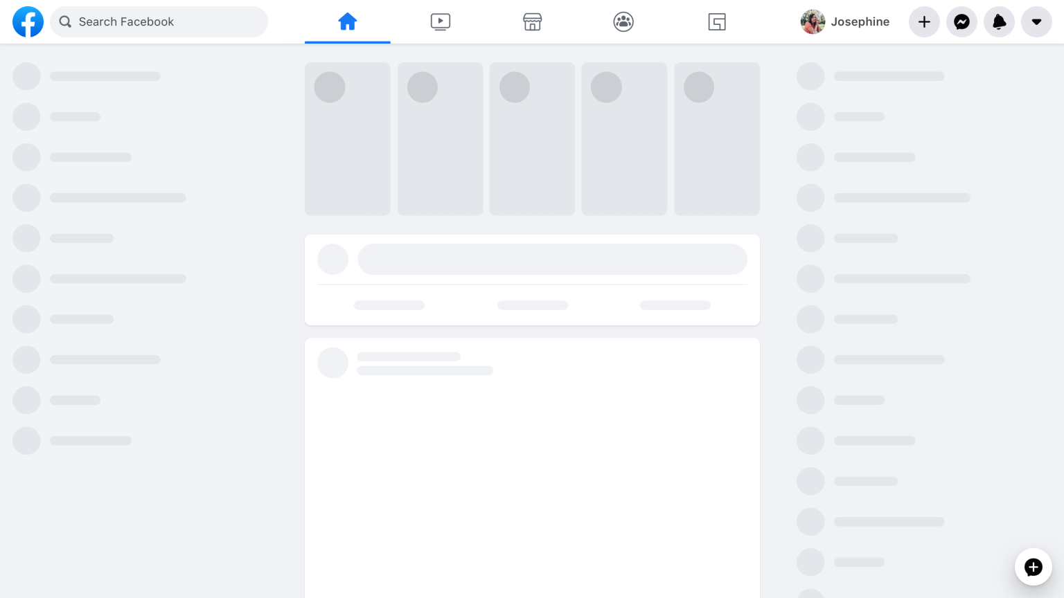
For this reason I recommend to use "spinner elements" - made as components with dimmensions1 and type provided as a parameter, and use them in place of UI that dynamically changes during the page load.
Here is how Facebook does it:
If you look closer to the page, you see that there are only 3 types of elements: circle, line, rectangle.
function Skeleton(props) {
  let className;
  switch (props.type) {
    case 'circle':
      className = 'skeleton-circle';
      break;
    case 'square':
      className = 'skeleton-square';
      break;
    case 'line':
      className = 'skeleton-line';
      break;
    default:
      throw new Error(`Unknown type ${props.type}.`);
  }

  return (
    <div
      className={className}
      style={{ height: props.height, width: props.width }}
    />
  );
}@keyframes pulse {
50% {
opacity: .5;
}
}
.skeleton-circle, .skeleton-square, .skeleton-line:after {
animation: pulse 2s cubic-bezier(.4,0,.6,1) infinite;
background: #e5e7eb;
}
.skeleton-circle {
aspect-ratio: 1 / 1;
border-radius: 100%;
}
.skeleton-line {
display: flex;
align-items: center;
}
.skeleton-line:after {
content: '';
display: block;
width: 100%;
height: 4px;
}This is how a spinner would be implemented in the previous example.
const data = await fetch('https://example.com');
if (!data) {
  return <Square height={100} />
}
return (
  <div style={{ height: 100 }}>
    Element showing data
  </div>
);
I've also made a JSFiddle where you can see the examples in practice: https://jsfiddle.net/cibulka/fowpj3zd/80/
Hope this helps! 💪
Footnotes
-
There are a bit more elegant CSS approaches than providing hard-coded height. Provide the specific dimensions, however, is very simple. :) ↩
