Last active
November 18, 2022 12:24
-
-
Save coco-napky/ecc85c2115e0469602f86d49d19d1baa to your computer and use it in GitHub Desktop.
Scss grid system based on flexbox
This file contains hidden or bidirectional Unicode text that may be interpreted or compiled differently than what appears below. To review, open the file in an editor that reveals hidden Unicode characters.
Learn more about bidirectional Unicode characters
| //Credits to : http://codepen.io/absolutholz/post/flex-box-grid-with-sass-mixins | |
| //for this awesome port of Kristopher Joseph's | |
| //awesome www.http://flexboxgrid.com/ | |
| //Define your break points : xs, sm, md, lg | |
| $viewport-layouts: ( | |
| "xs":("min-width": $xs), | |
| "sm":("min-width": $sm), | |
| "md":("min-width": $md), | |
| "lg":("min-width": $lg) | |
| ); | |
| $columns: 12; | |
| $gutter-width: 1rem; | |
| $half-gutter-width: $gutter-width / 2; | |
| $gutter-compensation: -1 * $half-gutter-width; | |
| @mixin grid-row ($reverse:false) { | |
| @include grid-row-direction($reverse); | |
| box-sizing: border-box; | |
| display: flex; | |
| flex: 0 1 auto; | |
| flex-wrap: wrap; | |
| margin-right: $gutter-compensation; | |
| margin-left: $gutter-compensation; | |
| } | |
| @mixin grid-row-direction ($reverse:false) { | |
| @if ($reverse) { | |
| flex-direction: row-reverse; | |
| } @else { | |
| flex-direction: row; | |
| } | |
| } | |
| @mixin grid-row-alignment-horizontal ($alignment) { | |
| $justify: inherit; | |
| @if ($alignment == center) { | |
| $justify: center; | |
| } @elseif ($alignment == end) { | |
| $justify: flex-end; | |
| } @elseif ($alignment == start) { | |
| $justify: flex-start; | |
| } | |
| justify-content: $justify; | |
| text-align: $alignment; | |
| } | |
| @mixin grid-row-alignment-vertical ($alignment) { | |
| @if ($alignment == middle) { | |
| align-items: center; | |
| } @else if ($alignment == bottom) { | |
| align-items: flex-end; | |
| } @else { | |
| align-items: flex-start; | |
| } | |
| } | |
| @mixin grid-row-spacing ($spacing) { | |
| justify-content: $spacing; | |
| } | |
| @mixin grid-column ($reverse:false) { | |
| @include grid-column-direction($reverse); | |
| box-sizing: border-box; | |
| display: flex; | |
| flex: 0 1 auto; | |
| flex-grow: 0; | |
| flex-shrink: 0; | |
| padding-right: $half-gutter-width; | |
| padding-left: $half-gutter-width; | |
| } | |
| @mixin grid-column-direction ($reverse:false) { | |
| @if ($reverse) { | |
| flex-direction: column-reverse; | |
| } @else { | |
| flex-direction: column; | |
| } | |
| } | |
| @mixin grid-column-span ($columns-to-span:12, $total-columns-in-row:12) { | |
| @if ($columns-to-span == auto) { | |
| flex-grow: 1; | |
| flex-basis: 0; | |
| max-width: 100%; | |
| } @else { | |
| $span-percentage: $columns-to-span / $total-columns-in-row; | |
| flex-basis: $span-percentage * 100%; | |
| max-width: $span-percentage * 100%; | |
| } | |
| } | |
| @mixin grid-column-offset ($columns-to-offset, $total-columns-in-row:12) { | |
| margin-left: ($columns-to-offset / $total-columns-in-row) * 100%; | |
| } | |
| @mixin grid-column-order ($position) { | |
| @if ($position == last) { | |
| $position: 9999; | |
| } @else if ($position == first) { | |
| $position: -9999; | |
| } | |
| order: $position; | |
| } | |
| .container-fluid { | |
| margin-right: auto; | |
| margin-left: auto; | |
| padding-right: 2rem; | |
| padding-left: 2rem; | |
| } | |
| .row { | |
| @include grid-row; | |
| } | |
| .row.reverse { | |
| @include grid-row-direction(true); | |
| } | |
| .col.reverse { | |
| @include grid-column-direction($reverse:true); | |
| } | |
| @mixin example-viewport ($key) { | |
| .col-#{$key} { | |
| $str: "&"; | |
| @for $i from 1 through $columns { | |
| $str: $str + "," & + "-" + $i + "," + & + "-offset-" + $i; | |
| } | |
| @at-root #{$str} { | |
| @include grid-column; | |
| } | |
| & { | |
| // no idea why the indenting no longer works for this and why I need & {} | |
| @include grid-column-span(auto); | |
| } | |
| @for $i from 1 through $columns { | |
| &-#{$i} { | |
| @include grid-column-span($i); | |
| } | |
| &-offset-#{$i} { | |
| @include grid-column-offset($i); | |
| } | |
| } | |
| } | |
| .start-#{$key} { | |
| @include grid-row-alignment-horizontal(start); | |
| } | |
| .center-#{$key} { | |
| @include grid-row-alignment-horizontal(center); | |
| } | |
| .end-#{$key} { | |
| @include grid-row-alignment-horizontal(end); | |
| } | |
| .top-#{$key} { | |
| @include grid-row-alignment-vertical(top); | |
| } | |
| .middle-#{$key} { | |
| @include grid-row-alignment-vertical(middle); | |
| } | |
| .bottom-#{$key} { | |
| @include grid-row-alignment-vertical(bottom); | |
| } | |
| .around-#{$key} { | |
| @include grid-row-spacing(space-around); | |
| } | |
| .between-#{$key} { | |
| @include grid-row-spacing(space-between); | |
| } | |
| .first-#{$key} { | |
| @include grid-column-order(first); | |
| } | |
| .last-#{$key} { | |
| @include grid-column-order(last); | |
| } | |
| } | |
| @each $key, $value in $viewport-layouts { | |
| @if ($key == xs) { | |
| @include example-viewport($key); | |
| } @else { | |
| $min-width: map-get($value, "min-width"); | |
| @media screen and (min-width: $min-width) { | |
| @include example-viewport($key); | |
| .container { | |
| width: $min-width; | |
| } | |
| } | |
| } | |
| } |
Sign up for free
to join this conversation on GitHub.
Already have an account?
Sign in to comment
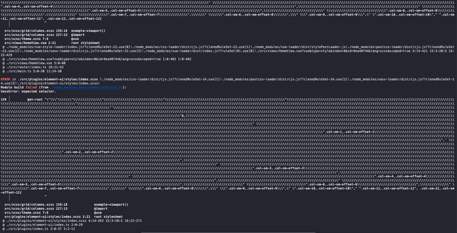
Hi @coco-napky, I went through the above code and I am trying to use it, but I am getting an error while building and I don't know how to solve it, error is on 139 when using @at-root, here is the image image of the build code, can you tell me what the error is and how to solve it, i am using 2 packages "sass": "^1.49.9", "sass-loader": "^12.6.0",