Last active
February 7, 2022 15:43
-
-
Save ctesta01/d01cf52de2cee3dc80e856743cd6d856 to your computer and use it in GitHub Desktop.
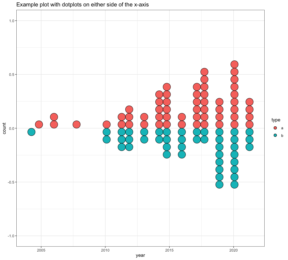
Putting dotplots for two distinct groups on either side of the x-axis
This file contains hidden or bidirectional Unicode text that may be interpreted or compiled differently than what appears below. To review, open the file in an editor that reveals hidden Unicode characters.
Learn more about bidirectional Unicode characters
| library(ggplot2) | |
| library(dplyr) | |
| library(magrittr) | |
| # generate fake data | |
| total_N_obs <- 1000 | |
| example_data <- | |
| data.frame( | |
| year = sample(2000:2020, replace = TRUE, size = total_N_obs), | |
| type = sample(c('a', 'b'), replace = TRUE, size = total_N_obs) | |
| ) | |
| # skew the data towards 2020 | |
| example_data %<>% rowwise() %>% mutate( | |
| year = year + sample(0:(2020-year), size = 1)) | |
| # make plot | |
| ggplot() + | |
| geom_dotplot( | |
| data = example_data %>% filter(type == 'a'), | |
| mapping = aes(x = year, fill = type), | |
| stackdir = 'up', | |
| method = 'histodot' | |
| ) + | |
| geom_dotplot( | |
| data = example_data %>% filter(type == 'b'), | |
| mapping = aes(x = year, fill = type), | |
| stackdir = 'down', | |
| method = 'histodot' | |
| ) + | |
| ggtitle("Example plot with dotplots on either side of the x-axis") |
Author
ctesta01
commented
Feb 4, 2022
Sign up for free
to join this conversation on GitHub.
Already have an account?
Sign in to comment