Ever encounter this? You've put a lot of effort on designing layout / UI for your app in Xcode, finally it looks good after spending hours tweaking it, but when you view it in another device with different screen size, it either looks too cramped with UILabels overlapping each other, or it looks too spacious with a lot of blank space between each elements.
Say you have designed two views to align side by side in iPhone 8 with a fixed width for both of them :
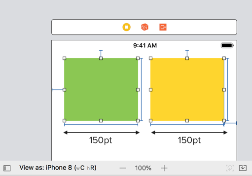
The green view has a leading and top constraint (X , Y position), a fixed width (150pt) and height constraint.
The yellow view has a trailing and top constraint (X, Y position), a fixed width (150 pt) and height constraint.
As the width is fixed at 150pt, when we view it in a smaller width screen size like iPhone SE, the two views gets overlapped! 😱
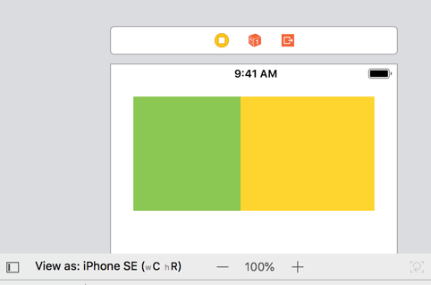
As iPhone SE screen width is 320pt, 150pt + 150 pt already took up almost the whole width!
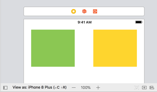
If we view it on iPhone 8 plus, there's a noticeable gap between the two views due to wider screen width :
These layout issues are usually caused by using fixed constraint constant, where the width / height of a view remain constant regardless of screen size. A better way to layout is to use proportional constraint.
For example, in the stock Photos app, photos are arranged nicely in 4 column, with each column taking roughly 1/4th of the screen width :
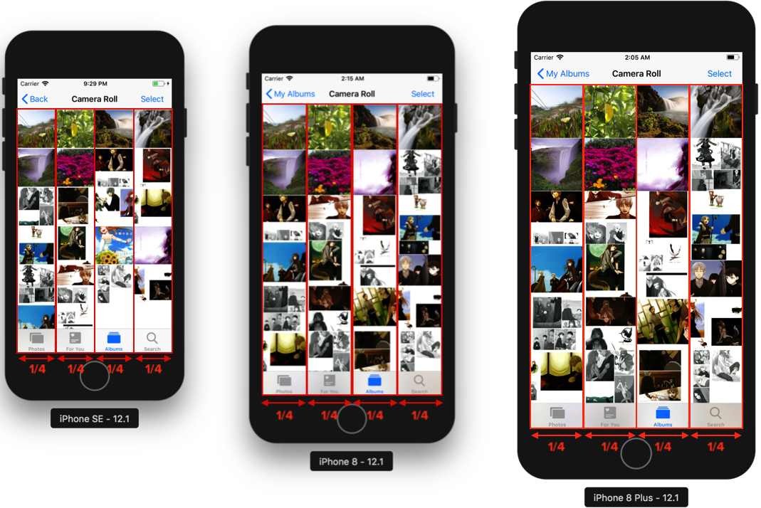
As each column takes up 1/4th width of the screen width, it adapts nicely on different screen size, it expands when the screen width is large (iPhone 8 plus), and it shrinks when the screen width is small (iPhone SE).
To set a proportional width constraint, press and hold **control **key + drag the view (or label or images) you want to the parent view, then select 'Equal Width' constraint.
An 'equal width' constraint will be created, click the 'Edit' button beside it to edit its value.
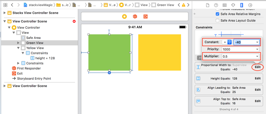
The multiplier is the ratio of the selected view (eg: green view) to its parent view, the value of 0.5 means that the green view width is 0.5x of its parent view (half). The constant -40 here means that the width of green view is half of its parent view minus 40pt, ie :
green view width = 0.5 x parent view width - 40 pt
The 40pt constant is to ensure we have some space between the view and its parent view.
We can then do the same to the yellow view on the right.
And now when we view it on different devices, the layout looks good as they follows the width of the device screens :
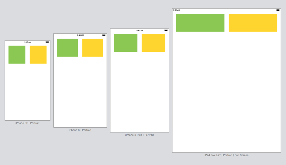
No more overlapping elements, no sudden big area of spacing, just nice 🙌. Doesn't it feels nice to design a layout that looks great across devices? No more spending nights trying to make a layout work and then find out it only looks good on one device, then you have to spend a few more nights to tweak it 😅.
This snippet is an excerpt from the Making Sense of Auto Layout book