Last active
February 2, 2022 22:38
-
-
Save helgasoft/d920ea0fc4085935c1e797992fb7395e to your computer and use it in GitHub Desktop.
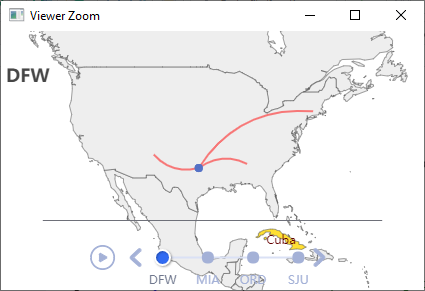
R | ECharts | timeline of geo map with scatter and lines; linked brush charts
This file contains hidden or bidirectional Unicode text that may be interpreted or compiled differently than what appears below. To review, open the file in an editor that reveals hidden Unicode characters.
Learn more about bidirectional Unicode characters
| library(echarty); library(dplyr) | |
| flights <- read.csv('https://raw.githubusercontent.com/plotly/datasets/master/2011_february_aa_flight_paths.csv') | |
| df <- head(flights) %>% relocate(start_lon, start_lat, end_lon) %>% | |
| group_by(airport1) %>% group_split() | |
| map.center <- c(mean(flights$start_lon), mean(flights$start_lat)) | |
| options <- lapply(df, function(y) { | |
| series <- list( | |
| list(type='scatter', coordinateSystem='geo', | |
| data = ec.data(y, 'values'), symbolSize = 8), | |
| list(type='lines', | |
| data = lapply(ec.data(y, 'names'), function(x) | |
| list(coords = list(c(x$start_lon, x$start_lat), | |
| c(x$end_lon, x$end_lat))) | |
| ), | |
| lineStyle = list(curveness=0.3, width=2, color='red') ) | |
| ) | |
| list(title=list(text=unique(y$airport1), top=30), | |
| geo = list(map="world", roam=TRUE, center=map.center, zoom=5), | |
| series = series) | |
| }) | |
| p <- ec.init(preset=FALSE, load='world') | |
| p$x$opts$yAxis <- list(ii='') | |
| p$x$opts$xAxis$type <- 'category' | |
| p$x$opts$timeline <- list(data=unlist(lapply(options, function(x) x$title$text)), | |
| axisType='category') | |
| p$x$opts$options <- options | |
| p | |
| # https://github.com/JohnCoene/echarts4r/issues/289 |

Author
Author
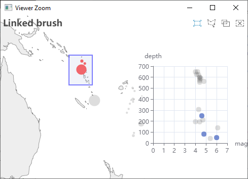
Two scatter charts (geo-map and cartesian) can have linked brush selections. Inquiry by @BigD7.
df <- head(quakes, 20) %>% dplyr::relocate('long') |>  # set order to lon,lat
	dplyr::mutate(size= exp(mag)/20)             	# add accented size

library(echarty)
p <- ec.init(load='world')
p$x$opts <- list(
	title= list(text= 'Linked brush'),
	geo= list(map='world', roam=TRUE, silent=TRUE,
				 center=c(mean(df$long),mean(df$lat)), zoom=6),
	series= list(
		list(
			type = 'scatter', name ='quakes',
			coordinateSystem = 'geo',
			symbolSize = ec.clmn(6, scale=1), itemStyle= list( color='red'),
			data = ec.data(df, format='values'),
			tooltip = list(formatter=ec.clmn('magnitude %@', 4))
		),
		list(type = 'scatter', name ='mag',
			data= ec.data(df[, c(4,3)], format='values'),
			tooltip = list(formatter=ec.clmn('mag %@', 1))
		)
	),
	tooltip= list(show=TRUE),
	grid= list(list(right= 40, top= 100, width= "30%")),
	xAxis= list(name= "magnitude"),
	yAxis= list(name= "depth"),
	brush= list(brushLink= 'all', brushStyle= list(borderColor= 'blue'),
		        outOfBrush= list(color= '#555', opacity=0.2)),
	toolbox= list(feature= list(brush=c()))
)
p

Brilliant, thank you!
Alan
… On Jan 27, 2022, at 3:31 PM, helgasoft ***@***.***> wrote:
@helgasoft commented on this gist.
Two scatter charts (geo-map and cartesian) can have linked brush selections. Inquiry by @BigD7 <https://github.com/BigD7>.
df <- head(quakes, 20) %>% dplyr::relocate('long') |> # set order to lon,lat
dplyr::mutate(size= exp(mag)/20) # add accented size
library(echarty)
p <- ec.init(load='world')
p$x$opts <- list(
title= list(text= 'Linked brush'),
geo= list(map='world', roam=TRUE, silent=TRUE,
center=c(mean(df$long),mean(df$lat)), zoom=6),
series= list(
list(
type = 'scatter', name ='quakes',
coordinateSystem = 'geo',
symbolSize = ec.clmn(6, scale=1), itemStyle= list( color='red'),
data = ec.data(df, format='values'),
tooltip = list(formatter=ec.clmn('magnitude %@', 4))
),
list(type = 'scatter', name ='mag',
data= ec.data(df[, c(4,3)], format='values'),
tooltip = list(formatter=ec.clmn('mag %@', 1))
)
),
tooltip= list(show=TRUE),
grid= list(list(right= 40, top= 100, width= "30%")),
xAxis= list(name= "magnitude"),
yAxis= list(name= "depth"),
brush= list(brushLink= 'all', brushStyle= list(borderColor= 'blue'),
outOfBrush= list(color= '#555', opacity=0.2)),
toolbox= list(feature= list(brush=c()))
)
p
<https://user-images.githubusercontent.com/13038071/151460573-f1195ed0-ba7c-451c-8269-9f9635e31e72.png>
—
Reply to this email directly, view it on GitHub <https://gist.github.com/d920ea0fc4085935c1e797992fb7395e#gistcomment-4044893>, or unsubscribe <https://github.com/notifications/unsubscribe-auth/ATB7FROJJARMD2WGGAHRVWDUYHITRANCNFSM5BHYEKYQ>.
Triage notifications on the go with GitHub Mobile for iOS <https://apps.apple.com/app/apple-store/id1477376905?ct=notification-email&mt=8&pt=524675> or Android <https://play.google.com/store/apps/details?id=com.github.android&referrer=utm_campaign%3Dnotification-email%26utm_medium%3Demail%26utm_source%3Dgithub>.
You are receiving this because you were mentioned.
Hi,
Can you please advise how to plot the result of an R hierarchical clustering procedure in Echarts via echarty?
Such as,
hc <- hclust(dist(USArrests), "ave")
plot(hc)
dend1 <- as.dendrogram(hc)
If this isn’t the correct place to ask this question I apologize, please advise.
Best,
Alan
…----------------------------------------------------------
Alan Deino
Geochronologist
Berkeley Geochronology Center
2455 Ridge Road
Berkeley, CA 94709
USA
510-644-1295 tel.
***@***.***
www.bgc.org
----------------------------------------------------------
Author
Very interesting question! Yes, please copy/paste in the correct place and I will answer there.
Sign up for free
to join this conversation on GitHub.
Already have an account?
Sign in to comment
output: