-
-
Save danhammer/13289b89f54fe6807ecb008204c4b301 to your computer and use it in GitHub Desktop.
| # pie chart exploration | |
| library(ggplot2) | |
| library(ngram) | |
| library(jsonlite) | |
| library(tidyr) | |
| library(RColorBrewer) | |
| library(dplyr) | |
| library(scales) | |
| film_indicator <- "MATRIX" | |
| metadata_location <- paste0("../../clean-scripts/r-data/", film_indicator, "_META.Rda") | |
| load(metadata_location) | |
| # Print the summary statistics for gender and race breakdown | |
| summary.gender <- meta %>% | |
| group_by(gender) %>% | |
| summarize(lines = sum(lines), words = sum(words)) | |
| summary.gender$line_summary <- summary.gender$lines/sum(meta$lines) | |
| summary.gender$word_summary <- summary.gender$words/sum(meta$words) | |
| print(summary.gender) | |
| blank_theme <- theme_minimal()+ | |
| theme( | |
| axis.title.x = element_blank(), | |
| axis.title.y = element_blank(), | |
| panel.border = element_blank(), | |
| panel.grid=element_blank(), | |
| axis.ticks = element_blank(), | |
| axis.text.x=element_blank(), | |
| plot.title=element_text(size=14, face="bold") | |
| ) | |
| ggplot(summary.gender, aes(x="", y=line_summary, fill=gender)) + | |
| geom_bar(width = 1, stat = "identity") + | |
| coord_polar("y", start=0) + | |
| blank_theme + | |
| annotate( | |
| "text", | |
| x = 1.7, | |
| y = c(0.005, 0.4, 0.9), | |
| label = percent(summary.gender$line_summary, 1) | |
| ) |
@danhammer, still running into issues with labels. Any idea?
pie + scale_fill_brewer() + blank_theme +
- theme(axis.text.x=element_blank())+
- geom_text(aes(y = lines/3 + c(0, cumsum(lines)[-length(lines)]),
- label = percent(summary.gender$line_summary, accuracy=1)), size=3)
Error: Aesthetics must be either length 1 or the same as the data (16): label
@dalon1891 yes, check out the most recent revision. This will create a chart like this. We can talk about why by phone, if that's helpful.
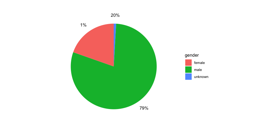
@danhammer looks great! Any idea why the 1% and 20% labels have switched place? Just have to change order of them under the Y-variable above? Thanks
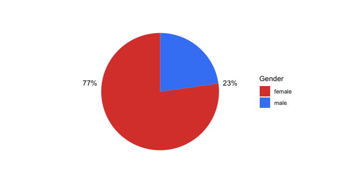
@danhammer was able to recreate based on snippets you to provided also used some customization of colours and legend label using below snippets. Any advice on how to move up the 23% so it is easier to identify that it belongs to the blue (obivious, but want to make it easy on the eye), and how to capitalise the Female/Male under Gender? Thanks a lot
@dalon1891 and @CollectiveGenius7, if you have any questions, put them here -- in the comments.