Last active
March 6, 2018 10:21
-
-
Save desinas/1f4c073060bc79ec12d3e2bde2633307 to your computer and use it in GitHub Desktop.
media screen Layout pattern responsive - FEWDev Udacity Lesson 14
This file contains hidden or bidirectional Unicode text that may be interpreted or compiled differently than what appears below. To review, open the file in an editor that reveals hidden Unicode characters.
Learn more about bidirectional Unicode characters
| <!DOCTYPE html> | |
| <html lang="en"> | |
| <head> | |
| <title>Mostly Fluid - Quiz</title> | |
| <meta charset="utf-8"> | |
| <meta name="viewport" content="width=device-width, initial-scale=1.0"> | |
| <style type="text/css"> | |
| /* | |
| These are the default styles. No need to change these. | |
| */ | |
| @import url(https://fonts.googleapis.com/css?family=Roboto); | |
| html, body { | |
| margin: 0; | |
| padding: 0; | |
| } | |
| body { | |
| font-family: 'Roboto', sans-serif; | |
| } | |
| .title { | |
| font-size: 2.5em; | |
| text-align: center; | |
| } | |
| .box { | |
| min-height: 150px; | |
| } | |
| .dark_blue { | |
| background-color: #2A457A; | |
| color: #efefef; | |
| } | |
| .light_blue { | |
| background-color: #099DD9; | |
| } | |
| .green { | |
| background-color: #0C8542; | |
| } | |
| .lime { | |
| background-color: rgb(179, 210, 52); | |
| } | |
| .seafoam { | |
| background-color: rgb(77, 190, 161); | |
| } | |
| .red { | |
| background-color: #EC1D3B; | |
| } | |
| .orange { | |
| background-color: #F79420; | |
| } | |
| </style> | |
| <style type="text/css"> | |
| /* | |
| These are the responsive styles. Throw some breakpoints in here! | |
| */ | |
| .container { | |
| display: flex; | |
| flex-wrap: wrap; | |
| } | |
| .box { | |
| width: 100%; | |
| } | |
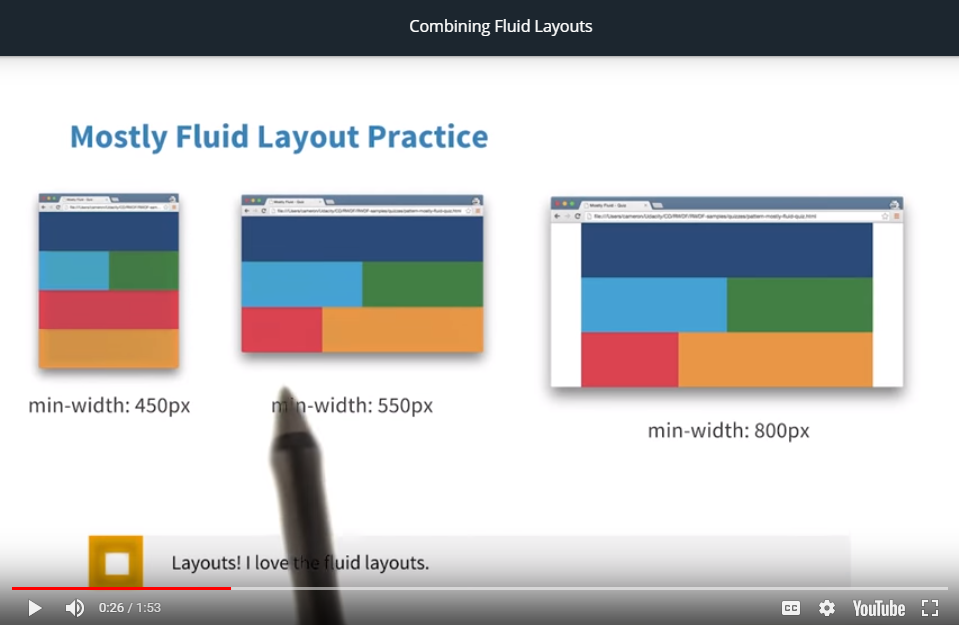
| @media screen and (min-width: 450px) { | |
| .light_blue, .green { | |
| width: 50%; | |
| } | |
| } | |
| @media screen and (min-width: 550px) { | |
| .red { | |
| width: 33.3%; | |
| } | |
| .orange { | |
| width: 66.6%; | |
| } | |
| } | |
| @media screen and (min-width: 800px) { | |
| .container { | |
| width: 800px; | |
| margin-left: auto; | |
| margin-right: auto; | |
| } | |
| } | |
| </style> | |
| </head> | |
| <body> | |
| <div class="container"> | |
| <div class="box dark_blue"></div> | |
| <div class="box light_blue"></div> | |
| <div class="box green"></div> | |
| <div class="box red"></div> | |
| <div class="box orange"></div> | |
| </div> | |
| </body> | |
| </html> |
Author
desinas
commented
Mar 6, 2018
Author
With the last media query, at over 800px view-ports, the container is fixed at 800px and the browser gives white space at the left and at the right of container.
Sign up for free
to join this conversation on GitHub.
Already have an account?
Sign in to comment