Design a simple webpage layout using Flexbox to achieve a responsive and visually appealing structure by conducting the tasks below:
- Create an HTML file (exercise5.html) with the basic structure:
<header>, <nav>, <main>, <aside>, and <footer>. - Apply a Flexbox layout to arrange the sections efficiently.
- The main content should be in the
<main>section, and additional content or sidebars can be in the<aside>section. - Style the elements using CSS to enhance the visual presentation.
- Ensure the layout is responsive, adapting to different screen sizes.
- Update your index.html that is Exercise 5 in index.html should link to this file
exercise5. Guide:Creating hyperlinks
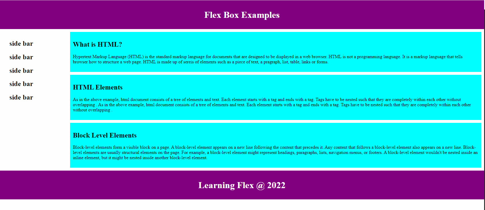
The end result may look as below:
Note: You can use your own color combination, however pay attention to the following tips for using colors on web pages:
Contrast is Key:
- Ensure sufficient contrast between text and background.
Color Alone Isn't Enough:
- Use additional cues (labels, icons) besides color to convey information.
Test Color Combinations:
- Use online tools to check and ensure accessible color contrast.
Consider Color Blindness:
- Use patterns or labels in addition to color to convey meaning.
Clear Focus Indicators:
- Provide visible focus indicators for interactive elements.
Use Descriptive Text:
- Include descriptive text for color-coded information.
Responsive Design:
- Ensure color choices work on various devices and screen sizes.
Accessible Charts:
- Ensure information in charts is conveyed through multiple means, not just color.
Avoid Flashing Content:
- Steer clear of rapidly flashing or blinking content.
User Testing Matters:
- Test with users of diverse abilities for valuable feedback.