Last active
November 22, 2019 10:57
-
-
Save dolphinsue319/c586793ee9b0061f80b7e7363f64e923 to your computer and use it in GitHub Desktop.
這是一個最簡短、最基本的 Keras 使用範例。
This file contains hidden or bidirectional Unicode text that may be interpreted or compiled differently than what appears below. To review, open the file in an editor that reveals hidden Unicode characters.
Learn more about bidirectional Unicode characters
| # 這段程式碼來自莫煩 Python: https://morvanzhou.github.io/tutorials/machine-learning/keras/2-1-regressor/ | |
| from keras.models import Sequential | |
| from keras.layers import Dense | |
| import matplotlib.pyplot as plt | |
| import numpy as np | |
| # 建立 X, Y 兩組資料用來練習 keras 的使用 | |
| X = np.linspace(-1, 1, 200) | |
| np.random.shuffle(X) | |
| Y = 0.5 * X + 2 + np.random.normal(0, 0.05, (200, )) | |
| # 將資料分成兩組,一組是用來 train model, 另一組用來測試 model 預測的效果。 | |
| X_train, Y_train = X[:160], Y[:160] | |
| X_test, Y_test = X[160:], Y[160:] | |
| # 建立一個 squential 的 model | |
| model = Sequential() | |
| # 建立一個輸入及輸出都是一維(輸入 X 輸出 Y)的全連接型態的神經層 | |
| dense = Dense(units=1, input_dim=1) | |
| # 將神經層加到 model 裡 | |
| model.add(dense) | |
| # compile 是用來安排學習過程的,optimizer 可以輸入一個 optimizer instance 或直接輸入該 optimizer class 的名字的字串。loss 也是一樣的用法。 | |
| # compile() 其實還有第三個參數 metrics, 那是用在「分類」的問題上。 | |
| # compile 文件: https://keras.io/getting-started/sequential-model-guide/#compilation | |
| # https://keras.io/optimizers/ | |
| # https://keras.io/losses/ | |
| model.compile(loss='mse', optimizer='sgd') | |
| # train 這個 model 300 次 | |
| for step in range(301): | |
| cost = model.train_on_batch(X_train, Y_train) | |
| if step % 100 == 0: | |
| print('train cost: {}'.format(cost)) | |
| # 用測試的那一組資料來測試 model 的學習效果, 用 model.evaluate 取得 loss 值。若在 compile 時有指定 metrics,這裡也會回傳 metrics。 | |
| # https://keras.io/models/model/ | |
| cost = model.evaluate(X_test, Y_test, batch_size=40) | |
| print("test cost: {}".format(cost)) | |
| W, b = model.layers[0].get_weights() | |
| print("weights = {}, biases= {}".format(W, b)) | |
| Y_pred = model.predict(X_test) | |
| plt.scatter(X_test, Y_test) | |
| plt.plot(X_test, Y_pred) | |
| plt.show() |
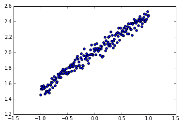
X, Y 在這裡只是一個隨便生出來的測試用資料。
X 是一個一維的陣列,裡面有 200 個元素,每一個元素是 -1.0 到 1.0 之間的 float。而 Y 也是一個一維 200 個元素的陣列,裡面的個一個元素是用 X 算出來的,算式是 0.5X+2+(0~0.5之間的隨機數)。畫成一個點陣圖大概像這樣。
Sign up for free
to join this conversation on GitHub.
Already have an account?
Sign in to comment
請問x跟y放進去的資料是怎麼來的,格式大約是長什麼樣子啊?in json format?