Good interfaces live or die by design’s role in the planning stages. Just as good architecture starts out with a plan, so do interfaces. UI is at the confluence of technology, psychology, and a pressing need to get something done. How effective that interface is at helping the user perform a task can be directly traced to the user stories (or jobs to be done).
Take, for example, the Miro board for pitches. Imagine having that call without any visuals; without any way of communicating the thing that’s going to be built. Now imagine asking our developers to go build a visual interface without the designs for it. Doesn’t make any sense, does it? The design is laden with detail and is a communication tool. Developers understand how to build interfaces, and fill in the gaps as they work.
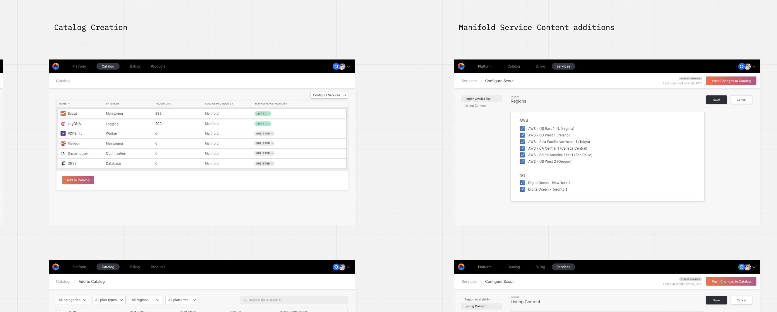
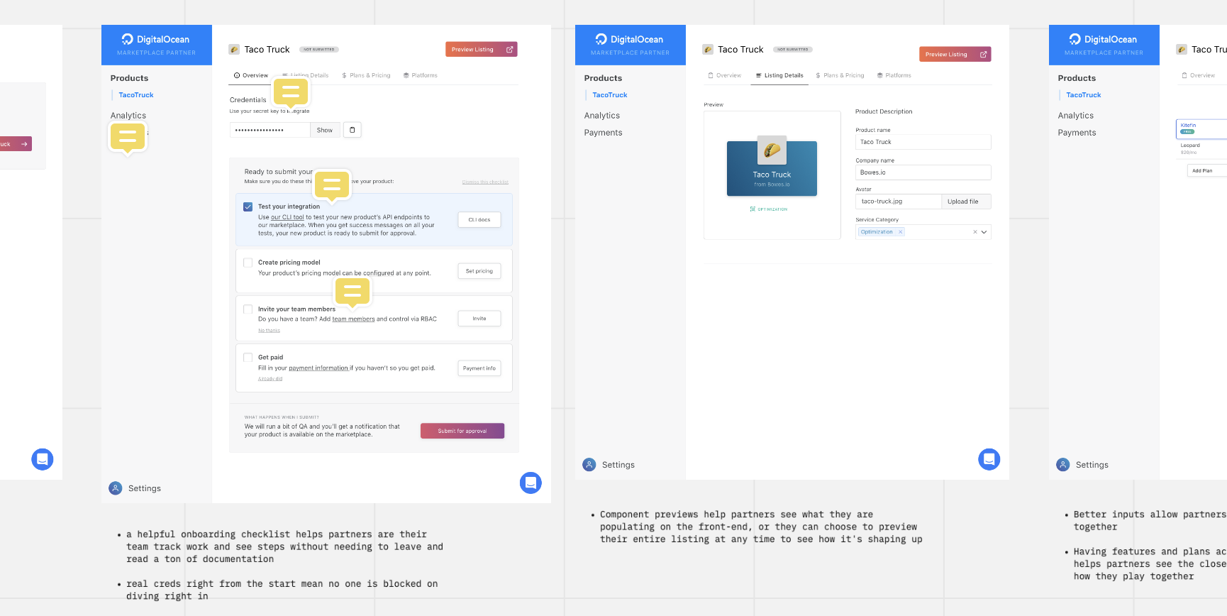
A good example of a project being set up right was Sphericon. After a couple shortcuts, and a few minor failures we learned that reinventing the wheel for self-onboarding onto a marketplace wasn’t a quick win that somehow everyone else missed. With Sphericon, we took it back to design, and development and design collaborated on discovering this new world—thinking through the challenges, and coming up with multiple solutions to the hard problems and weighing each.
In the end, everyone was crystal-clear on what was being built. Design was at the heart of it, and it showed. Only, when it came time to execute, resources were shifted to onboarding our first platform and it was later decided we didn’t have time so the plug was pulled. But it was nonetheless set up for success in execution.
A product person, designer, and engineer walk into a bar Zoom call. Together they define what it is, collaborating on blue-sky thinking and unfiltered wishes followed by cycles of reduction and feasibility. In the end you get a grand vision backed by practical steps to reach that (it’ll definitely adjust along the way, but the main point is that it creates a shared target to hit). This solves the Moving from doubt to certainty element of Lean UX.
As a deliverable (ideally as part of the process), napkin sketches and low-fidelity wireframes are made to capture the conversation. Think flows and loose organization, not copywriting and relative hierarchy. Because you’re creating the first step of a design and not an internal document, this hits the removing waste principle of Lean UX.
So your group of 3 is aligned, but how do you get the rest of the organization on board? How do you tell the engineers what to build? Well, fortunately, that’s where wireframes come in that were part of the previous step. These aren’t high-fidelity mockups; they’re simple flows and loose organizations to create a stab at how things fit together. Socializing these wireframes are great for the shared understanding part of Lean UX.
The above example was put together in 1 week’s time and is a tremendous aid for shared understanding (and it’s even higher-fidelity than would be required).
Information architecture is a principal discipline of UI design, and it should be handled at that step. The wireframes (or mockups, if there’s time) are an indispensible tool for communicating the vision of what this UI should look like. Otherwise, you’re asking your engineers to design, and that’s not an efficient use of time and the results can be disappointing to say the least.
The above is all communicated with Kickoff meetings, a period where the reasoning is delivered alongside the wireframes to all the engineers that will be involved. Sometimes this can be several meetings, with plenty of time for questions, pushing back, and even polishing and refining the end result from everyone’s collective experience and knowledge.
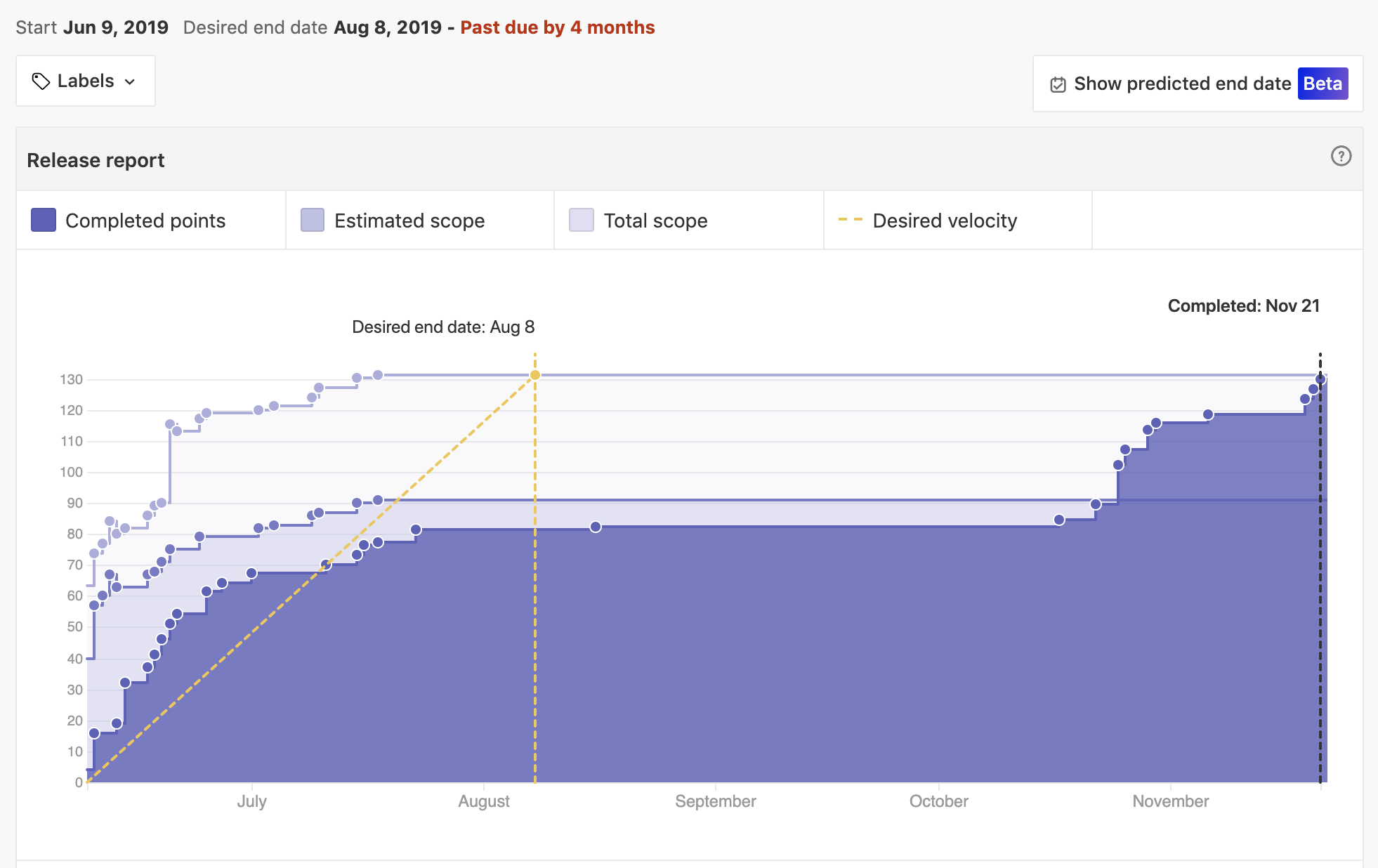
That’s good for alignment, but how does that translate into transparency and shipping? Incremental delivery addresses that. Also part of the removing waste principle, the engineers get to work. But rather than just going dark for weeks, the engineers focus on arranging the work so that it’s trackable, demo-able at regular intervals (every week, or every other week), and along the way, any feedback in regard to form & function is welcome.
Setting Milestone dates are helpful goals as targets to hit, but the progress each week should be made clear with transparency tools like ZenHub Releases and regular demos (Engineering Demo Day is every other week!).
The following are thoughts from Meg from the Miro board she made on the subject. I wanted to cite my sources here—there are more links and reading materials on the subject but I’ve tried to summarize all her major points above. This is just a copy of what she sent me.
- Competitive Analysis (to see how other folks were doing it to validate a right-sized approach for our customer): https://miro.com/app/board/o9J_kydOH-c=/
- Pain Map (we used this to call out areas of the flow that were painful for a user and make the case for a new holistic dashboard): https://miro.com/app/board/o9J_kxwuQmc=/
- "30% story board" - came at the end of ^ this, week's effort with 3 designers: https://miro.com/app/board/o9J_kxxGFQo=/
- lightweight details explaining "why"
- starts of flows, architecture, very lightweight
- Discovery - how to assess what stage you're in, what you need to move forward (this is partially driven by my mentor at Shopify who leads a team there) https://miro.com/app/board/o9J_kxgzAtU=/
- Dream design-driven product process: https://www.designbetter.co/enterprise-design-sprints/the-design-sprint
Lean UX: the process that's probably the right fit for us at the moment
- contains advice for remote collaboration
- contains advice for the stage we're in
- TL:DR: problem-focused collaborative teams take an assumption from Product and run with it to continuously learn more - explicit discovery track always
- steps