
Last active
January 3, 2022 03:44
-
-
Save helgasoft/b74c4f5c0532c83a8c0bbf571ae8cd02 to your computer and use it in GitHub Desktop.
R | ECharts | area bands (confidence bands)
This file contains hidden or bidirectional Unicode text that may be interpreted or compiled differently than what appears below. To review, open the file in an editor that reveals hidden Unicode characters.
Learn more about bidirectional Unicode characters
| #' Area band (confidence bands) is a 'custom' serie with lower and upper boundaries | |
| #' When type='polygon', coordinates of the two boundaries are chained into a polygon and displayed as one. | |
| #' When type='stack', two (smooth) stacked lines are drawn, one with customizable areaStyle. | |
| #' The upper boundary coordinates should be values added on top of the lower boundary coordinates. | |
| #' Standard and custom(formatter) tooltips could be used. | |
| #' | |
| #' ec.init(load='custom') will preset values like dataset, xAxis, etc. | |
| #' those could be customized (like xAxis below), and new ones added - like legend and tooltip. | |
| library(echarty) | |
| set.seed(5) | |
| df <- data.frame( x = 1:10, y = runif(10, 5, 10)) %>% | |
| dplyr::mutate(lwr = y-runif(10, 1, 3), upr = y+runif(10, 2, 4)) | |
| # --------- type='stack' | |
| p <- df %>% ec.init(load='custom') | |
| p$x$opts$xAxis <- list(type='category', boundaryGap=FALSE) | |
| p$x$opts$series <- append( list(list(type='line', color='gold', name='line1')), | |
| ecr.band(df, 'lwr', 'upr', type='stack', name='stak') #, smooth=FALSE) | |
| ) | |
| p$x$opts$tooltip <- list(trigger = 'axis' | |
| ,formatter = htmlwidgets::JS("function(x) { | |
| let str = x.length>1 | |
| ? 'high <b>'+x[2].value[2]+'</b><br>line <b>'+x[0].value[1]+'</b><br>low <b>'+x[1].value[1]+'</b>' | |
| : 'line <b>'+x[0].value[1]+'</b>'; | |
| return str; }")) | |
| p$x$opts$legend <- list(ii='') | |
| p | |
| # --------- type='polygon' | |
| p <- df %>% ec.init(load='custom') | |
| p$x$opts$xAxis <- list(type='category', boundaryGap=FALSE) | |
| p$x$opts$series <- append( list(list(type='line', color='gold', name='line1')), | |
| ecr.band(df, 'lwr', 'upr', type='polygon', name='poly') | |
| ) | |
| p$x$opts$tooltip <- list(trigger = 'axis') | |
| p$x$opts$legend <- list(ii='') | |
| p | |


Author
Your data is fine. There was a bug in echarty. Pushed a fix, please install.
remotes::install_github("helgasoft/echarty")    # v.3.1.1
library(echarty); library(dplyr)

p <- df_to_charty %>% group_by(scenario) %>% ec.init(load='custom', ctype='line')
p$x$opts$xAxis <- list(boundaryGap=FALSE, type='category', splitLine=list(show=TRUE))
for(i in 1:length(band_df)) {
    p$x$opts$series <- append(p$x$opts$series,
             ecr.band(band_df[[i]], 'lower', 'upper', type='stack',
                   stack=unique(band_df[[i]]$scenario),
                   name=unique(band_df[[i]]$scenario))
    )
}
p
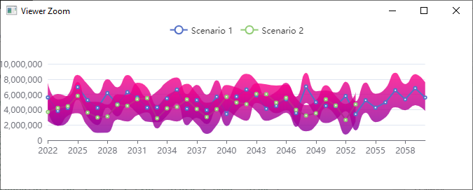
Works great! Thank you!
Sign up for free
to join this conversation on GitHub.
Already have an account?
Sign in to comment
Hi there! Thanks again for the quick reply and illustrative example. I'm still having issues - I can get your example above to work, but am having a hard time reproducing the results with my own data. I've generated a small reproducible example:
Generating Data
Attempting to plot
While it looks like the groups worked correctly in the legend, no data is plotted. Any help you could provide would be fantastic!