Last active
December 16, 2022 20:26
-
-
Save helgasoft/eb970a425059be5f13dd5aadc2b112ff to your computer and use it in GitHub Desktop.
R | ECharts | heatmap and scatter with visualMap coloring
This file contains hidden or bidirectional Unicode text that may be interpreted or compiled differently than what appears below. To review, open the file in an editor that reveals hidden Unicode characters.
Learn more about bidirectional Unicode characters
| library(echarty) | |
| library(dplyr) | |
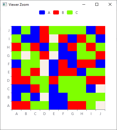
| # 1. --------------- ECharts heatmap with categorical data, like ggplot2::geom_tile | |
| v <- LETTERS[1:10] | |
| set.seed(2021) | |
| matrix <- data.frame( | |
| x = sample(v, 300, replace = TRUE), | |
| y = sample(v, 300, replace = TRUE), | |
| z = sample(LETTERS[1:3], 300, replace = TRUE), | |
| stringsAsFactors = FALSE | |
| ) %>% | |
| group_by(x, y) %>% | |
| summarise(z = z) %>% #slice_tail() %>% | |
| ungroup() %>% | |
| mutate(z = case_when(z=='A' ~1, z=='B' ~2, TRUE ~3)) | |
| p <- matrix %>% ec.init() | |
| p$x$opts$series <- list(list(type='heatmap')) | |
| p$x$opts$xAxis <- list(type='category') | |
| p$x$opts$yAxis <- list(type='category') | |
| p$x$opts$grid <- list(show=TRUE, backgroundColor='linen') | |
| p$x$opts$visualMap <- list( | |
| type='piecewise', top='top', left='center', orient='horizontal', | |
| pieces = list(list(value=1,label='A',color='blue'), | |
| list(value=2,label='B',color='red'), | |
| list(value=3,label='C',color='chartreuse')) ) | |
| p | |
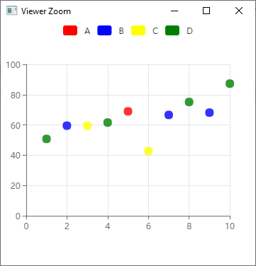
| # 2. --------------- scatter coloring with visualMap | |
| set.seed(2021) | |
| matrix <- tibble( | |
| x = 1:10, | |
| y = rnorm(10, 50 + 2 * x, 10), | |
| z = factor(sample(LETTERS[1:4], 10, TRUE), levels = LETTERS[1:4]) | |
| ) | |
| p <- matrix %>% ec.init() | |
| p$x$opts$series <- list(list(type='scatter', symbolSize=12)) | |
| p$x$opts$visualMap <- list( | |
| top='top', left='center', orient='horizontal', | |
| # dimension = 2, # z is 3rd column, 3-1=2 for JS | |
| dimension = 'z', # more readable | |
| # categories = list('A','B','C','D'), | |
| categories = sort(unique(matrix$z)), # more convenient | |
| inRange = list(color=list('red', 'blue', 'yellow','green')) | |
| ) | |
| p | |
| # RE: https://github.com/JohnCoene/echarts4r/issues/318 | |
| # RE: https://github.com/JohnCoene/echarts4r/issues/345 |

Author
Author
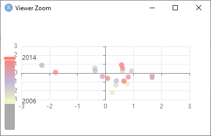
Simplest visualMap code, for @stla
library(echarty)
data.frame(
  x = rnorm(30),
  y = rnorm(30),
  year = rep(2000:2014, 2)
) |>
ec.init(
	series.param= list(symbolSize= 10),
	visualMap= list(dimension= 3, calculable= T,
		        inRange= list(color = c("#8DD3C7", "#FFFFB3", "#BEBADA", "#FB8072")))
) 
if you like this solution, please consider granting a Github star ⭐ to echarty.
Sign up for free
to join this conversation on GitHub.
Already have an account?
Sign in to comment
experiment ideas by @szmsu2011.
output
output