.my-container {
font-size: 18px;
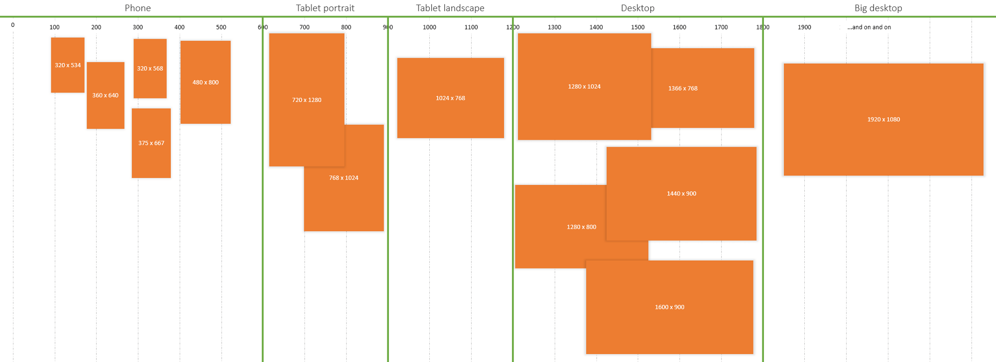
@include support(phone) {
font-size: 12px;
}
@include support(tablet-portrait) {
font-size: 16px;
}
@include support(big-desktop) {
font-size: 24px;
}
}
Created
October 21, 2021 14:01
-
-
Save henrycunh/cdcdbc303914951d3ee1034112920ce6 to your computer and use it in GitHub Desktop.
Responsiveness SASS mixins
This file contains hidden or bidirectional Unicode text that may be interpreted or compiled differently than what appears below. To review, open the file in an editor that reveals hidden Unicode characters.
Learn more about bidirectional Unicode characters
| @mixin support($size) { | |
| @if $size == phone { | |
| @media (max-width: 599px) { @content; } | |
| } @else if $size == tablet-portrait { | |
| @media (min-width: 600px) { @content; } | |
| } @else if $size == tablet-landscape { | |
| @media (min-width: 900px) { @content; } | |
| } @else if $size == desktop { | |
| @media (min-width: 1200px) { @content; } | |
| } @else if $size == big-desktop { | |
| @media (min-width: 1800px) { @content; } | |
| } | |
| } |
Sign up for free
to join this conversation on GitHub.
Already have an account?
Sign in to comment