Created
February 15, 2020 01:52
-
-
Save hnakamur/2a123ce7bdc0d7e5070218c258f990a8 to your computer and use it in GitHub Desktop.
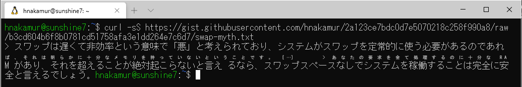
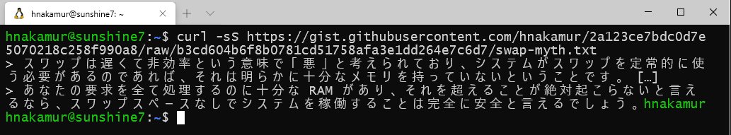
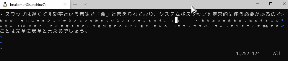
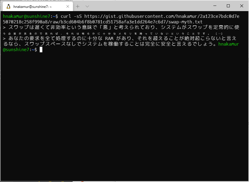
example Japanese text which is not rendred properly on Windows Terminal
This file contains hidden or bidirectional Unicode text that may be interpreted or compiled differently than what appears below. To review, open the file in an editor that reveals hidden Unicode characters.
Learn more about bidirectional Unicode characters
| > スワップは遅くて非効率という意味で「悪」と考えられており、システムがスワップを定常的に使う必要があるのであれば、それは明らかに十分なメモリを持っていないということです。 […] > あなたの要求を全て処理するのに十分な RAM があり、それを超えることが絶対起こらないと言え るなら、スワップスペースなしでシステムを稼働することは完全に安全と言えるでしょう。 |
Author
Author
It has rendering issue with MS Gothic font too.
Author
With Lucida Console font, all characters are rendered in appropriate size, but horizontal spacing between characters are too wide.
Author
With Cica font and Vim, the characters rendered size changes with the cursor position.
Sign up for free
to join this conversation on GitHub.
Already have an account?
Sign in to comment
font: Cica
screenshot with Windows Terminal (Preview) Version: 0.9.433.0
The characters on the second line are rendered too small.