|
/* Thanks to https://shields.io/category/build for inspiration */ |
|
.build-badge-container { |
|
height: 20px; |
|
min-width: 200px; |
|
|
|
margin: 2px 0; |
|
} |
|
|
|
.badge-name, |
|
.badge-status { |
|
display: inline-block; |
|
height: 18px; |
|
color: #fff; |
|
font-family: Verdana, DejaVu Sans, sans-serif; |
|
font-size: 11px; |
|
line-height: 1.538; |
|
letter-spacing: 0px; |
|
|
|
text-shadow: 0px 1px rgba(1, 1, 1, 0.3); |
|
} |
|
|
|
.badge-name { |
|
background: rgb(95, 95, 95); |
|
background: linear-gradient( |
|
180deg, |
|
rgba(95, 95, 95, 1) 0%, |
|
rgba(78, 78, 78, 1) 100% |
|
); |
|
border-radius: 3px 0px 0px 3px; |
|
padding: 2px 4px 0px 6px; |
|
} |
|
|
|
.badge-status { |
|
border-radius: 0px 3px 3px 0px; |
|
padding: 2px 6px 0px 4px; |
|
} |
|
|
|
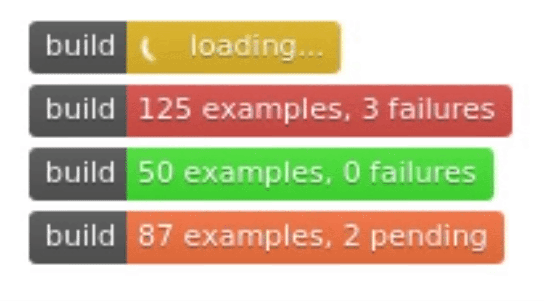
.badge-status.loading { |
|
background: rgb(223, 179, 23); |
|
background: linear-gradient( |
|
180deg, |
|
rgba(223, 179, 23, 1) 0%, |
|
rgba(206, 162, 6, 1) 100% |
|
); |
|
} |
|
|
|
.badge-status.success { |
|
background: rgb(223, 179, 23); |
|
background: linear-gradient( |
|
180deg, |
|
rgba(85, 202, 48, 1) 0%, |
|
rgba(62, 183, 17, 1) 100% |
|
); |
|
} |
|
|
|
.badge-status.pending { |
|
background: rgb(247, 132, 71); |
|
background: linear-gradient( |
|
180deg, |
|
rgba(247, 132, 71, 1) 0%, |
|
rgba(228, 113, 49, 1) 100% |
|
); |
|
} |
|
|
|
.badge-status.error, |
|
.badge-status.failed { |
|
background: rgb(221, 103, 81); |
|
background: linear-gradient( |
|
180deg, |
|
rgba(221, 103, 81, 1) 0%, |
|
rgba(201, 84, 61, 1) 100% |
|
); |
|
} |
|
|
|
/* Thanks to |
|
https://vineethtrv.github.io/loader/ |
|
and |
|
https://www.w3schools.com/howto/howto_css_loader.asp |
|
for inspiration |
|
*/ |
|
.loader { |
|
position: relative; |
|
padding-left: 20px; /* spinner size * 2 */ |
|
} |
|
|
|
.loader::before { |
|
content: ""; |
|
display: inline-block; |
|
position: absolute; |
|
|
|
left: 0; |
|
top: 0; |
|
margin: 0px 6px 0px 2px; |
|
|
|
border: 1px solid transparent; |
|
border-radius: 50%; |
|
border-top: 2px solid #fff; |
|
width: 10px; |
|
height: 10px; |
|
|
|
animation: spin 1s ease-out infinite; |
|
} |
|
|
|
@keyframes spin { |
|
to { |
|
transform: rotate(360deg); |
|
} |
|
} |