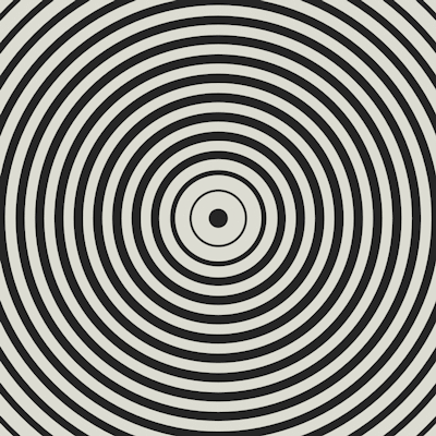
Recreation of this gif from FLRN
A Pen by Jake Albaugh on CodePen.
Recreation of this gif from FLRN
A Pen by Jake Albaugh on CodePen.
| <figure class=figure></figure> | |
| <img src="http://38.media.tumblr.com/d458a330fdfe91c3222c9c419c47070e/tumblr_nmi6mbcECM1tcuj64o1_400.gif" title="Original Image" class="img"/> |
| // canvas dimensions | |
| $w: 400px; $h: $w; | |
| // diameter of center dot | |
| $dot-di: 16px; | |
| $dot-rad: $dot-di / 2; | |
| // shadows to generate | |
| $loop-count: 34; | |
| // colors | |
| $c-light: #D7D7CE; | |
| $c-dark: #2A2B26; | |
| // figure is canvas | |
| .figure { | |
| // removing default margin | |
| margin: 0; | |
| // centering canvas on screen | |
| position: fixed; | |
| top: 50%; left: 50%; | |
| transform: translate(-50%, -50%); | |
| width: $w; height: $h; | |
| // hiding excess | |
| overflow: hidden; | |
| // dot is after | |
| &::after { | |
| content: ""; | |
| // position dot in center of canvas | |
| position: absolute; | |
| top: 50%; left: 50%; | |
| transform: translate(-50%, -50%); | |
| width: $dot-di; height: $dot-di; | |
| // make a circle | |
| border-radius: $dot-di / 2; | |
| // circle color is dark | |
| background: $c-dark; | |
| // calling box-shadow animation | |
| animation: pulse 1800ms linear infinite; | |
| } | |
| } | |
| // how many white lines to influence per full pulse | |
| $infl-count: 7; | |
| // influence step | |
| $infl-step: 0.2; | |
| $shadows: (); | |
| // outer loop for each circle. | |
| // will generate shadow per animation step | |
| @for $i from 1 through $loop-count + ($infl-count * 2) { | |
| $shadow: (); | |
| // creating the actual shodow | |
| @if $i % 2 == 1 { | |
| @for $l from 1 through $loop-count { | |
| // color | |
| $c: undefined; | |
| // size | |
| $s: undefined; | |
| // if a light color | |
| @if $l % 2 == 1 { | |
| $c: $c-light; | |
| // this could be simplified... | |
| // current light color | |
| @if $l == $i { | |
| $s: $l * $dot-rad + ($dot-rad * $infl-step * 1); | |
| // previous light color | |
| } @elseif $l == $i - 2 { | |
| $s: $l * $dot-rad + ($dot-rad * $infl-step * 2); | |
| } @elseif $l == $i - 4 { | |
| $s: $l * $dot-rad + ($dot-rad * $infl-step * 3); | |
| } @elseif $l == $i - 6 { | |
| $s: $l * $dot-rad + ($dot-rad * $infl-step * 4); | |
| } @elseif $l == $i - 8 { | |
| $s: $l * $dot-rad + ($dot-rad * $infl-step * 3); | |
| } @elseif $l == $i - 10 { | |
| $s: $l * $dot-rad + ($dot-rad * $infl-step * 2); | |
| } @elseif $l == $i - 12 { | |
| $s: $l * $dot-rad + ($dot-rad * $infl-step * 1); | |
| // standard light color | |
| } @else { | |
| $s: $l * $dot-rad; | |
| } | |
| // standard dark color | |
| } @else { | |
| $c: $c-dark; | |
| $s: $l * $dot-rad; | |
| } | |
| $shadow: append($shadow, 0px 0px 0px $s $c, comma); | |
| } | |
| $shadows: append($shadows, ($shadow), comma); | |
| } | |
| } | |
| // set box shadow to first shadow | |
| .figure::after { box-shadow: nth($shadows,1); } | |
| // this should match $loop-count / 2 | |
| $shadow-count: length($shadows); | |
| // pulse animation | |
| @keyframes pulse { | |
| @for $s from 1 through $shadow-count { | |
| #{$s/$shadow-count * 100}% { box-shadow: nth($shadows,$s); } | |
| } | |
| } | |
| // global style | |
| body { background: #222; } | |
| // example gif in bottom left | |
| .img { | |
| position: fixed; | |
| left: 0; bottom: 0; | |
| width: 15%; | |
| // below centers on screen to scale | |
| //left: 50%; top: 50%; | |
| //transform: translate(-50%, -50%); | |
| //width: 400px; | |
| //opacity: 0.5; | |
| height: auto; | |
| z-index: -1; | |
| } |