Srry, this is a bit of an awkward format. I might move this and a few other demos to a repo.
This is code one could drop into Jupyter [1] notebook cells and draw some wicked-looking graphs. I wrote it to understand Bayesian linear regression (for this classMLPR, specifically this and this). No promises that I did it perfectly.
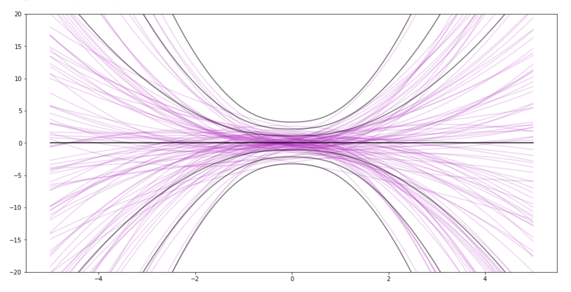
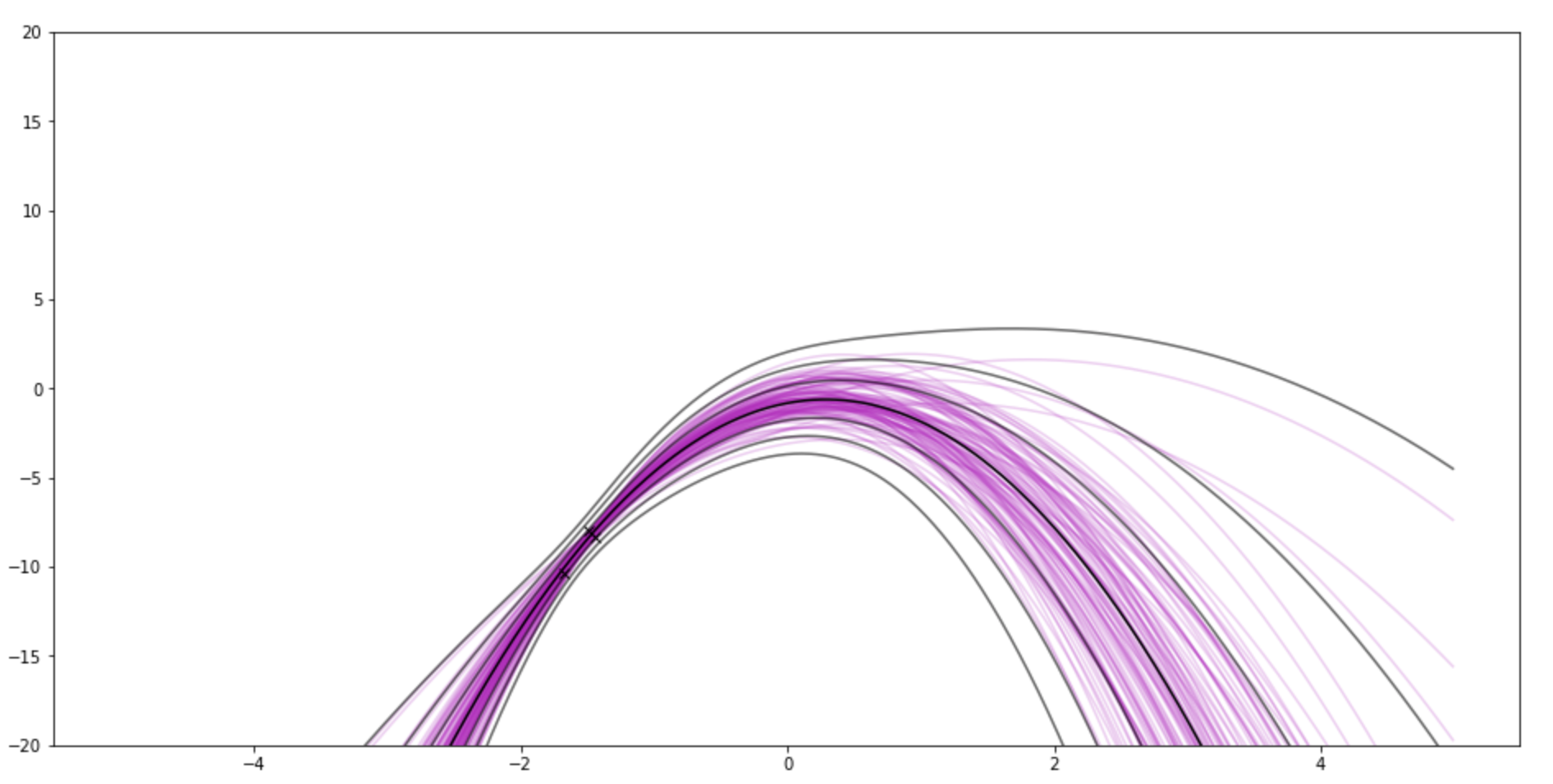
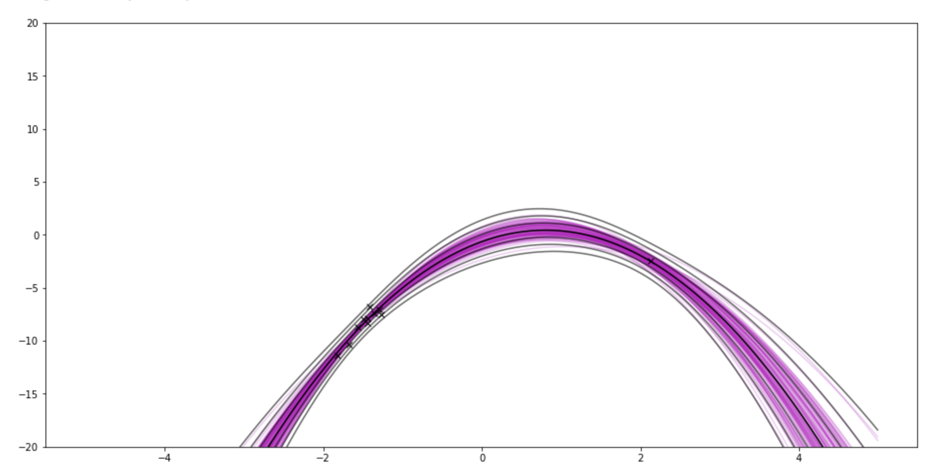
The graphs show samples from the posterior weights in pink. The black lines kinda show the posterior distribution P(y|data) by drawing lines for standard deviations away from the mean. So it goes through the points on the x-axis, asks P(y|data) for the value and uncertainty
It uses polynomial basis functions, because they are sqiggly and cool-looking.
- model_params=3 matches the underlying function (and the right noise variance sigma_y is already set)
- If you set "sample size" to 0, you can see the prior. Then try messing with sigma_w. This demo uses the same sigma_w for all weights. You can also see the impact of the prior after data.
- For fun, I sample from two regions of the underlying function. So try going from sample_size 10 to 11.
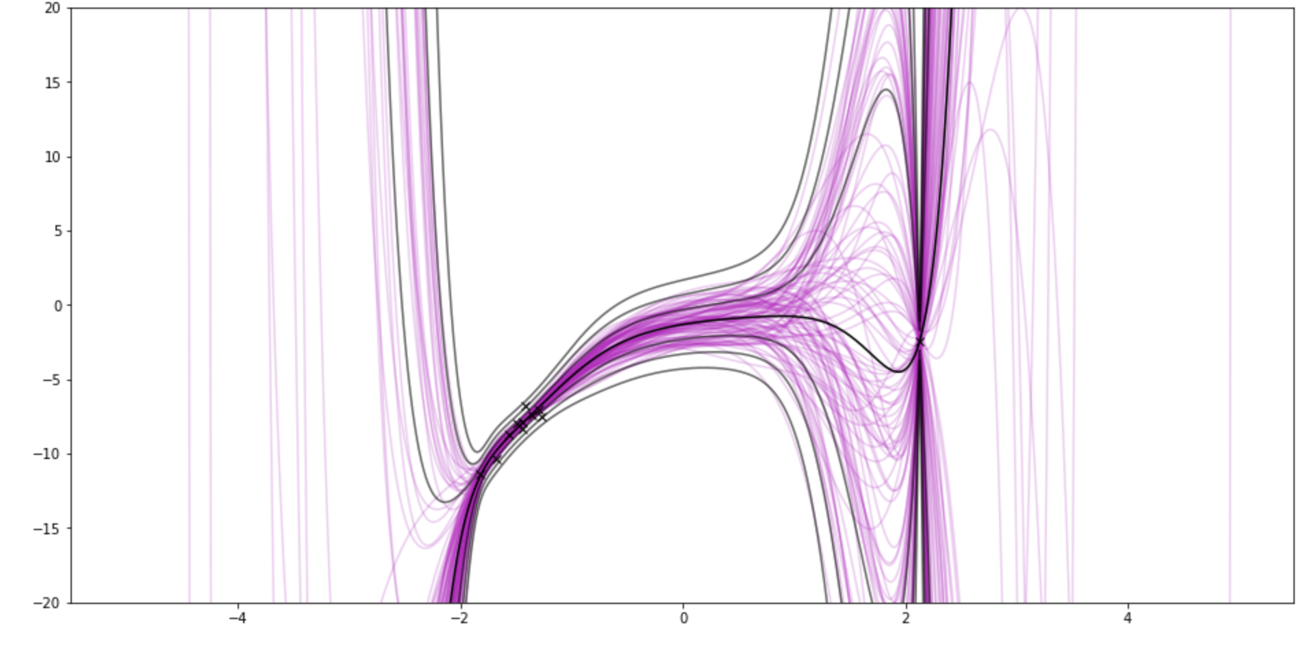
- If you set the "model–params" (number of coefficients) to 10 and sample size to 11, it pinches around the brand new point.
[1] with matplotlib, numpy, scipy
This is the prior for 3 weights (quadratic)

After 3 observations. There's still a little lump around 0.

After 11:

If I use 9-degree polynomial, and show 11 samples (10 from one side, 1 from another side)
