ilikescience
/ convertColorTokensFormat.js
Last active
July 27, 2025 18:29
This file contains hidden or bidirectional Unicode text that may be interpreted or compiled differently than what appears below. To review, open the file in an editor that reveals hidden Unicode characters.
Learn more about bidirectional Unicode characters
| #!/usr/bin/env node | |
| /* | |
| MIT License | |
| Copyright (c) 2025 Matt Ström-Awn | |
| Permission is hereby granted, free of charge, to any person obtaining a copy | |
| of this software and associated documentation files (the "Software"), to deal | |
| in the Software without restriction, including without limitation the rights |
ronalson
/ DS-reading-list.md
Last active
September 3, 2020 13:08
Design System / Tokens - Reading List
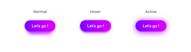
tunguskha
/ Gradient shadow in pure CSS.md
Last active
October 12, 2024 17:02
Gradient shadow in pure CSS
This file contains hidden or bidirectional Unicode text that may be interpreted or compiled differently than what appears below. To review, open the file in an editor that reveals hidden Unicode characters.
Learn more about bidirectional Unicode characters
| { | |
| "plugins": [ | |
| "stylelint-declaration-use-variable" | |
| ], | |
| "rules": { | |
| "color-hex-case": ["lower", {"severity": "warning"} ], | |
| "color-hex-length": ["short", {"severity": "warning"} ], | |
| "color-named": ["never", {"severity": "warning"} ], | |
| "time-no-imperceptible": [true, {"severity": "warning"} ], | |
| "max-nesting-depth": [5, {"severity": "warning"} ], |
paulirish
/ what-forces-layout.md
Last active
July 26, 2026 09:05
What forces layout/reflow. The comprehensive list.
All of the below properties or methods, when requested/called in JavaScript, will trigger the browser to synchronously calculate the style and layout*. This is also called reflow or layout thrashing, and is common performance bottleneck.
Generally, all APIs that synchronously provide layout metrics will trigger forced reflow / layout. Read on for additional cases and details.
elem.offsetLeft,elem.offsetTop,elem.offsetWidth,elem.offsetHeight,elem.offsetParent
juukie
/ _bootstrap-sass-xl.scss
Last active
August 7, 2018 08:33
Add xl step to bootstrap sass. Should be after bootstrap.scss.
This file contains hidden or bidirectional Unicode text that may be interpreted or compiled differently than what appears below. To review, open the file in an editor that reveals hidden Unicode characters.
Learn more about bidirectional Unicode characters
| /* Place this after bootstrap.scss */ | |
| $screen-xl: 1560px !default; | |
| $screen-xl-min: $screen-xl !default; | |
| $screen-xl-desktop: $screen-xl-min !default; | |
| $screen-lg-max: ($screen-xl-min - 1) !default; | |
| $container-xlarge-desktop: (1530px + $grid-gutter-width) !default; | |
| $container-xl: $container-xlarge-desktop !default; | |
| .container { |
This file contains hidden or bidirectional Unicode text that may be interpreted or compiled differently than what appears below. To review, open the file in an editor that reveals hidden Unicode characters.
Learn more about bidirectional Unicode characters
| // STRIP UNIT | |
| // It strips the unit of measure and returns it | |
| @function strip-unit($num) { | |
| @return $num / ($num * 0 + 1); | |
| } | |
| // Media queries mixin | |
| // Default widths | |
| $default-medium: 768px !default; |
salt-istanbul
/ Bootstrap Responsive Square & Rectangle
Last active
October 27, 2016 16:44
Bootstrap Responsive Square & Rectangle
This file contains hidden or bidirectional Unicode text that may be interpreted or compiled differently than what appears below. To review, open the file in an editor that reveals hidden Unicode characters.
Learn more about bidirectional Unicode characters
| div[class*="col-"] > .square-responsive, | |
| span[class*="col-"] > .square-responsive, | |
| ol[class*="col-"] > .square-responsive, | |
| ul[class*="col-"] > .square-responsive, | |
| li[class*="col-"] > .square-responsive{ | |
| padding-bottom:100%; | |
| } | |
| div[class*="col-"] > .rect-responsive, | |
| span[class*="col-"] > .rect-responsive, | |
| ol[class*="col-"] > .rect-responsive, |
anthonyholmes
/ bootstrap-sass-mixin-cheatsheet.scss
Created
October 10, 2014 08:13
Bootstrap Sass Mixin Cheatsheet
This file contains hidden or bidirectional Unicode text that may be interpreted or compiled differently than what appears below. To review, open the file in an editor that reveals hidden Unicode characters.
Learn more about bidirectional Unicode characters
| // Alerts | |
| @include alert-variant($background, $border, $text-color); | |
| // Background Variant | |
| @include bg-variant($parent, $color); | |
| // Border Radius | |
| @include border-top-radius($radius); | |
| @include border-right-radius($radius); | |
| @include border-bottom-radius($radius); |
donnierayjones
/ LICENSE
Last active
June 24, 2024 14:28
Render Bootstrap as "small" layout when printing
This file contains hidden or bidirectional Unicode text that may be interpreted or compiled differently than what appears below. To review, open the file in an editor that reveals hidden Unicode characters.
Learn more about bidirectional Unicode characters
| Copyright (C) 2016 Donnie Ray Jones | |
| Permission is hereby granted, free of charge, to any person obtaining a | |
| copy of this software and associated documentation files (the | |
| "Software"), to deal in the Software without restriction, including | |
| without limitation the rights to use, copy, modify, merge, publish, | |
| distribute, sublicense, and/or sell copies of the Software, and to | |
| permit persons to whom the Software is furnished to do so, subject to | |
| the following conditions: |
NewerOlder