Collect and analyze best practices to create the most effective website design for an E-commerce site.
- Reduce page download speed to 1 second.
- Design pages following the F-Shape / Golden Triangle principle.
- Break design into sub-pages which fit perfectly on the screen.
- Present only 5 things / content blocks on every page.
- Try to make visitors contactable at the first visit.
- Once contactable make visitors return and buy.
- Reduce the steps from 'Add To Cart' to 'Make Purchase' by deploying 1-click shopping.
- Use non-classic e-commerce techniques like flash sales, subscription and social commerce.
This section presents common problems presented by industry leaders and offers solutions — in order of importance and impact.
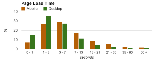
Every 100 ms increase in load time of Amazon.com decreased sales by 1% (via websiteoptimisation.com)
Make the site download speed to meet the industry standard 1-3 seconds. 0.1 second gives the user the feeling of direct manipulation, 1 second keeps the user's flow of thought seamless.
Users don't see stuff that's right on the screen. Selective attention makes people overlook things outside their focus of interest. (via Jakob Nielsen)
Each page will contain the minimum amount of information positioned after the Golden Triangle / F shape principle considering website eye tracking best practices and heat maps.

The Minimum Amount of Information means visitors can focus only on 5 things on a single page. On importance these areas / information blocks must be:
- Identity — Makes the visitor feeling safe, being in the right place
- Offer — What this page offers
- Values — Emphasize what your site does that's valuable from the user's point of view, as well as how you differ from key competitors.
- Tasks — Emphasize the highest priority tasks so that users have a clear starting point for what to do next.
- Entertainment — If all above are not interesting for the user make it feel good by offering something fun which still connects / links back to your site.
(Distilled after the Design Guidelines For Usability by Jakob Nielsen)


Users often leave Web pages in 10–20 seconds, but pages with a clear value proposition can hold people's attention for much longer. (via Jakob Nielsen)


Once contactable go after each visitor on every channel (e-mail, facebook, twitter) and make them customers.
Yet despite many years of optimization, online shopping cart abandonment rates reached 75% in the first six months of 2011. (via Luke Wroblewski)

Very few successful e-commerce companies were started in the 2000s. Since then, e-commerce startups have enjoyed a revival. Dozens of companies have gotten traction and venture dollars have followed. Phrases like flash sales, social commerce, and subscription commerce have entered the startup lexicon. (via Chris Dixon)