A while back, I noticed that the fonts in our Typekit subscription displayed poorly at many many sizes.
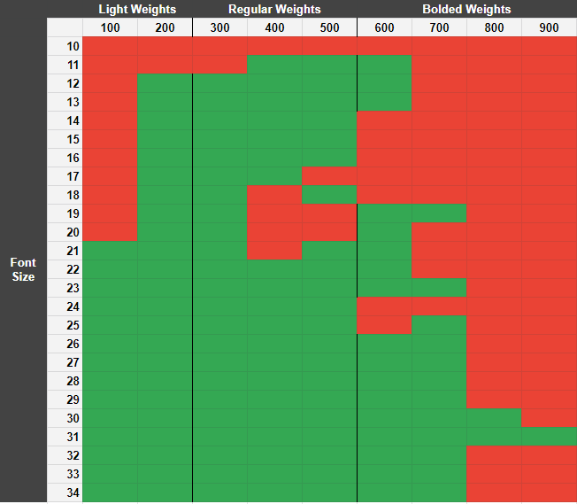
I mapped out font/weight combinations for the font Acumin Pro across 25 font-sizes and all 9 weights, and noticed that a shocking 41% of font/weight combinations had noticeable distortions, particularly around the characters a, e, s.
The font Utopia Std also had distortions at multiple sizes, though not as many as Acumin Pro.
Both Acumin and Utopia were made by the Adobe Originals font foundry and can only, per their LICENSE, be served via Adobe Fonts (Typekit). As I continue to visit websites, fonts with artifacts around a, e, and s stick out like a sore thumb and I take the time to inspect them. They're almost all by Adobe Originals, and every instance I've seen has been served with Adobe Fonts.
This collection exists because I couldn't find any other documentation online about the display errors of one of the most popular Webfont products on the web.
I have some leading theories:
-
Adobe Originals foundry optimizes for Adobe Products, which may have a custom font-smoothing engine. Non-Adobe Products would then have potential display issues. (There are non-Adobe Originals fonts served by Typekit which do have this issue)
-
Typekit is optimized to serve retina devices / Mac devices / Mobile devices. The standard-sized Windows desktop experience is not a priority, so it has display issues.
-
Adobe Fonts isn't optimized for the web? Simply, if Adobe Fonts is optimized for Adobe Products and other applications, its use as a webfont could be an afterthought. A test for this theory would be to put together a sample site which uses Adobe Fonts to serve a font with distortions and then self-host the same font. This violates the license of any Adobe Originals font, but would provide much insight.


Proxima Nova on CBS News
Artifacts are seen on the characters
A,a,e,f,s