Last active
June 23, 2021 18:55
-
-
Save roipeker/fa7e5b63b489c05c76e5a738aed9d166 to your computer and use it in GitHub Desktop.
Flutter's CustomDropdownButton. Exposes some extra params for fine tunning the UI.
This file contains hidden or bidirectional Unicode text that may be interpreted or compiled differently than what appears below. To review, open the file in an editor that reveals hidden Unicode characters.
Learn more about bidirectional Unicode characters
| /// new "custom" parameters: | |
| /// -menuRadius: menu corner radius [BorderRadius] | |
| /// -menuDecoration: background [BoxDecoration] | |
| /// -menuPadding: menu vertical padding [EdgeInsets] | |
| /// -menuClip: To clip (mask) menu's content [Clip.none] | |
| /// -itemPadding: item's horizontal padding [EdgeInsets] | |
| // Copyright 2014 The Flutter Authors. All rights reserved. | |
| // Use of this source code is governed by a BSD-style license that can be | |
| // found in the LICENSE file. | |
| import 'dart:math' as math; | |
| import 'dart:ui' show window; | |
| import 'package:flutter/foundation.dart'; | |
| import 'package:flutter/material.dart'; | |
| import 'package:flutter/rendering.dart'; | |
| import 'package:flutter/services.dart'; | |
| const Duration _kDropdownMenuDuration = Duration(milliseconds: 300); | |
| const double _kMenuItemHeight = kMinInteractiveDimension; | |
| const double _kDenseButtonHeight = 24.0; | |
| const EdgeInsets _kMenuItemPadding = EdgeInsets.symmetric(horizontal: 16.0); | |
| const EdgeInsetsGeometry _kAlignedButtonPadding = | |
| EdgeInsetsDirectional.only(start: 16.0, end: 4.0); | |
| const EdgeInsets _kUnalignedButtonPadding = EdgeInsets.zero; | |
| const EdgeInsets _kAlignedMenuMargin = EdgeInsets.zero; | |
| const EdgeInsetsGeometry _kUnalignedMenuMargin = | |
| EdgeInsetsDirectional.only(start: 16.0, end: 24.0); | |
| class _DropdownMenuPainter extends CustomPainter { | |
| _DropdownMenuPainter({ | |
| BoxDecoration? decoration, | |
| this.color, | |
| this.elevation, | |
| this.selectedIndex, | |
| BorderRadius? radius, | |
| required this.resize, | |
| required this.getSelectedItemOffset, | |
| }) : decoration = BoxDecoration( | |
| // If you add an image here, you must provide a real | |
| // configuration in the paint() function and you must provide some sort | |
| // of onChanged callback here. | |
| image: decoration?.image, | |
| shape: decoration?.shape ?? BoxShape.rectangle, | |
| backgroundBlendMode: decoration?.backgroundBlendMode, | |
| gradient: decoration?.gradient, | |
| color: decoration?.color ?? color, | |
| border: decoration?.border, | |
| borderRadius: | |
| decoration?.borderRadius ?? radius ?? BorderRadius.circular(5.0), | |
| boxShadow: decoration?.boxShadow ?? kElevationToShadow[elevation], | |
| ), | |
| super(repaint: resize); | |
| final BoxDecoration decoration; | |
| final Color? color; | |
| final int? elevation; | |
| final int? selectedIndex; | |
| final Animation<double> resize; | |
| final ValueGetter<double> getSelectedItemOffset; | |
| late BoxPainter _painter = decoration.createBoxPainter(); | |
| @override | |
| void paint(Canvas canvas, Size size) { | |
| final double selectedItemOffset = getSelectedItemOffset(); | |
| final Tween<double> top = Tween<double>( | |
| begin: selectedItemOffset.clamp( | |
| 0.0, math.max(size.height - _kMenuItemHeight, 0.0)), | |
| end: 0.0, | |
| ); | |
| final Tween<double> bottom = Tween<double>( | |
| begin: (top.begin! + _kMenuItemHeight) | |
| .clamp(math.min(_kMenuItemHeight, size.height), size.height), | |
| end: size.height, | |
| ); | |
| final Rect rect = Rect.fromLTRB( | |
| 0.0, top.evaluate(resize), size.width, bottom.evaluate(resize)); | |
| _painter.paint(canvas, rect.topLeft, ImageConfiguration(size: rect.size)); | |
| } | |
| @override | |
| bool shouldRepaint(_DropdownMenuPainter oldPainter) { | |
| return oldPainter.color != color || | |
| oldPainter.decoration != decoration || | |
| oldPainter.elevation != elevation || | |
| oldPainter.selectedIndex != selectedIndex || | |
| oldPainter.resize != resize; | |
| } | |
| } | |
| // The widget that is the button wrapping the menu items. | |
| class _DropdownMenuItemButton<T> extends StatefulWidget { | |
| const _DropdownMenuItemButton({ | |
| Key? key, | |
| this.padding, | |
| required this.route, | |
| required this.buttonRect, | |
| required this.constraints, | |
| required this.itemIndex, | |
| }) : super(key: key); | |
| final _DropdownRoute<T> route; | |
| final EdgeInsets? padding; | |
| final Rect buttonRect; | |
| final BoxConstraints constraints; | |
| final int itemIndex; | |
| @override | |
| _DropdownMenuItemButtonState<T> createState() => | |
| _DropdownMenuItemButtonState<T>(); | |
| } | |
| class _DropdownMenuItemButtonState<T> | |
| extends State<_DropdownMenuItemButton<T>> { | |
| void _handleFocusChange(bool focused) { | |
| final bool inTraditionalMode; | |
| switch (FocusManager.instance.highlightMode) { | |
| case FocusHighlightMode.touch: | |
| inTraditionalMode = false; | |
| break; | |
| case FocusHighlightMode.traditional: | |
| inTraditionalMode = true; | |
| break; | |
| } | |
| if (focused && inTraditionalMode) { | |
| final _MenuLimits menuLimits = widget.route.getMenuLimits( | |
| widget.buttonRect, | |
| widget.constraints.maxHeight, | |
| widget.itemIndex, | |
| ); | |
| widget.route.scrollController!.animateTo( | |
| menuLimits.scrollOffset, | |
| curve: Curves.easeInOut, | |
| duration: const Duration(milliseconds: 100), | |
| ); | |
| } | |
| } | |
| void _handleOnTap() { | |
| final DropdownMenuItem<T> dropdownMenuItem = | |
| widget.route.items[widget.itemIndex].item!; | |
| dropdownMenuItem.onTap?.call(); | |
| Navigator.pop( | |
| context, | |
| _DropdownRouteResult<T>(dropdownMenuItem.value), | |
| ); | |
| } | |
| static final Map<LogicalKeySet, Intent> _webShortcuts = | |
| <LogicalKeySet, Intent>{ | |
| // On the web, up/down don't change focus, *except* in a <select> | |
| // element, which is what a dropdown emulates. | |
| LogicalKeySet(LogicalKeyboardKey.arrowDown): | |
| const DirectionalFocusIntent(TraversalDirection.down), | |
| LogicalKeySet(LogicalKeyboardKey.arrowUp): | |
| const DirectionalFocusIntent(TraversalDirection.up), | |
| }; | |
| @override | |
| Widget build(BuildContext context) { | |
| final CurvedAnimation opacity; | |
| final double unit = 0.5 / (widget.route.items.length + 1.5); | |
| if (widget.itemIndex == widget.route.selectedIndex) { | |
| opacity = CurvedAnimation( | |
| parent: widget.route.animation!, curve: const Threshold(0.0)); | |
| } else { | |
| final double start = | |
| (0.5 + (widget.itemIndex + 1) * unit).clamp(0.0, 1.0); | |
| final double end = (start + 1.5 * unit).clamp(0.0, 1.0); | |
| opacity = CurvedAnimation( | |
| parent: widget.route.animation!, curve: Interval(start, end)); | |
| } | |
| Widget child = FadeTransition( | |
| opacity: opacity, | |
| child: InkWell( | |
| // borderRadius: BorderRadius.circular(20), | |
| autofocus: widget.itemIndex == widget.route.selectedIndex, | |
| child: Container( | |
| padding: widget.padding, | |
| child: widget.route.items[widget.itemIndex], | |
| ), | |
| onTap: _handleOnTap, | |
| onFocusChange: _handleFocusChange, | |
| ), | |
| ); | |
| if (kIsWeb) { | |
| child = Shortcuts( | |
| shortcuts: _webShortcuts, | |
| child: child, | |
| ); | |
| } | |
| return child; | |
| } | |
| } | |
| class _DropdownMenu<T> extends StatefulWidget { | |
| const _DropdownMenu({ | |
| Key? key, | |
| this.padding, | |
| required this.route, | |
| required this.buttonRect, | |
| required this.constraints, | |
| this.radius, | |
| this.backgroundDecoration, | |
| this.clipList = Clip.none, | |
| this.listPadding, | |
| this.dropdownColor, | |
| }) : super(key: key); | |
| final _DropdownRoute<T> route; | |
| final BorderRadius? radius; | |
| final EdgeInsets? padding; | |
| final EdgeInsets? listPadding; | |
| final Clip clipList; | |
| final Rect buttonRect; | |
| final BoxConstraints constraints; | |
| final Color? dropdownColor; | |
| final BoxDecoration? backgroundDecoration; | |
| @override | |
| _DropdownMenuState<T> createState() => _DropdownMenuState<T>(); | |
| } | |
| class _DropdownMenuState<T> extends State<_DropdownMenu<T>> { | |
| late CurvedAnimation _fadeOpacity; | |
| late CurvedAnimation _resize; | |
| @override | |
| void initState() { | |
| super.initState(); | |
| // We need to hold these animations as state because of their curve | |
| // direction. When the route's animation reverses, if we were to recreate | |
| // the CurvedAnimation objects in build, we'd lose | |
| // CurvedAnimation._curveDirection. | |
| _fadeOpacity = CurvedAnimation( | |
| parent: widget.route.animation!, | |
| curve: const Interval(0.0, 0.25), | |
| reverseCurve: const Interval(0.75, 1.0), | |
| ); | |
| _resize = CurvedAnimation( | |
| parent: widget.route.animation!, | |
| curve: const Interval(0.25, 0.5), | |
| reverseCurve: const Threshold(0.0), | |
| ); | |
| } | |
| @override | |
| Widget build(BuildContext context) { | |
| // The menu is shown in three stages (unit timing in brackets): | |
| // [0s - 0.25s] - Fade in a rect-sized menu container with the selected item. | |
| // [0.25s - 0.5s] - Grow the otherwise empty menu container from the center | |
| // until it's big enough for as many items as we're going to show. | |
| // [0.5s - 1.0s] Fade in the remaining visible items from top to bottom. | |
| // | |
| // When the menu is dismissed we just fade the entire thing out | |
| // in the first 0.25s. | |
| assert(debugCheckHasMaterialLocalizations(context)); | |
| final MaterialLocalizations localizations = | |
| MaterialLocalizations.of(context); | |
| final _DropdownRoute<T> route = widget.route; | |
| final List<Widget> children = <Widget>[ | |
| for (int itemIndex = 0; itemIndex < route.items.length; ++itemIndex) | |
| _DropdownMenuItemButton<T>( | |
| route: widget.route, | |
| padding: widget.padding, | |
| buttonRect: widget.buttonRect, | |
| constraints: widget.constraints, | |
| itemIndex: itemIndex, | |
| ), | |
| ]; | |
| return FadeTransition( | |
| opacity: _fadeOpacity, | |
| child: CustomPaint( | |
| painter: _DropdownMenuPainter( | |
| decoration: widget.backgroundDecoration, | |
| color: widget.dropdownColor ?? Theme.of(context).canvasColor, | |
| elevation: route.elevation, | |
| selectedIndex: route.selectedIndex, | |
| resize: _resize, | |
| radius: widget.radius, | |
| // This offset is passed as a callback, not a value, because it must | |
| // be retrieved at paint time (after layout), not at build time. | |
| getSelectedItemOffset: () => route.getItemOffset(route.selectedIndex), | |
| ), | |
| child: Semantics( | |
| scopesRoute: true, | |
| namesRoute: true, | |
| explicitChildNodes: true, | |
| label: localizations.popupMenuLabel, | |
| child: Material( | |
| type: MaterialType.transparency, | |
| textStyle: route.style, | |
| borderRadius: widget.radius, | |
| /// get clipping from widget. | |
| clipBehavior: widget.clipList, | |
| child: ScrollConfiguration( | |
| // Dropdown menus should never overscroll or display an overscroll indicator. | |
| // The default scrollbar platforms will apply. | |
| // Platform must use Theme and ScrollPhysics must be Clamping. | |
| behavior: ScrollConfiguration.of(context).copyWith( | |
| overscroll: false, | |
| physics: const ClampingScrollPhysics(), | |
| platform: Theme.of(context).platform, | |
| ), | |
| child: PrimaryScrollController( | |
| controller: widget.route.scrollController!, | |
| child: Scrollbar( | |
| isAlwaysShown: true, | |
| child: ListView( | |
| padding: widget.listPadding ?? kMaterialListPadding, | |
| shrinkWrap: true, | |
| children: children, | |
| ), | |
| ), | |
| ), | |
| ), | |
| ), | |
| ), | |
| ), | |
| ); | |
| } | |
| } | |
| class _DropdownMenuRouteLayout<T> extends SingleChildLayoutDelegate { | |
| _DropdownMenuRouteLayout({ | |
| required this.buttonRect, | |
| required this.route, | |
| required this.textDirection, | |
| }); | |
| final Rect buttonRect; | |
| final _DropdownRoute<T> route; | |
| final TextDirection? textDirection; | |
| @override | |
| BoxConstraints getConstraintsForChild(BoxConstraints constraints) { | |
| // The maximum height of a simple menu should be one or more rows less than | |
| // the view height. This ensures a tappable area outside of the simple menu | |
| // with which to dismiss the menu. | |
| // -- https://material.io/design/components/menus.html#usage | |
| double maxHeight = | |
| math.max(0.0, constraints.maxHeight - 2 * _kMenuItemHeight); | |
| if (route.menuMaxHeight != null && route.menuMaxHeight! <= maxHeight) { | |
| maxHeight = route.menuMaxHeight!; | |
| } | |
| // The width of a menu should be at most the view width. This ensures that | |
| // the menu does not extend past the left and right edges of the screen. | |
| final double width = math.min(constraints.maxWidth, buttonRect.width); | |
| return BoxConstraints( | |
| minWidth: width, | |
| maxWidth: width, | |
| minHeight: 0.0, | |
| maxHeight: maxHeight, | |
| ); | |
| } | |
| @override | |
| Offset getPositionForChild(Size size, Size childSize) { | |
| final _MenuLimits menuLimits = | |
| route.getMenuLimits(buttonRect, size.height, route.selectedIndex); | |
| assert(() { | |
| final Rect container = Offset.zero & size; | |
| if (container.intersect(buttonRect) == buttonRect) { | |
| // If the button was entirely on-screen, then verify | |
| // that the menu is also on-screen. | |
| // If the button was a bit off-screen, then, oh well. | |
| assert(menuLimits.top >= 0.0); | |
| assert(menuLimits.top + menuLimits.height <= size.height); | |
| } | |
| return true; | |
| }()); | |
| assert(textDirection != null); | |
| final double left; | |
| switch (textDirection!) { | |
| case TextDirection.rtl: | |
| left = buttonRect.right.clamp(0.0, size.width) - childSize.width; | |
| break; | |
| case TextDirection.ltr: | |
| left = buttonRect.left.clamp(0.0, size.width - childSize.width); | |
| break; | |
| } | |
| return Offset(left, menuLimits.top); | |
| } | |
| @override | |
| bool shouldRelayout(_DropdownMenuRouteLayout<T> oldDelegate) { | |
| return buttonRect != oldDelegate.buttonRect || | |
| textDirection != oldDelegate.textDirection; | |
| } | |
| } | |
| // We box the return value so that the return value can be null. Otherwise, | |
| // canceling the route (which returns null) would get confused with actually | |
| // returning a real null value. | |
| @immutable | |
| class _DropdownRouteResult<T> { | |
| const _DropdownRouteResult(this.result); | |
| final T? result; | |
| @override | |
| bool operator ==(Object other) { | |
| return other is _DropdownRouteResult<T> && other.result == result; | |
| } | |
| @override | |
| int get hashCode => result.hashCode; | |
| } | |
| class _MenuLimits { | |
| const _MenuLimits(this.top, this.bottom, this.height, this.scrollOffset); | |
| final double top; | |
| final double bottom; | |
| final double height; | |
| final double scrollOffset; | |
| } | |
| class _DropdownRoute<T> extends PopupRoute<_DropdownRouteResult<T>> { | |
| _DropdownRoute({ | |
| required this.items, | |
| required this.padding, | |
| required this.buttonRect, | |
| required this.selectedIndex, | |
| this.elevation = 8, | |
| required this.capturedThemes, | |
| required this.style, | |
| this.barrierLabel, | |
| this.itemHeight, | |
| this.dropdownColor, | |
| this.menuMaxHeight, | |
| this.radius, | |
| this.clipList = Clip.none, | |
| this.listPadding, | |
| this.backgroundDecoration, | |
| }) : assert(style != null), | |
| itemHeights = List<double>.filled( | |
| items.length, itemHeight ?? kMinInteractiveDimension); | |
| final List<_MenuItem<T>> items; | |
| final EdgeInsetsGeometry padding; | |
| final Rect buttonRect; | |
| final int selectedIndex; | |
| final int elevation; | |
| final CapturedThemes capturedThemes; | |
| final TextStyle style; | |
| final double? itemHeight; | |
| final Color? dropdownColor; | |
| final double? menuMaxHeight; | |
| final BorderRadius? radius; | |
| final EdgeInsets? listPadding; | |
| final BoxDecoration? backgroundDecoration; | |
| final Clip clipList; | |
| final List<double> itemHeights; | |
| ScrollController? scrollController; | |
| @override | |
| Duration get transitionDuration => _kDropdownMenuDuration; | |
| @override | |
| bool get barrierDismissible => true; | |
| @override | |
| Color? get barrierColor => null; | |
| @override | |
| final String? barrierLabel; | |
| @override | |
| Widget buildPage(BuildContext context, Animation<double> animation, | |
| Animation<double> secondaryAnimation) { | |
| return LayoutBuilder( | |
| builder: (BuildContext context, BoxConstraints constraints) { | |
| return _DropdownRoutePage<T>( | |
| route: this, | |
| constraints: constraints, | |
| items: items, | |
| clipList: clipList, | |
| listPadding: listPadding, | |
| backgroundDecoration: backgroundDecoration, | |
| radius: radius, | |
| padding: padding, | |
| buttonRect: buttonRect, | |
| selectedIndex: selectedIndex, | |
| elevation: elevation, | |
| capturedThemes: capturedThemes, | |
| style: style, | |
| dropdownColor: dropdownColor, | |
| ); | |
| }, | |
| ); | |
| } | |
| void _dismiss() { | |
| if (isActive) { | |
| navigator?.removeRoute(this); | |
| } | |
| } | |
| double getItemOffset(int index) { | |
| double offset = kMaterialListPadding.top; | |
| if (items.isNotEmpty && index > 0) { | |
| assert(items.length == itemHeights.length); | |
| offset += itemHeights | |
| .sublist(0, index) | |
| .reduce((double total, double height) => total + height); | |
| } | |
| return offset; | |
| } | |
| // Returns the vertical extent of the menu and the initial scrollOffset | |
| // for the ListView that contains the menu items. The vertical center of the | |
| // selected item is aligned with the button's vertical center, as far as | |
| // that's possible given availableHeight. | |
| _MenuLimits getMenuLimits( | |
| Rect buttonRect, double availableHeight, int index) { | |
| final double maxMenuHeight = availableHeight - 2.0 * _kMenuItemHeight; | |
| final double buttonTop = buttonRect.top; | |
| final double buttonBottom = math.min(buttonRect.bottom, availableHeight); | |
| final double selectedItemOffset = getItemOffset(index); | |
| // If the button is placed on the bottom or top of the screen, its top or | |
| // bottom may be less than [_kMenuItemHeight] from the edge of the screen. | |
| // In this case, we want to change the menu limits to align with the top | |
| // or bottom edge of the button. | |
| final double topLimit = math.min(_kMenuItemHeight, buttonTop); | |
| final double bottomLimit = | |
| math.max(availableHeight - _kMenuItemHeight, buttonBottom); | |
| double menuTop = (buttonTop - selectedItemOffset) - | |
| (itemHeights[selectedIndex] - buttonRect.height) / 2.0; | |
| double preferredMenuHeight = kMaterialListPadding.vertical; | |
| if (items.isNotEmpty) | |
| preferredMenuHeight += | |
| itemHeights.reduce((double total, double height) => total + height); | |
| // If there are too many elements in the menu, we need to shrink it down | |
| // so it is at most the maxMenuHeight. | |
| final double menuHeight = math.min(maxMenuHeight, preferredMenuHeight); | |
| double menuBottom = menuTop + menuHeight; | |
| // If the computed top or bottom of the menu are outside of the range | |
| // specified, we need to bring them into range. If the item height is larger | |
| // than the button height and the button is at the very bottom or top of the | |
| // screen, the menu will be aligned with the bottom or top of the button | |
| // respectively. | |
| if (menuTop < topLimit) menuTop = math.min(buttonTop, topLimit); | |
| if (menuBottom > bottomLimit) { | |
| menuBottom = math.max(buttonBottom, bottomLimit); | |
| menuTop = menuBottom - menuHeight; | |
| } | |
| double scrollOffset = 0; | |
| // If all of the menu items will not fit within availableHeight then | |
| // compute the scroll offset that will line the selected menu item up | |
| // with the select item. This is only done when the menu is first | |
| // shown - subsequently we leave the scroll offset where the user left | |
| // it. This scroll offset is only accurate for fixed height menu items | |
| // (the default). | |
| if (preferredMenuHeight > maxMenuHeight) { | |
| // The offset should be zero if the selected item is in view at the beginning | |
| // of the menu. Otherwise, the scroll offset should center the item if possible. | |
| scrollOffset = math.max(0.0, selectedItemOffset - (buttonTop - menuTop)); | |
| // If the selected item's scroll offset is greater than the maximum scroll offset, | |
| // set it instead to the maximum allowed scroll offset. | |
| scrollOffset = math.min(scrollOffset, preferredMenuHeight - menuHeight); | |
| } | |
| return _MenuLimits(menuTop, menuBottom, menuHeight, scrollOffset); | |
| } | |
| } | |
| class _DropdownRoutePage<T> extends StatelessWidget { | |
| const _DropdownRoutePage({ | |
| Key? key, | |
| required this.route, | |
| required this.constraints, | |
| this.items, | |
| this.radius, | |
| this.clipList = Clip.none, | |
| this.listPadding, | |
| this.backgroundDecoration, | |
| required this.padding, | |
| required this.buttonRect, | |
| required this.selectedIndex, | |
| this.elevation = 8, | |
| required this.capturedThemes, | |
| this.style, | |
| required this.dropdownColor, | |
| }) : super(key: key); | |
| final BorderRadius? radius; | |
| final EdgeInsets? listPadding; | |
| final Clip clipList; | |
| final _DropdownRoute<T> route; | |
| final BoxConstraints constraints; | |
| final List<_MenuItem<T>>? items; | |
| final EdgeInsetsGeometry padding; | |
| final Rect buttonRect; | |
| final int selectedIndex; | |
| final int elevation; | |
| final CapturedThemes capturedThemes; | |
| final TextStyle? style; | |
| final Color? dropdownColor; | |
| final BoxDecoration? backgroundDecoration; | |
| @override | |
| Widget build(BuildContext context) { | |
| assert(debugCheckHasDirectionality(context)); | |
| // Computing the initialScrollOffset now, before the items have been laid | |
| // out. This only works if the item heights are effectively fixed, i.e. either | |
| // DropdownButton.itemHeight is specified or DropdownButton.itemHeight is null | |
| // and all of the items' intrinsic heights are less than kMinInteractiveDimension. | |
| // Otherwise the initialScrollOffset is just a rough approximation based on | |
| // treating the items as if their heights were all equal to kMinInteractveDimension. | |
| if (route.scrollController == null) { | |
| final _MenuLimits menuLimits = | |
| route.getMenuLimits(buttonRect, constraints.maxHeight, selectedIndex); | |
| route.scrollController = | |
| ScrollController(initialScrollOffset: menuLimits.scrollOffset); | |
| } | |
| final TextDirection? textDirection = Directionality.maybeOf(context); | |
| final Widget menu = _DropdownMenu<T>( | |
| route: route, | |
| radius: radius, | |
| backgroundDecoration: backgroundDecoration, | |
| clipList: clipList, | |
| listPadding: listPadding, | |
| padding: padding.resolve(textDirection), | |
| buttonRect: buttonRect, | |
| constraints: constraints, | |
| dropdownColor: dropdownColor, | |
| ); | |
| return MediaQuery.removePadding( | |
| context: context, | |
| removeTop: true, | |
| removeBottom: true, | |
| removeLeft: true, | |
| removeRight: true, | |
| child: Builder( | |
| builder: (BuildContext context) { | |
| return CustomSingleChildLayout( | |
| delegate: _DropdownMenuRouteLayout<T>( | |
| buttonRect: buttonRect, | |
| route: route, | |
| textDirection: textDirection, | |
| ), | |
| child: capturedThemes.wrap(menu), | |
| ); | |
| }, | |
| ), | |
| ); | |
| } | |
| } | |
| // This widget enables _DropdownRoute to look up the sizes of | |
| // each menu item. These sizes are used to compute the offset of the selected | |
| // item so that _DropdownRoutePage can align the vertical center of the | |
| // selected item lines up with the vertical center of the dropdown button, | |
| // as closely as possible. | |
| class _MenuItem<T> extends SingleChildRenderObjectWidget { | |
| const _MenuItem({ | |
| Key? key, | |
| required this.onLayout, | |
| required this.item, | |
| }) : assert(onLayout != null), | |
| super(key: key, child: item); | |
| final ValueChanged<Size> onLayout; | |
| final DropdownMenuItem<T>? item; | |
| @override | |
| RenderObject createRenderObject(BuildContext context) { | |
| return _RenderMenuItem(onLayout); | |
| } | |
| @override | |
| void updateRenderObject( | |
| BuildContext context, covariant _RenderMenuItem renderObject) { | |
| renderObject.onLayout = onLayout; | |
| } | |
| } | |
| class _RenderMenuItem extends RenderProxyBox { | |
| _RenderMenuItem(this.onLayout, [RenderBox? child]) | |
| : assert(onLayout != null), | |
| super(child); | |
| ValueChanged<Size> onLayout; | |
| @override | |
| void performLayout() { | |
| super.performLayout(); | |
| onLayout(size); | |
| } | |
| } | |
| // The container widget for a menu item created by a [DropdownButton]. It | |
| // provides the default configuration for [DropdownMenuItem]s, as well as a | |
| // [DropdownButton]'s hint and disabledHint widgets. | |
| class _DropdownMenuItemContainer extends StatelessWidget { | |
| /// Creates an item for a dropdown menu. | |
| /// | |
| /// The [child] argument is required. | |
| const _DropdownMenuItemContainer({ | |
| Key? key, | |
| required this.child, | |
| }) : assert(child != null), | |
| super(key: key); | |
| /// The widget below this widget in the tree. | |
| /// | |
| /// Typically a [Text] widget. | |
| final Widget child; | |
| @override | |
| Widget build(BuildContext context) { | |
| return Container( | |
| constraints: const BoxConstraints(minHeight: _kMenuItemHeight), | |
| alignment: AlignmentDirectional.centerStart, | |
| child: child, | |
| ); | |
| } | |
| } | |
| /// A material design button for selecting from a list of items. | |
| /// | |
| /// A dropdown button lets the user select from a number of items. The button | |
| /// shows the currently selected item as well as an arrow that opens a menu for | |
| /// selecting another item. | |
| /// | |
| /// The type `T` is the type of the [value] that each dropdown item represents. | |
| /// All the entries in a given menu must represent values with consistent types. | |
| /// Typically, an enum is used. Each [DropdownMenuItem] in [items] must be | |
| /// specialized with that same type argument. | |
| /// | |
| /// The [onChanged] callback should update a state variable that defines the | |
| /// dropdown's value. It should also call [State.setState] to rebuild the | |
| /// dropdown with the new value. | |
| /// | |
| /// {@tool dartpad --template=stateful_widget_scaffold_center} | |
| /// | |
| /// This sample shows a `DropdownButton` with a large arrow icon, | |
| /// purple text style, and bold purple underline, whose value is one of "One", | |
| /// "Two", "Free", or "Four". | |
| /// | |
| /// 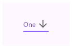 | |
| /// | |
| /// ```dart | |
| /// String dropdownValue = 'One'; | |
| /// | |
| /// @override | |
| /// Widget build(BuildContext context) { | |
| /// return DropdownButton<String>( | |
| /// value: dropdownValue, | |
| /// icon: const Icon(Icons.arrow_downward), | |
| /// iconSize: 24, | |
| /// elevation: 16, | |
| /// style: const TextStyle( | |
| /// color: Colors.deepPurple | |
| /// ), | |
| /// underline: Container( | |
| /// height: 2, | |
| /// color: Colors.deepPurpleAccent, | |
| /// ), | |
| /// onChanged: (String? newValue) { | |
| /// setState(() { | |
| /// dropdownValue = newValue!; | |
| /// }); | |
| /// }, | |
| /// items: <String>['One', 'Two', 'Free', 'Four'] | |
| /// .map<DropdownMenuItem<String>>((String value) { | |
| /// return DropdownMenuItem<String>( | |
| /// value: value, | |
| /// child: Text(value), | |
| /// ); | |
| /// }) | |
| /// .toList(), | |
| /// ); | |
| /// } | |
| /// ``` | |
| /// {@end-tool} | |
| /// | |
| /// If the [onChanged] callback is null or the list of [items] is null | |
| /// then the dropdown button will be disabled, i.e. its arrow will be | |
| /// displayed in grey and it will not respond to input. A disabled button | |
| /// will display the [disabledHint] widget if it is non-null. However, if | |
| /// [disabledHint] is null and [hint] is non-null, the [hint] widget will | |
| /// instead be displayed. | |
| /// | |
| /// Requires one of its ancestors to be a [Material] widget. | |
| /// | |
| /// See also: | |
| /// | |
| /// * [DropdownMenuItem], the class used to represent the [items]. | |
| /// * [DropdownButtonHideUnderline], which prevents its descendant dropdown buttons | |
| /// from displaying their underlines. | |
| /// * [ElevatedButton], [TextButton], ordinary buttons that trigger a single action. | |
| /// * <https://material.io/design/components/menus.html#dropdown-menu> | |
| class CustomDropdownButton<T> extends StatefulWidget { | |
| /// Creates a dropdown button. | |
| /// | |
| /// The [items] must have distinct values. If [value] isn't null then it | |
| /// must be equal to one of the [DropdownMenuItem] values. If [items] or | |
| /// [onChanged] is null, the button will be disabled, the down arrow | |
| /// will be greyed out. | |
| /// | |
| /// If [value] is null and the button is enabled, [hint] will be displayed | |
| /// if it is non-null. | |
| /// | |
| /// If [value] is null and the button is disabled, [disabledHint] will be displayed | |
| /// if it is non-null. If [disabledHint] is null, then [hint] will be displayed | |
| /// if it is non-null. | |
| /// | |
| /// The [elevation] and [iconSize] arguments must not be null (they both have | |
| /// defaults, so do not need to be specified). The boolean [isDense] and | |
| /// [isExpanded] arguments must not be null. | |
| /// | |
| /// The [autofocus] argument must not be null. | |
| /// | |
| /// The [dropdownColor] argument specifies the background color of the | |
| /// dropdown when it is open. If it is null, the current theme's | |
| /// [ThemeData.canvasColor] will be used instead. | |
| CustomDropdownButton({ | |
| Key? key, | |
| required this.items, | |
| this.selectedItemBuilder, | |
| this.value, | |
| this.hint, | |
| this.disabledHint, | |
| this.onChanged, | |
| this.onTap, | |
| this.elevation = 8, | |
| this.style, | |
| this.underline, | |
| this.icon, | |
| this.iconDisabledColor, | |
| this.iconEnabledColor, | |
| this.iconSize = 24.0, | |
| this.isDense = false, | |
| this.isExpanded = false, | |
| this.itemHeight = kMinInteractiveDimension, | |
| this.focusColor, | |
| this.focusNode, | |
| this.autofocus = false, | |
| this.dropdownColor, | |
| this.menuMaxHeight, | |
| this.menuRadius, | |
| this.menuPadding, | |
| this.itemPadding, | |
| this.menuClip = Clip.none, | |
| this.menuDecoration, | |
| // When adding new arguments, consider adding similar arguments to | |
| // DropdownButtonFormField. | |
| }) : assert( | |
| items == null || | |
| items.isEmpty || | |
| value == null || | |
| items.where((DropdownMenuItem<T> item) { | |
| return item.value == value; | |
| }).length == | |
| 1, | |
| "There should be exactly one item with [DropdownButton]'s value: " | |
| '$value. \n' | |
| 'Either zero or 2 or more [DropdownMenuItem]s were detected ' | |
| 'with the same value', | |
| ), | |
| assert(elevation != null), | |
| assert(iconSize != null), | |
| assert(isDense != null), | |
| assert(isExpanded != null), | |
| assert(autofocus != null), | |
| assert(itemHeight == null || itemHeight >= kMinInteractiveDimension), | |
| super(key: key); | |
| /// The list of items the user can select. | |
| /// | |
| /// If the [onChanged] callback is null or the list of items is null | |
| /// then the dropdown button will be disabled, i.e. its arrow will be | |
| /// displayed in grey and it will not respond to input. | |
| final List<DropdownMenuItem<T>>? items; | |
| /// The value of the currently selected [DropdownMenuItem]. | |
| /// | |
| /// If [value] is null and the button is enabled, [hint] will be displayed | |
| /// if it is non-null. | |
| /// | |
| /// If [value] is null and the button is disabled, [disabledHint] will be displayed | |
| /// if it is non-null. If [disabledHint] is null, then [hint] will be displayed | |
| /// if it is non-null. | |
| final T? value; | |
| /// A placeholder widget that is displayed by the dropdown button. | |
| /// | |
| /// If [value] is null and the dropdown is enabled ([items] and [onChanged] are non-null), | |
| /// this widget is displayed as a placeholder for the dropdown button's value. | |
| /// | |
| /// If [value] is null and the dropdown is disabled and [disabledHint] is null, | |
| /// this widget is used as the placeholder. | |
| final Widget? hint; | |
| /// A preferred placeholder widget that is displayed when the dropdown is disabled. | |
| /// | |
| /// If [value] is null, the dropdown is disabled ([items] or [onChanged] is null), | |
| /// this widget is displayed as a placeholder for the dropdown button's value. | |
| final Widget? disabledHint; | |
| /// {@template flutter.material.dropdownButton.onChanged} | |
| /// Called when the user selects an item. | |
| /// | |
| /// If the [onChanged] callback is null or the list of [CustomDropdownButton.items] | |
| /// is null then the dropdown button will be disabled, i.e. its arrow will be | |
| /// displayed in grey and it will not respond to input. A disabled button | |
| /// will display the [CustomDropdownButton.disabledHint] widget if it is non-null. | |
| /// If [CustomDropdownButton.disabledHint] is also null but [CustomDropdownButton.hint] is | |
| /// non-null, [CustomDropdownButton.hint] will instead be displayed. | |
| /// {@endtemplate} | |
| final ValueChanged<T?>? onChanged; | |
| /// Called when the dropdown button is tapped. | |
| /// | |
| /// This is distinct from [onChanged], which is called when the user | |
| /// selects an item from the dropdown. | |
| /// | |
| /// The callback will not be invoked if the dropdown button is disabled. | |
| final VoidCallback? onTap; | |
| /// A builder to customize the dropdown buttons corresponding to the | |
| /// [DropdownMenuItem]s in [items]. | |
| /// | |
| /// When a [DropdownMenuItem] is selected, the widget that will be displayed | |
| /// from the list corresponds to the [DropdownMenuItem] of the same index | |
| /// in [items]. | |
| /// | |
| /// {@tool dartpad --template=stateful_widget_scaffold} | |
| /// | |
| /// This sample shows a `DropdownButton` with a button with [Text] that | |
| /// corresponds to but is unique from [DropdownMenuItem]. | |
| /// | |
| /// ```dart | |
| /// final List<String> items = <String>['1','2','3']; | |
| /// String selectedItem = '1'; | |
| /// | |
| /// @override | |
| /// Widget build(BuildContext context) { | |
| /// return Padding( | |
| /// padding: const EdgeInsets.symmetric(horizontal: 12.0), | |
| /// child: DropdownButton<String>( | |
| /// value: selectedItem, | |
| /// onChanged: (String? string) => setState(() => selectedItem = string!), | |
| /// selectedItemBuilder: (BuildContext context) { | |
| /// return items.map<Widget>((String item) { | |
| /// return Text(item); | |
| /// }).toList(); | |
| /// }, | |
| /// items: items.map((String item) { | |
| /// return DropdownMenuItem<String>( | |
| /// child: Text('Log $item'), | |
| /// value: item, | |
| /// ); | |
| /// }).toList(), | |
| /// ), | |
| /// ); | |
| /// } | |
| /// ``` | |
| /// {@end-tool} | |
| /// | |
| /// If this callback is null, the [DropdownMenuItem] from [items] | |
| /// that matches [value] will be displayed. | |
| final DropdownButtonBuilder? selectedItemBuilder; | |
| /// The z-coordinate at which to place the menu when open. | |
| /// | |
| /// The following elevations have defined shadows: 1, 2, 3, 4, 6, 8, 9, 12, | |
| /// 16, and 24. See [kElevationToShadow]. | |
| /// | |
| /// Defaults to 8, the appropriate elevation for dropdown buttons. | |
| final int elevation; | |
| /// custom props. | |
| final BorderRadius? menuRadius; | |
| final EdgeInsets? itemPadding; | |
| final EdgeInsets? menuPadding; | |
| final Clip menuClip; | |
| final BoxDecoration? menuDecoration; | |
| /// The text style to use for text in the dropdown button and the dropdown | |
| /// menu that appears when you tap the button. | |
| /// | |
| /// To use a separate text style for selected item when it's displayed within | |
| /// the dropdown button, consider using [selectedItemBuilder]. | |
| /// | |
| /// {@tool dartpad --template=stateful_widget_scaffold} | |
| /// | |
| /// This sample shows a `DropdownButton` with a dropdown button text style | |
| /// that is different than its menu items. | |
| /// | |
| /// ```dart | |
| /// List<String> options = <String>['One', 'Two', 'Free', 'Four']; | |
| /// String dropdownValue = 'One'; | |
| /// | |
| /// @override | |
| /// Widget build(BuildContext context) { | |
| /// return Container( | |
| /// alignment: Alignment.center, | |
| /// color: Colors.blue, | |
| /// child: DropdownButton<String>( | |
| /// value: dropdownValue, | |
| /// onChanged: (String? newValue) { | |
| /// setState(() { | |
| /// dropdownValue = newValue!; | |
| /// }); | |
| /// }, | |
| /// style: const TextStyle(color: Colors.blue), | |
| /// selectedItemBuilder: (BuildContext context) { | |
| /// return options.map((String value) { | |
| /// return Text( | |
| /// dropdownValue, | |
| /// style: const TextStyle(color: Colors.white), | |
| /// ); | |
| /// }).toList(); | |
| /// }, | |
| /// items: options.map<DropdownMenuItem<String>>((String value) { | |
| /// return DropdownMenuItem<String>( | |
| /// value: value, | |
| /// child: Text(value), | |
| /// ); | |
| /// }).toList(), | |
| /// ), | |
| /// ); | |
| /// } | |
| /// ``` | |
| /// {@end-tool} | |
| /// | |
| /// Defaults to the [TextTheme.subtitle1] value of the current | |
| /// [ThemeData.textTheme] of the current [Theme]. | |
| final TextStyle? style; | |
| /// The widget to use for drawing the drop-down button's underline. | |
| /// | |
| /// Defaults to a 0.0 width bottom border with color 0xFFBDBDBD. | |
| final Widget? underline; | |
| /// The widget to use for the drop-down button's icon. | |
| /// | |
| /// Defaults to an [Icon] with the [Icons.arrow_drop_down] glyph. | |
| final Widget? icon; | |
| /// The color of any [Icon] descendant of [icon] if this button is disabled, | |
| /// i.e. if [onChanged] is null. | |
| /// | |
| /// Defaults to [MaterialColor.shade400] of [Colors.grey] when the theme's | |
| /// [ThemeData.brightness] is [Brightness.light] and to | |
| /// [Colors.white10] when it is [Brightness.dark] | |
| final Color? iconDisabledColor; | |
| /// The color of any [Icon] descendant of [icon] if this button is enabled, | |
| /// i.e. if [onChanged] is defined. | |
| /// | |
| /// Defaults to [MaterialColor.shade700] of [Colors.grey] when the theme's | |
| /// [ThemeData.brightness] is [Brightness.light] and to | |
| /// [Colors.white70] when it is [Brightness.dark] | |
| final Color? iconEnabledColor; | |
| /// The size to use for the drop-down button's down arrow icon button. | |
| /// | |
| /// Defaults to 24.0. | |
| final double iconSize; | |
| /// Reduce the button's height. | |
| /// | |
| /// By default this button's height is the same as its menu items' heights. | |
| /// If isDense is true, the button's height is reduced by about half. This | |
| /// can be useful when the button is embedded in a container that adds | |
| /// its own decorations, like [InputDecorator]. | |
| final bool isDense; | |
| /// Set the dropdown's inner contents to horizontally fill its parent. | |
| /// | |
| /// By default this button's inner width is the minimum size of its contents. | |
| /// If [isExpanded] is true, the inner width is expanded to fill its | |
| /// surrounding container. | |
| final bool isExpanded; | |
| /// If null, then the menu item heights will vary according to each menu item's | |
| /// intrinsic height. | |
| /// | |
| /// The default value is [kMinInteractiveDimension], which is also the minimum | |
| /// height for menu items. | |
| /// | |
| /// If this value is null and there isn't enough vertical room for the menu, | |
| /// then the menu's initial scroll offset may not align the selected item with | |
| /// the dropdown button. That's because, in this case, the initial scroll | |
| /// offset is computed as if all of the menu item heights were | |
| /// [kMinInteractiveDimension]. | |
| final double? itemHeight; | |
| /// The color for the button's [Material] when it has the input focus. | |
| final Color? focusColor; | |
| /// {@macro flutter.widgets.Focus.focusNode} | |
| final FocusNode? focusNode; | |
| /// {@macro flutter.widgets.Focus.autofocus} | |
| final bool autofocus; | |
| /// The background color of the dropdown. | |
| /// | |
| /// If it is not provided, the theme's [ThemeData.canvasColor] will be used | |
| /// instead. | |
| final Color? dropdownColor; | |
| /// The maximum height of the menu. | |
| /// | |
| /// The maximum height of the menu must be at least one row shorter than | |
| /// the height of the app's view. This ensures that a tappable area | |
| /// outside of the simple menu is present so the user can dismiss the menu. | |
| /// | |
| /// If this property is set above the maximum allowable height threshold | |
| /// mentioned above, then the menu defaults to being padded at the top | |
| /// and bottom of the menu by at one menu item's height. | |
| final double? menuMaxHeight; | |
| @override | |
| _CustomDropdownButtonState<T> createState() => | |
| _CustomDropdownButtonState<T>(); | |
| } | |
| class _CustomDropdownButtonState<T> extends State<CustomDropdownButton<T>> | |
| with WidgetsBindingObserver { | |
| int? _selectedIndex; | |
| _DropdownRoute<T>? _dropdownRoute; | |
| Orientation? _lastOrientation; | |
| FocusNode? _internalNode; | |
| FocusNode? get focusNode => widget.focusNode ?? _internalNode; | |
| bool _hasPrimaryFocus = false; | |
| late Map<Type, Action<Intent>> _actionMap; | |
| late FocusHighlightMode _focusHighlightMode; | |
| // Only used if needed to create _internalNode. | |
| FocusNode _createFocusNode() { | |
| return FocusNode(debugLabel: '${widget.runtimeType}'); | |
| } | |
| @override | |
| void initState() { | |
| super.initState(); | |
| _updateSelectedIndex(); | |
| if (widget.focusNode == null) { | |
| _internalNode ??= _createFocusNode(); | |
| } | |
| _actionMap = <Type, Action<Intent>>{ | |
| ActivateIntent: CallbackAction<ActivateIntent>( | |
| onInvoke: (ActivateIntent intent) => _handleTap(), | |
| ), | |
| ButtonActivateIntent: CallbackAction<ButtonActivateIntent>( | |
| onInvoke: (ButtonActivateIntent intent) => _handleTap(), | |
| ), | |
| }; | |
| focusNode!.addListener(_handleFocusChanged); | |
| final FocusManager focusManager = WidgetsBinding.instance!.focusManager; | |
| _focusHighlightMode = focusManager.highlightMode; | |
| focusManager.addHighlightModeListener(_handleFocusHighlightModeChange); | |
| } | |
| @override | |
| void dispose() { | |
| WidgetsBinding.instance!.removeObserver(this); | |
| _removeDropdownRoute(); | |
| WidgetsBinding.instance!.focusManager | |
| .removeHighlightModeListener(_handleFocusHighlightModeChange); | |
| focusNode!.removeListener(_handleFocusChanged); | |
| _internalNode?.dispose(); | |
| super.dispose(); | |
| } | |
| void _removeDropdownRoute() { | |
| _dropdownRoute?._dismiss(); | |
| _dropdownRoute = null; | |
| _lastOrientation = null; | |
| } | |
| void _handleFocusChanged() { | |
| if (_hasPrimaryFocus != focusNode!.hasPrimaryFocus) { | |
| setState(() { | |
| _hasPrimaryFocus = focusNode!.hasPrimaryFocus; | |
| }); | |
| } | |
| } | |
| void _handleFocusHighlightModeChange(FocusHighlightMode mode) { | |
| if (!mounted) { | |
| return; | |
| } | |
| setState(() { | |
| _focusHighlightMode = mode; | |
| }); | |
| } | |
| @override | |
| void didUpdateWidget(CustomDropdownButton<T> oldWidget) { | |
| super.didUpdateWidget(oldWidget); | |
| if (widget.focusNode != oldWidget.focusNode) { | |
| oldWidget.focusNode?.removeListener(_handleFocusChanged); | |
| if (widget.focusNode == null) { | |
| _internalNode ??= _createFocusNode(); | |
| } | |
| _hasPrimaryFocus = focusNode!.hasPrimaryFocus; | |
| focusNode!.addListener(_handleFocusChanged); | |
| } | |
| _updateSelectedIndex(); | |
| } | |
| void _updateSelectedIndex() { | |
| if (widget.items == null || | |
| widget.items!.isEmpty || | |
| (widget.value == null && | |
| widget.items! | |
| .where((DropdownMenuItem<T> item) => item.value == widget.value) | |
| .isEmpty)) { | |
| _selectedIndex = null; | |
| return; | |
| } | |
| assert(widget.items! | |
| .where((DropdownMenuItem<T> item) => item.value == widget.value) | |
| .length == | |
| 1); | |
| for (int itemIndex = 0; itemIndex < widget.items!.length; itemIndex++) { | |
| if (widget.items![itemIndex].value == widget.value) { | |
| _selectedIndex = itemIndex; | |
| return; | |
| } | |
| } | |
| } | |
| TextStyle? get _textStyle => | |
| widget.style ?? Theme.of(context).textTheme.subtitle1; | |
| void _handleTap() { | |
| final TextDirection? textDirection = Directionality.maybeOf(context); | |
| final EdgeInsetsGeometry menuMargin = | |
| ButtonTheme.of(context).alignedDropdown | |
| ? _kAlignedMenuMargin | |
| : _kUnalignedMenuMargin; | |
| final List<_MenuItem<T>> menuItems = <_MenuItem<T>>[ | |
| for (int index = 0; index < widget.items!.length; index += 1) | |
| _MenuItem<T>( | |
| item: widget.items![index], | |
| onLayout: (Size size) { | |
| // If [_dropdownRoute] is null and onLayout is called, this means | |
| // that performLayout was called on a _DropdownRoute that has not | |
| // left the widget tree but is already on its way out. | |
| // | |
| // Since onLayout is used primarily to collect the desired heights | |
| // of each menu item before laying them out, not having the _DropdownRoute | |
| // collect each item's height to lay out is fine since the route is | |
| // already on its way out. | |
| if (_dropdownRoute == null) return; | |
| _dropdownRoute!.itemHeights[index] = size.height; | |
| }, | |
| ), | |
| ]; | |
| final NavigatorState navigator = Navigator.of(context); | |
| assert(_dropdownRoute == null); | |
| final RenderBox itemBox = context.findRenderObject()! as RenderBox; | |
| final Rect itemRect = itemBox.localToGlobal(Offset.zero, | |
| ancestor: navigator.context.findRenderObject()) & | |
| itemBox.size; | |
| _dropdownRoute = _DropdownRoute<T>( | |
| items: menuItems, | |
| buttonRect: menuMargin.resolve(textDirection).inflateRect(itemRect), | |
| selectedIndex: _selectedIndex ?? 0, | |
| radius: widget.menuRadius, | |
| clipList: widget.menuClip, | |
| padding: (widget.itemPadding ?? _kMenuItemPadding).resolve(textDirection), | |
| listPadding: widget.menuPadding, | |
| backgroundDecoration: widget.menuDecoration, | |
| elevation: widget.elevation, | |
| capturedThemes: | |
| InheritedTheme.capture(from: context, to: navigator.context), | |
| style: _textStyle!, | |
| barrierLabel: MaterialLocalizations.of(context).modalBarrierDismissLabel, | |
| itemHeight: widget.itemHeight, | |
| dropdownColor: widget.dropdownColor, | |
| menuMaxHeight: widget.menuMaxHeight, | |
| ); | |
| navigator | |
| .push(_dropdownRoute!) | |
| .then<void>((_DropdownRouteResult<T>? newValue) { | |
| _removeDropdownRoute(); | |
| if (!mounted || newValue == null) return; | |
| widget.onChanged?.call(newValue.result); | |
| }); | |
| widget.onTap?.call(); | |
| } | |
| // When isDense is true, reduce the height of this button from _kMenuItemHeight to | |
| // _kDenseButtonHeight, but don't make it smaller than the text that it contains. | |
| // Similarly, we don't reduce the height of the button so much that its icon | |
| // would be clipped. | |
| double get _denseButtonHeight { | |
| final double fontSize = _textStyle!.fontSize ?? | |
| Theme.of(context).textTheme.subtitle1!.fontSize!; | |
| return math.max(fontSize, math.max(widget.iconSize, _kDenseButtonHeight)); | |
| } | |
| Color get _iconColor { | |
| // These colors are not defined in the Material Design spec. | |
| if (_enabled) { | |
| if (widget.iconEnabledColor != null) return widget.iconEnabledColor!; | |
| switch (Theme.of(context).brightness) { | |
| case Brightness.light: | |
| return Colors.grey.shade700; | |
| case Brightness.dark: | |
| return Colors.white70; | |
| } | |
| } else { | |
| if (widget.iconDisabledColor != null) return widget.iconDisabledColor!; | |
| switch (Theme.of(context).brightness) { | |
| case Brightness.light: | |
| return Colors.grey.shade400; | |
| case Brightness.dark: | |
| return Colors.white10; | |
| } | |
| } | |
| } | |
| bool get _enabled => | |
| widget.items != null && | |
| widget.items!.isNotEmpty && | |
| widget.onChanged != null; | |
| Orientation _getOrientation(BuildContext context) { | |
| Orientation? result = MediaQuery.maybeOf(context)?.orientation; | |
| if (result == null) { | |
| // If there's no MediaQuery, then use the window aspect to determine | |
| // orientation. | |
| final Size size = window.physicalSize; | |
| result = size.width > size.height | |
| ? Orientation.landscape | |
| : Orientation.portrait; | |
| } | |
| return result; | |
| } | |
| bool get _showHighlight { | |
| switch (_focusHighlightMode) { | |
| case FocusHighlightMode.touch: | |
| return false; | |
| case FocusHighlightMode.traditional: | |
| return _hasPrimaryFocus; | |
| } | |
| } | |
| @override | |
| Widget build(BuildContext context) { | |
| assert(debugCheckHasMaterial(context)); | |
| assert(debugCheckHasMaterialLocalizations(context)); | |
| final Orientation newOrientation = _getOrientation(context); | |
| _lastOrientation ??= newOrientation; | |
| if (newOrientation != _lastOrientation) { | |
| _removeDropdownRoute(); | |
| _lastOrientation = newOrientation; | |
| } | |
| // The width of the button and the menu are defined by the widest | |
| // item and the width of the hint. | |
| // We should explicitly type the items list to be a list of <Widget>, | |
| // otherwise, no explicit type adding items maybe trigger a crash/failure | |
| // when hint and selectedItemBuilder are provided. | |
| final List<Widget> items = widget.selectedItemBuilder == null | |
| ? (widget.items != null ? List<Widget>.from(widget.items!) : <Widget>[]) | |
| : List<Widget>.from(widget.selectedItemBuilder!(context)); | |
| int? hintIndex; | |
| if (widget.hint != null || (!_enabled && widget.disabledHint != null)) { | |
| Widget displayedHint = | |
| _enabled ? widget.hint! : widget.disabledHint ?? widget.hint!; | |
| if (widget.selectedItemBuilder == null) | |
| displayedHint = _DropdownMenuItemContainer(child: displayedHint); | |
| hintIndex = items.length; | |
| items.add(DefaultTextStyle( | |
| style: _textStyle!.copyWith(color: Theme.of(context).hintColor), | |
| child: IgnorePointer( | |
| ignoringSemantics: false, | |
| child: displayedHint, | |
| ), | |
| )); | |
| } | |
| final EdgeInsetsGeometry padding = ButtonTheme.of(context).alignedDropdown | |
| ? _kAlignedButtonPadding | |
| : _kUnalignedButtonPadding; | |
| // If value is null (then _selectedIndex is null) then we | |
| // display the hint or nothing at all. | |
| final Widget innerItemsWidget; | |
| if (items.isEmpty) { | |
| innerItemsWidget = Container(); | |
| } else { | |
| innerItemsWidget = IndexedStack( | |
| index: _selectedIndex ?? hintIndex, | |
| alignment: AlignmentDirectional.centerStart, | |
| children: widget.isDense | |
| ? items | |
| : items.map((Widget item) { | |
| return widget.itemHeight != null | |
| ? SizedBox(height: widget.itemHeight, child: item) | |
| : Column( | |
| mainAxisSize: MainAxisSize.min, | |
| children: <Widget>[item]); | |
| }).toList(), | |
| ); | |
| } | |
| const Icon defaultIcon = Icon(Icons.arrow_drop_down); | |
| Widget result = DefaultTextStyle( | |
| style: _enabled | |
| ? _textStyle! | |
| : _textStyle!.copyWith(color: Theme.of(context).disabledColor), | |
| child: Container( | |
| decoration: _showHighlight | |
| ? BoxDecoration( | |
| color: widget.focusColor ?? Theme.of(context).focusColor, | |
| borderRadius: const BorderRadius.all(Radius.circular(4.0)), | |
| ) | |
| : null, | |
| padding: padding.resolve(Directionality.of(context)), | |
| height: widget.isDense ? _denseButtonHeight : null, | |
| child: Row( | |
| mainAxisAlignment: MainAxisAlignment.spaceBetween, | |
| mainAxisSize: MainAxisSize.min, | |
| children: <Widget>[ | |
| if (widget.isExpanded) | |
| Expanded(child: innerItemsWidget) | |
| else | |
| innerItemsWidget, | |
| IconTheme( | |
| data: IconThemeData( | |
| color: _iconColor, | |
| size: widget.iconSize, | |
| ), | |
| child: widget.icon ?? defaultIcon, | |
| ), | |
| ], | |
| ), | |
| ), | |
| ); | |
| if (!DropdownButtonHideUnderline.at(context)) { | |
| final double bottom = | |
| (widget.isDense || widget.itemHeight == null) ? 0.0 : 8.0; | |
| result = Stack( | |
| children: <Widget>[ | |
| result, | |
| Positioned( | |
| left: 0.0, | |
| right: 0.0, | |
| bottom: bottom, | |
| child: widget.underline ?? | |
| Container( | |
| height: 1.0, | |
| decoration: const BoxDecoration( | |
| border: Border( | |
| bottom: BorderSide( | |
| color: Color(0xFFBDBDBD), | |
| width: 0.0, | |
| ), | |
| ), | |
| ), | |
| ), | |
| ), | |
| ], | |
| ); | |
| } | |
| return Semantics( | |
| button: true, | |
| child: Actions( | |
| actions: _actionMap, | |
| child: Focus( | |
| canRequestFocus: _enabled, | |
| focusNode: focusNode, | |
| autofocus: widget.autofocus, | |
| child: GestureDetector( | |
| onTap: _enabled ? _handleTap : null, | |
| behavior: HitTestBehavior.opaque, | |
| child: result, | |
| ), | |
| ), | |
| ), | |
| ); | |
| } | |
| } | |
| /// A convenience widget that makes a [CustomDropdownButton] into a [FormField]. | |
| class CustomDropdownButtonFormField<T> extends FormField<T> { | |
| /// Creates a [CustomDropdownButton] widget that is a [FormField], wrapped in an | |
| /// [InputDecorator]. | |
| /// | |
| /// For a description of the `onSaved`, `validator`, or `autovalidateMode` | |
| /// parameters, see [FormField]. For the rest (other than [decoration]), see | |
| /// [CustomDropdownButton]. | |
| /// | |
| /// The `items`, `elevation`, `iconSize`, `isDense`, `isExpanded`, | |
| /// `autofocus`, and `decoration` parameters must not be null. | |
| CustomDropdownButtonFormField({ | |
| Key? key, | |
| required List<DropdownMenuItem<T>>? items, | |
| DropdownButtonBuilder? selectedItemBuilder, | |
| T? value, | |
| Widget? hint, | |
| Widget? disabledHint, | |
| this.onChanged, | |
| VoidCallback? onTap, | |
| int elevation = 8, | |
| TextStyle? style, | |
| Widget? icon, | |
| Color? iconDisabledColor, | |
| Color? iconEnabledColor, | |
| double iconSize = 24.0, | |
| bool isDense = true, | |
| bool isExpanded = false, | |
| double? itemHeight, | |
| Color? focusColor, | |
| FocusNode? focusNode, | |
| bool autofocus = false, | |
| Color? dropdownColor, | |
| InputDecoration? decoration, | |
| FormFieldSetter<T>? onSaved, | |
| FormFieldValidator<T>? validator, | |
| @Deprecated( | |
| 'Use autovalidateMode parameter which provide more specific ' | |
| 'behaviour related to auto validation. ' | |
| 'This feature was deprecated after v1.19.0.', | |
| ) | |
| bool autovalidate = false, | |
| AutovalidateMode? autovalidateMode, | |
| double? menuMaxHeight, | |
| }) : assert( | |
| items == null || | |
| items.isEmpty || | |
| value == null || | |
| items.where((DropdownMenuItem<T> item) { | |
| return item.value == value; | |
| }).length == | |
| 1, | |
| "There should be exactly one item with [DropdownButton]'s value: " | |
| '$value. \n' | |
| 'Either zero or 2 or more [DropdownMenuItem]s were detected ' | |
| 'with the same value', | |
| ), | |
| assert(elevation != null), | |
| assert(iconSize != null), | |
| assert(isDense != null), | |
| assert(isExpanded != null), | |
| assert(itemHeight == null || itemHeight >= kMinInteractiveDimension), | |
| assert(autofocus != null), | |
| assert(autovalidate != null), | |
| assert( | |
| autovalidate == false || | |
| autovalidate == true && autovalidateMode == null, | |
| 'autovalidate and autovalidateMode should not be used together.', | |
| ), | |
| decoration = decoration ?? InputDecoration(focusColor: focusColor), | |
| super( | |
| key: key, | |
| onSaved: onSaved, | |
| initialValue: value, | |
| validator: validator, | |
| autovalidateMode: autovalidate | |
| ? AutovalidateMode.always | |
| : (autovalidateMode ?? AutovalidateMode.disabled), | |
| builder: (FormFieldState<T> field) { | |
| final _DropdownButtonFormFieldState<T> state = | |
| field as _DropdownButtonFormFieldState<T>; | |
| final InputDecoration decorationArg = | |
| decoration ?? InputDecoration(focusColor: focusColor); | |
| final InputDecoration effectiveDecoration = | |
| decorationArg.applyDefaults( | |
| Theme.of(field.context).inputDecorationTheme, | |
| ); | |
| // An unfocusable Focus widget so that this widget can detect if its | |
| // descendants have focus or not. | |
| return Focus( | |
| canRequestFocus: false, | |
| skipTraversal: true, | |
| child: Builder(builder: (BuildContext context) { | |
| return InputDecorator( | |
| decoration: | |
| effectiveDecoration.copyWith(errorText: field.errorText), | |
| isEmpty: state.value == null, | |
| isFocused: Focus.of(context).hasFocus, | |
| child: DropdownButtonHideUnderline( | |
| child: CustomDropdownButton<T>( | |
| items: items, | |
| selectedItemBuilder: selectedItemBuilder, | |
| value: state.value, | |
| hint: hint, | |
| disabledHint: disabledHint, | |
| onChanged: onChanged == null ? null : state.didChange, | |
| onTap: onTap, | |
| elevation: elevation, | |
| style: style, | |
| icon: icon, | |
| iconDisabledColor: iconDisabledColor, | |
| iconEnabledColor: iconEnabledColor, | |
| iconSize: iconSize, | |
| isDense: isDense, | |
| isExpanded: isExpanded, | |
| itemHeight: itemHeight, | |
| focusColor: focusColor, | |
| focusNode: focusNode, | |
| autofocus: autofocus, | |
| dropdownColor: dropdownColor, | |
| menuMaxHeight: menuMaxHeight, | |
| ), | |
| ), | |
| ); | |
| }), | |
| ); | |
| }, | |
| ); | |
| /// {@macro flutter.material.dropdownButton.onChanged} | |
| final ValueChanged<T?>? onChanged; | |
| /// The decoration to show around the dropdown button form field. | |
| /// | |
| /// By default, draws a horizontal line under the dropdown button field but | |
| /// can be configured to show an icon, label, hint text, and error text. | |
| /// | |
| /// If not specified, an [InputDecorator] with the `focusColor` set to the | |
| /// supplied `focusColor` (if any) will be used. | |
| final InputDecoration decoration; | |
| @override | |
| FormFieldState<T> createState() => _DropdownButtonFormFieldState<T>(); | |
| } | |
| class _DropdownButtonFormFieldState<T> extends FormFieldState<T> { | |
| @override | |
| CustomDropdownButtonFormField<T> get widget => | |
| super.widget as CustomDropdownButtonFormField<T>; | |
| @override | |
| void didChange(T? value) { | |
| super.didChange(value); | |
| assert(widget.onChanged != null); | |
| widget.onChanged!(value); | |
| } | |
| @override | |
| void didUpdateWidget(CustomDropdownButtonFormField<T> oldWidget) { | |
| super.didUpdateWidget(oldWidget); | |
| if (oldWidget.initialValue != widget.initialValue) { | |
| setValue(widget.initialValue); | |
| } | |
| } | |
| } |
This file contains hidden or bidirectional Unicode text that may be interpreted or compiled differently than what appears below. To review, open the file in an editor that reveals hidden Unicode characters.
Learn more about bidirectional Unicode characters
| /// sample: | |
| MyAppDropdown( | |
| options: [ | |
| 'option 1', | |
| 'option 2', | |
| 'option 3', | |
| 'option 4' | |
| ], | |
| onChanged: (value) { | |
| print('selected option: $value'); | |
| }, | |
| ) | |
| /// widget: | |
| class MyAppDropdown extends StatelessWidget { | |
| final List<String> options; | |
| final ValueChanged<String?>? onChanged; | |
| final String? selected; | |
| final String? label; | |
| const MyAppDropdown({ | |
| Key? key, | |
| this.label = "Select a topic", | |
| required this.options, | |
| required this.onChanged, | |
| this.selected, | |
| }) : super(key: key); | |
| @override | |
| Widget build(BuildContext context) { | |
| final items = options | |
| .map( | |
| (e) => DropdownMenuItem( | |
| child: Text( | |
| e, | |
| style: const TextStyle( | |
| color: Color(0xffaeaeae), | |
| fontSize: 14, | |
| fontWeight: FontWeight.w400, | |
| letterSpacing: 0.252, | |
| ), | |
| ), | |
| value: e), | |
| ) | |
| .toList(growable: false); | |
| return Container( | |
| height: 60, | |
| padding: const EdgeInsets.symmetric(horizontal: 12.0, vertical: 6.0), | |
| decoration: BoxDecoration( | |
| color: const Color(0xff282835), | |
| border: Border.all(color: const Color(0xFF393A4B)), | |
| borderRadius: kBorderRadius8, | |
| ), | |
| child: CustomDropdownButton<String>( | |
| isExpanded: true, | |
| menuRadius: BorderRadius.circular(8), | |
| menuDecoration: BoxDecoration( | |
| color: Color(0xff282835), | |
| gradient: | |
| LinearGradient(colors: [Color(0xff282835), Colors.redAccent]), | |
| border: Border.all(color: Color(0xff393A4B), width: 2), | |
| boxShadow: [ | |
| BoxShadow( | |
| color: Colors.redAccent.withOpacity(1), | |
| blurRadius: 24, | |
| ), | |
| ]), | |
| menuPadding: EdgeInsets.zero, | |
| menuClip: Clip.antiAlias, | |
| hint: Text( | |
| label ?? "Select a topic", | |
| style: const TextStyle( | |
| color: Color(0xffaeaeae), | |
| fontSize: 14, | |
| fontWeight: FontWeight.w400, | |
| letterSpacing: 0.252, | |
| ), | |
| ), | |
| underline: const SizedBox.shrink(), | |
| // dropdownColor: Color(0xff282835), | |
| items: items, | |
| value: selected, | |
| elevation: 4, | |
| onChanged: onChanged, | |
| ), | |
| ); | |
| } | |
| } |
Sign up for free
to join this conversation on GitHub.
Already have an account?
Sign in to comment