Created
August 31, 2018 04:58
-
-
Save tobigithub/10d52d8befccd1dcf3504d9504191d41 to your computer and use it in GitHub Desktop.
This file contains hidden or bidirectional Unicode text that may be interpreted or compiled differently than what appears below. To review, open the file in an editor that reveals hidden Unicode characters.
Learn more about bidirectional Unicode characters
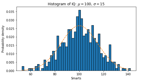
| import matplotlib | |
| import numpy as np | |
| import matplotlib.pyplot as plt | |
| np.random.seed(19680801) | |
| # example data | |
| mu = 100 # mean of distribution | |
| sigma = 15 # standard deviation of distribution | |
| x = mu + sigma * np.random.randn(437) | |
| num_bins = 50 | |
| plt.rcParams["figure.figsize"] = (6.66,4) | |
| fig, ax = plt.subplots() | |
| # the histogram of the data | |
| n, bins, patches = ax.hist(x, num_bins, density=1) | |
| # add a 'best fit' line | |
| y = ((1 / (np.sqrt(2 * np.pi) * sigma)) * | |
| np.exp(-0.5 * (1 / sigma * (bins - mu))**2)) | |
| ax.plot(bins, y, '--') | |
| ax.set_xlabel('Smarts') | |
| ax.set_ylabel('Probability density') | |
| ax.set_title(r'Histogram of IQ: $\mu=100$, $\sigma=15$') | |
| # Tweak spacing to prevent clipping of ylabel | |
| fig.tight_layout() | |
| plt.show() |
tobigithub
commented
Aug 31, 2018
Author
Sign up for free
to join this conversation on GitHub.
Already have an account?
Sign in to comment