See this Cloudup stream for visual references.
The short answer is that I miss everything. There is no comparing the two projects. Stash's feature set is a shadow of Github's.
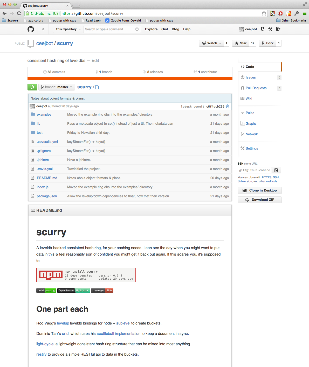
What a project looks like on Github:
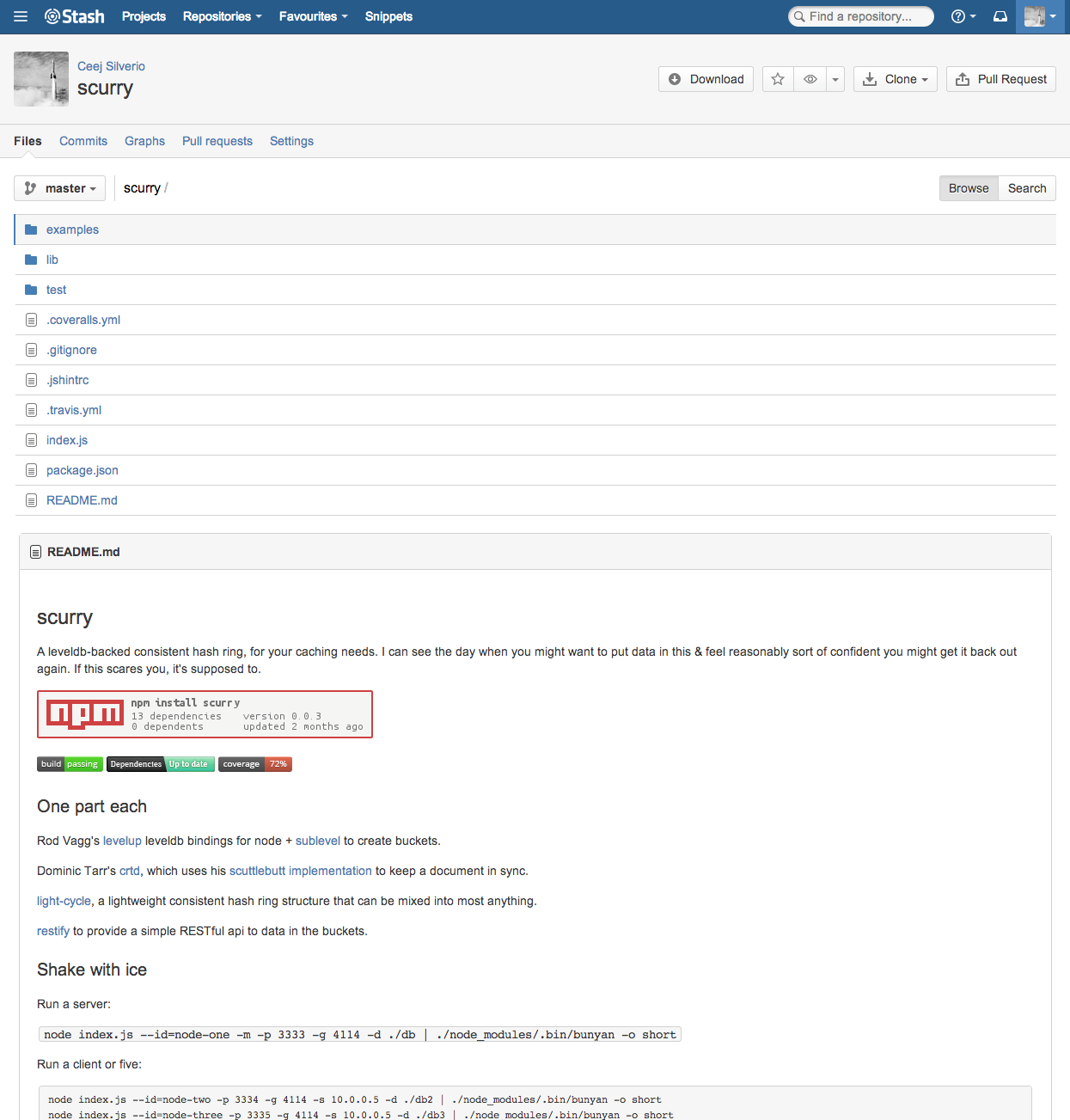
What the same project looks like on Stash:
The constrast is stark. The Stash project has:
- no project description
- no most recent commit message/contributor on top
- no most recent commit message/date for each item in the file browser
- no contributor information
- no commit count, no branch count
The Stash view shows almost no useful information at all. It renders the README markdown, which is nice. It fails to render previews of markdown anywhere else, however. It also only previews that one file type. On github, I can preview not only markdown everywhere, but also geojson files, 3D models, and csv files.
I didn't know how much I loved the ability to edit files right in the web page until I went to do it on Stash one day and couldn't.
Gists are ways to have conversations about code or anything without needing a full git repo. They're ways to share documents like this one.
They can be code files, markdown, or a fast way to share log data with teammates.
Stash has no equivalent. There's a plugin you can buy that lets you do something like a pastebin clone, but it's nowhere near as useful as the git-backed syntax-highlighted comment-enabled Gist.
Comparisons without PRs:
On github, I can click the "compare" button on any fork or branch to compare the state of my code to the other version. I can tinker with the comparison until I feel ready to make a pull request. Stash has no equivalent. If I want to compare branches, I must do it with the git command-line instead of with Stash.
Github has Github issues. Atlassian has Jira.
Jira is giant, complicated, littered with fields you don't care about, heavyweight. It takes forever to enter a single simple issue. It has no integration with Stash anyway: I have to paste in links to commits by hand, even when I've mentioned a bug number in a commit message. Perhaps some for-extra-money plugin exists to solve the integration problem, but nothing can solve the problem of a bug client that has lived long enough to accumulate that many fields for a bug.
Would any engineer ever choose to use Jira for a personal project?
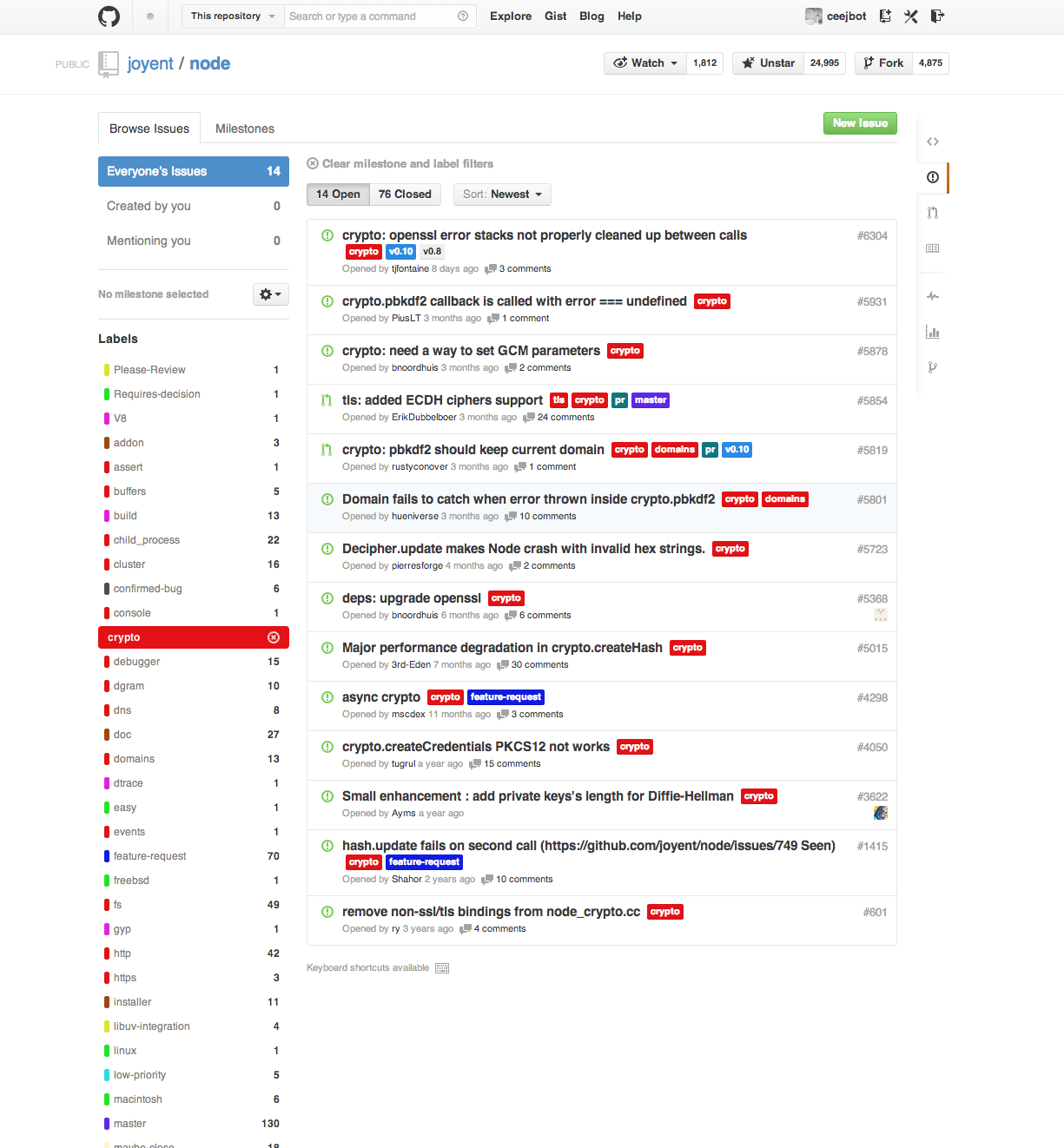
Github issues are simple and direct. Title, markdown description, assignee (optional), milestone (optional), tags (optional), markdown comments with link conveniences to commits & people. Excellent integration with the git workflow. The simplicity scales even to large busy projects, like this one:
The equivalent listing for the Stash project itself was three clicks in from the top page. I knew which links to click on so it didn't take me very long. I'm surprised by how much less information they manage to show on that page. I get far less of a sense of the project's activity than I do from the lighter-weight Github tool.
My engineering director assures me that Atlassian is a lot cheaper and that's why he went with it. That'd be the only reason anybody ever has for choosing it, but for mid-sized engineering organizations it can be a strong argument.
For a company of less than 500 people, Atlassian's pricing looks like this: $12000 + $16000 + $12000 = $40K/yr for the 3 Atlassian products
Github pricing is per seat. For a company the size of mine, with say 50 people needing accounts, it'd be $15K/yr. Over 150 people Github starts looking pretty bad. For many companies, hosting on Github's servers makes more sense, unless you don't want your code living on somebody else's disks.
Stash is a centralized server for git repos. It adds almost no value to me beyond that. If you want to do something interesting with git, you'll be doing it in the command line or a dedicated git client.
In response to Stash's browsing features, I have beefed up my git aliases considerably, so there's that.


