<button>Let's Go !</button>
Ian Egner webdevian
tunguskha
/ Gradient shadow in pure CSS.md
Last active
October 12, 2024 17:02
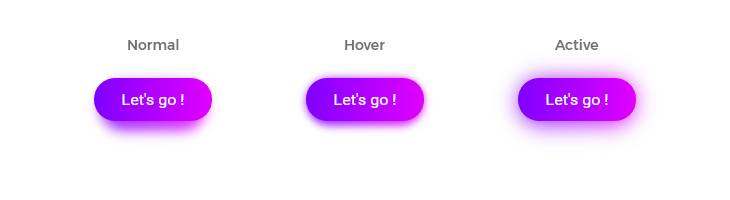
Gradient shadow in pure CSS
This file contains hidden or bidirectional Unicode text that may be interpreted or compiled differently than what appears below. To review, open the file in an editor that reveals hidden Unicode characters.
Learn more about bidirectional Unicode characters
| <!DOCTYPE html> | |
| <html prefix="og: http://ogp.me/ns#"> | |
| <head> | |
| <!-- content-type, which overrides http equivalent header. Because of charset, this meta should be set at first. --> | |
| <meta http-equiv="Content-Type" content="text/html; charset=utf-8"/> | |
| <!-- Overrides http equivalent header. This tells IE to use the most updated engine. --> | |
| <meta http-equiv="X-UA-Compatible" content="IE=Edge"> | |
| <!-- Tells crawlers how to crawl this page, and the role of this page. https://developer.mozilla.org/en-US/docs/Web/HTML/Element/meta --> | |
| <meta name="robots" content="index, follow"> |
This file contains hidden or bidirectional Unicode text that may be interpreted or compiled differently than what appears below. To review, open the file in an editor that reveals hidden Unicode characters.
Learn more about bidirectional Unicode characters
| 'use strict' | |
| const timeout = ms => new Promise(res => setTimeout(res, ms)) | |
| function convinceMe (convince) { | |
| let unixTime = Math.round(+new Date() / 1000) | |
| console.log(`Delay ${convince} at ${unixTime}`) | |
| } | |
| async function delay () { |
kylemclaren
/ findLongRunningOp.js
Last active
January 30, 2026 07:12
— forked from comerford/killLongRunningOps.js
Find and (safely) kill long running MongoDB ops
This file contains hidden or bidirectional Unicode text that may be interpreted or compiled differently than what appears below. To review, open the file in an editor that reveals hidden Unicode characters.
Learn more about bidirectional Unicode characters
| db.currentOp().inprog.forEach( | |
| function(op) { | |
| if(op.secs_running > 5) printjson(op); | |
| } | |
| ) |
webdevian
/ foundation-grid-columns-mixin
Last active
August 29, 2015 14:06
— forked from macbleser/foundation-grid-columns-mixin
Grid offset mixin
This file contains hidden or bidirectional Unicode text that may be interpreted or compiled differently than what appears below. To review, open the file in an editor that reveals hidden Unicode characters.
Learn more about bidirectional Unicode characters
| @mixin grid-offset( | |
| // Mobile First Media Queries | |
| $small-up-screens: false, | |
| $medium-up-screens: false, | |
| $large-up-screens: false, | |
| $xlarge-up-screens: false, | |
| $xxlarge-up-screens: false, | |
| // Specific Range Media Queries | |
| $small-only-screens: false, | |
| $medium-only-screens: false, |
macbleser
/ foundation-grid-columns-mixin
Last active
August 29, 2015 14:02
Foundation Grid Columns Mixin
This file contains hidden or bidirectional Unicode text that may be interpreted or compiled differently than what appears below. To review, open the file in an editor that reveals hidden Unicode characters.
Learn more about bidirectional Unicode characters
| // | |
| // Grid Columns | |
| // | |
| // A mixin to help make Foundation's grid-column mixin easier | |
| // to use when specifying multiple media quries/screen sizes | |
| @mixin grid-columns( | |
| // Mobile First Media Queries | |
| $small-up-screens: false, | |
| $medium-up-screens: false, |
⇐ back to the gist-blog at jrw.fi
Or, 16 cool things you may not have known your stylesheets could do. I'd rather have kept it to a nice round number like 10, but they just kept coming. Sorry.
I've been using SCSS/SASS for most of my styling work since 2009, and I'm a huge fan of Compass (by the great @chriseppstein). It really helped many of us through the darkest cross-browser crap. Even though browsers are increasingly playing nice with CSS, another problem has become very topical: managing the complexity in stylesheets as our in-browser apps get larger and larger. SCSS is an indispensable tool for dealing with this.
This isn't an introduction to the language by a long shot; many things probably won't make sense unless you have some SCSS under your belt already. That said, if you're not yet comfy with the basics, check out the aweso
This file contains hidden or bidirectional Unicode text that may be interpreted or compiled differently than what appears below. To review, open the file in an editor that reveals hidden Unicode characters.
Learn more about bidirectional Unicode characters
| # | |
| # Sample nginx.conf optimized for EC2 c1.medium to xlarge instances. | |
| # Also look at the haproxy.conf file for how the backend is balanced. | |
| # | |
| user "nginx" "nginx"; | |
| worker_processes 10; | |
| error_log /var/log/nginx_error.log info; |
This file contains hidden or bidirectional Unicode text that may be interpreted or compiled differently than what appears below. To review, open the file in an editor that reveals hidden Unicode characters.
Learn more about bidirectional Unicode characters
| function slugify(text) | |
| { | |
| return text.toString().toLowerCase() | |
| .replace(/\s+/g, '-') // Replace spaces with - | |
| .replace(/[^\w\-]+/g, '') // Remove all non-word chars | |
| .replace(/\-\-+/g, '-') // Replace multiple - with single - | |
| .replace(/^-+/, '') // Trim - from start of text | |
| .replace(/-+$/, ''); // Trim - from end of text | |
| } |