
-
-
Save helgasoft/b74c4f5c0532c83a8c0bbf571ae8cd02 to your computer and use it in GitHub Desktop.
| #' Area band (confidence bands) is a 'custom' serie with lower and upper boundaries | |
| #' When type='polygon', coordinates of the two boundaries are chained into a polygon and displayed as one. | |
| #' When type='stack', two (smooth) stacked lines are drawn, one with customizable areaStyle. | |
| #' The upper boundary coordinates should be values added on top of the lower boundary coordinates. | |
| #' Standard and custom(formatter) tooltips could be used. | |
| #' | |
| #' ec.init(load='custom') will preset values like dataset, xAxis, etc. | |
| #' those could be customized (like xAxis below), and new ones added - like legend and tooltip. | |
| library(echarty) | |
| set.seed(5) | |
| df <- data.frame( x = 1:10, y = runif(10, 5, 10)) %>% | |
| dplyr::mutate(lwr = y-runif(10, 1, 3), upr = y+runif(10, 2, 4)) | |
| # --------- type='stack' | |
| p <- df %>% ec.init(load='custom') | |
| p$x$opts$xAxis <- list(type='category', boundaryGap=FALSE) | |
| p$x$opts$series <- append( list(list(type='line', color='gold', name='line1')), | |
| ecr.band(df, 'lwr', 'upr', type='stack', name='stak') #, smooth=FALSE) | |
| ) | |
| p$x$opts$tooltip <- list(trigger = 'axis' | |
| ,formatter = htmlwidgets::JS("function(x) { | |
| let str = x.length>1 | |
| ? 'high <b>'+x[2].value[2]+'</b><br>line <b>'+x[0].value[1]+'</b><br>low <b>'+x[1].value[1]+'</b>' | |
| : 'line <b>'+x[0].value[1]+'</b>'; | |
| return str; }")) | |
| p$x$opts$legend <- list(ii='') | |
| p | |
| # --------- type='polygon' | |
| p <- df %>% ec.init(load='custom') | |
| p$x$opts$xAxis <- list(type='category', boundaryGap=FALSE) | |
| p$x$opts$series <- append( list(list(type='line', color='gold', name='line1')), | |
| ecr.band(df, 'lwr', 'upr', type='polygon', name='poly') | |
| ) | |
| p$x$opts$tooltip <- list(trigger = 'axis') | |
| p$x$opts$legend <- list(ii='') | |
| p | |


Good questions 👍 Will try to answer mostly with code. Let me know if something looks incomprehensible or not what you intended.
1) groups:
# lets add data groups to the original example
set.seed(5)
df <- data.frame( x = 1:30, y = runif(30, 5, 10), cat=sample(LETTERS[1:3],size=30, replace=TRUE)) %>%
  dplyr::mutate(lwr = y-runif(30, 1, 3), upr = y+runif(30, 2, 4))
band.df <- df  %>% group_by(cat) %>% group_split()

p <- df  %>% group_by(cat) %>% ec.init(load='custom', ctype='line')
p$x$opts$xAxis <- list(boundaryGap=FALSE, type='category')
for(ii in 1:3)   # add bands to their respective groups
  p$x$opts$series <- append(p$x$opts$series,   ecr.band(band.df[[ii]], 'lwr', 'upr', type='stack'))
p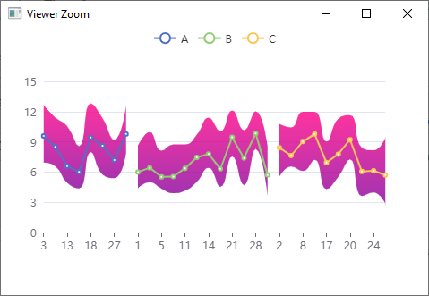
Now, by changing xAxis params, we can superimpose the graphs: p$x$opts$xAxis <- list(boundaryGap=FALSE, data=unique(df$x))
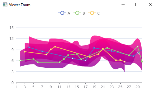
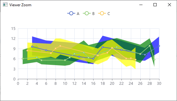
Looks messy... Lets customize the bands:
p <- df  %>% group_by(cat) %>% ec.init(load='custom', ctype='line')
p$x$opts$xAxis <- list(boundaryGap=FALSE, data=c(0,unique(df$x)), splitLine=list(show=TRUE))
for(ii in 1:3)   # add bands to their respective groups
  p$x$opts$series <- append(p$x$opts$series,
      ecr.band(band.df[[ii]], 'lwr', 'upr', type='stack', smooth=FALSE,
      name=unique(band.df[[ii]]$cat), areaStyle=list(color=c('blue','green','yellow')[ii])) )
p
Hovering the legend will highlight the group and band.
2) tooltips
I guess your question is about the formatter JS/HTML code. The default stack type (no formatter) tooltip p$x$opts$tooltip <- list(ii='') will show only line points. The band info is also available, but we need to use a formatter to get and display it. Formatter code is either ECharts specific or JavaScript(JS). JS code has to be a function enclosed in htmlwidgets::JS. The function parameter (x in example) represents the data available. Could be inspected(F12) in the browser with console.log:
... ,formatter = htmlwidgets::JS("function(x) { console.log(x); } ...
The rest is HTML tags like <br>,<b> or any other.
Hi there! Thanks again for the quick reply and illustrative example. I'm still having issues - I can get your example above to work, but am having a hard time reproducing the results with my own data. I've generated a small reproducible example:
Generating Data
scenario_1 = data.frame(year = 2022:2060,
           scenario = "Scenario 1",
           median = runif(length(2022:2060), min = 3376358, max = 7137382))

scenario_1 = scenario_1 %>%
  mutate(lower = median - runif(length(2022:2060), 1374548, 2347895),
         upper = median + runif(length(2022:2060), 1374548, 2347895))

scenario_2 = data.frame(year = 2022:2053,
                        scenario = "Scenario 2",
                        median = runif(length(2022:2053), min = 2376358, max = 6137382))

scenario_2 = scenario_2 %>%
  mutate(lower = median - runif(length(2022:2053), 1074548, 2347895),
         upper = median + runif(length(2022:2053), 1174548, 2347895))

# combining
combined_df = bind_rows(scenario_1, scenario_2) %>%
  arrange(year)

df_to_charty = combined_df %>%
  relocate(year, median, scenario, lower, upper) %>%
  tibble()

band_df = df_to_charty %>%
  group_by(scenario) %>%
  group_split()

band_df = lapply(band_df, data.frame) # ecr.band seems to report an error if this list is a list of tibbles and not dataframes
Attempting to plot
p = df_to_charty %>% group_by(scenario) %>% ec.init(load='custom', group1='line')
p$x$opts$xAxis <- list(boundaryGap=FALSE, data=c(0,unique(df_to_charty$year)), splitLine=list(show=TRUE))
for(i in 1:length(band_df)) {
  p$x$opts$series = append(p$x$opts$series,
                           ecr.band(band_df[[i]],
                                    'lower',
                                    'upper',
                                    type='stack',
                                    name=unique(band_df[[i]]$scenario))
  )
}
p
While it looks like the groups worked correctly in the legend, no data is plotted. Any help you could provide would be fantastic!
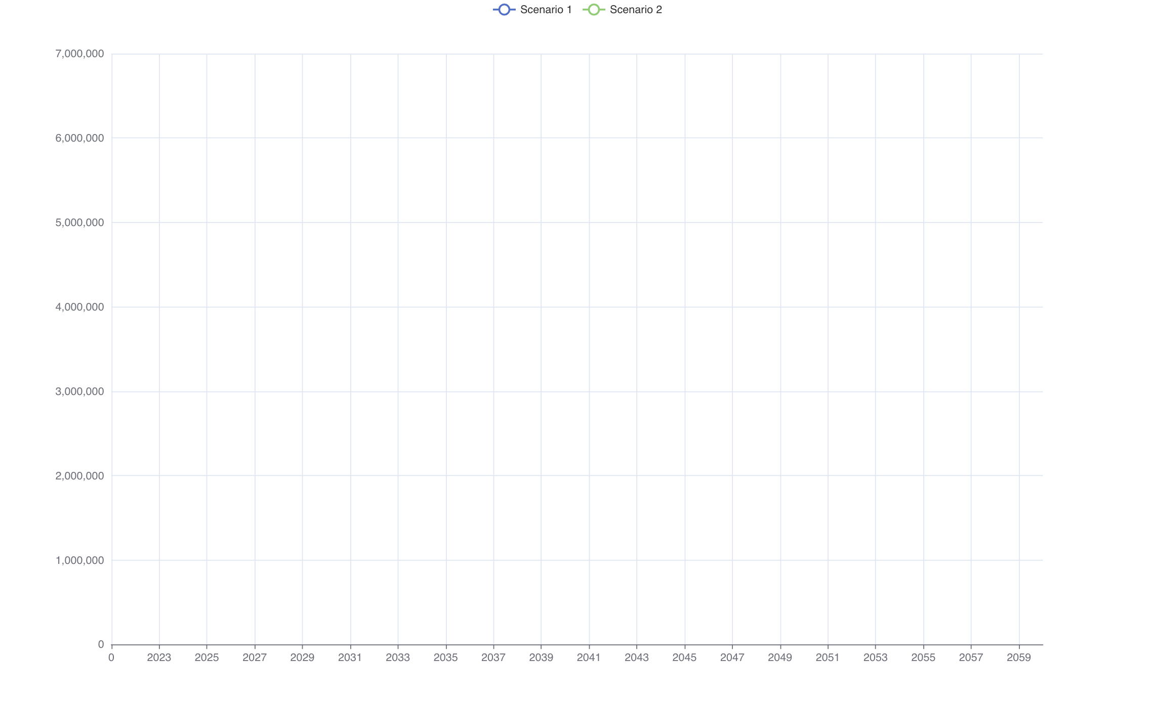
Your data is fine. There was a bug in echarty. Pushed a fix, please install.
remotes::install_github("helgasoft/echarty")    # v.3.1.1
library(echarty); library(dplyr)

p <- df_to_charty %>% group_by(scenario) %>% ec.init(load='custom', ctype='line')
p$x$opts$xAxis <- list(boundaryGap=FALSE, type='category', splitLine=list(show=TRUE))
for(i in 1:length(band_df)) {
    p$x$opts$series <- append(p$x$opts$series,
             ecr.band(band_df[[i]], 'lower', 'upper', type='stack',
                   stack=unique(band_df[[i]]$scenario),
                   name=unique(band_df[[i]]$scenario))
    )
}
p
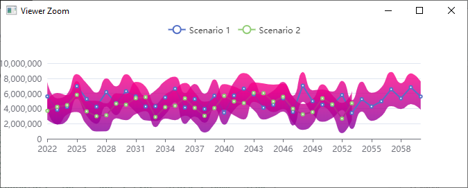
Works great! Thank you!
This is super helpful, but I'm struggling with two things: 1) making this work with groups (e.g. a given group has a median line and a confidence band) and 2) customizing the tooltip via the formatter. Any insight you have would be great - and thank you again for this great package!