-
-
Save gVallverdu/0b446d0061a785c808dbe79262a37eea to your computer and use it in GitHub Desktop.
| #!/usr/bin/env python3 | |
| # coding: utf-8 | |
| import matplotlib | |
| import matplotlib.pyplot as plt | |
| import pandas as pd | |
| import squarify | |
| import platform | |
| # print versions | |
| print("python : ", platform.python_version()) | |
| print("pandas : ", pd.__version__) | |
| print("matplotlib : ", matplotlib.__version__) | |
| print("squarify : 0.4.3") | |
| # quantities plotted | |
| # squarre area is the town surface area (superf) | |
| # color scale is the town population in 2011 (p11_pop) | |
| # read data from csv file | |
| # data from CAPP opendata http://opendata.agglo-pau.fr/index.php/fiche?idQ=27 | |
| df = pd.read_csv("Evolution_et_structure_de_la_population/Evolution_structure_population.csv", sep=";") | |
| df = df.set_index("libgeo") | |
| df = df[["superf", "p11_pop"]] | |
| df2 = df.sort_values(by="superf", ascending=False) | |
| # treemap parameters | |
| x = 0. | |
| y = 0. | |
| width = 100. | |
| height = 100. | |
| cmap = matplotlib.cm.viridis | |
| # color scale on the population | |
| # min and max values without Pau | |
| mini, maxi = df2.drop("PAU").p11_pop.min(), df2.drop("PAU").p11_pop.max() | |
| norm = matplotlib.colors.Normalize(vmin=mini, vmax=maxi) | |
| colors = [cmap(norm(value)) for value in df2.p11_pop] | |
| colors[1] = "#FBFCFE" | |
| # labels for squares | |
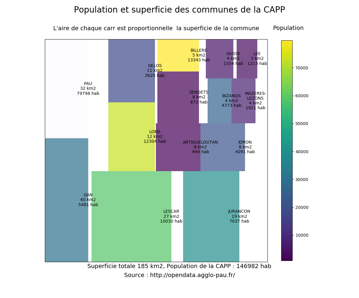
| labels = ["%s\n%d km2\n%d hab" % (label) for label in zip(df2.index, df2.superf, df2.p11_pop)] | |
| labels[11] = "MAZERES-\nLEZONS\n%d km2\n%d hab" % (df2["superf"]["MAZERES-LEZONS"], df2["p11_pop"]["MAZERES-LEZONS"]) | |
| # make plot | |
| fig = plt.figure(figsize=(12, 10)) | |
| fig.suptitle("Population et superficie des communes de la CAPP", fontsize=20) | |
| ax = fig.add_subplot(111, aspect="equal") | |
| ax = squarify.plot(df2.superf, color=colors, label=labels, ax=ax, alpha=.7) | |
| # use this if you want to draw a border between rectangles | |
| # you have to give both linewidth and edgecolor | |
| # ax = squarify.plot(df2.superf, color=colors, label=labels, ax=ax, alpha=.7, | |
| # bar_kwargs=dict(linewidth=1, edgecolor="#222222")) | |
| ax.set_xticks([]) | |
| ax.set_yticks([]) | |
| ax.set_title("L'aire de chaque carré est proportionnelle à la superficie de la commune\n", fontsize=14) | |
| # color bar | |
| # create dummy invisible image with a color map | |
| img = plt.imshow([df2.p11_pop], cmap=cmap) | |
| img.set_visible(False) | |
| fig.colorbar(img, orientation="vertical", shrink=.96) | |
| fig.text(.76, .9, "Population", fontsize=14) | |
| fig.text(.5, 0.1, | |
| "Superficie totale %d km2, Population de la CAPP : %d hab" % (df2.superf.sum(), df2.p11_pop.sum()), | |
| fontsize=14, | |
| ha="center") | |
| fig.text(.5, 0.07, | |
| "Source : http://opendata.agglo-pau.fr/", | |
| fontsize=14, | |
| ha="center") | |
| plt.savefig("capp_treemaps.png") | |
| plt.show() |
Hi there, could you tell what version of python, matplotlib did you use? It does not render like you have on your webpage.
Without knowledge of how the data looks like this example is pretty useless.
@Michael-E-Rose
I disagree, I've been looking for way to plot treemaps and I find it very helpful. You can look at the data yourself here:
Evolution et structure de la population de 1968 à 2012 sur la CAPP
You probably want to also scale the colorbar without PAU. Line 46 should probably be:
img = plt.imshow([df2.drop("PAU").p11_pop], cmap=cmap)
I've tried replicating your example with the data from the link, code runs fine but the treemap has overlapping rectangles and labels, and is generally unreadable/not useful. Mind sharing your versions? using python 2.7 and matplotlib 2.0.2
Hi, this is some thing useful. However, learning from your example, my boxes in the plot doesn't have any border. Did I miss something?
Hi how did you get the border?
@dannikaaa squarify.plot() allows you to add extra parameters tomatplotlib.pyplot.bar
ex:
squarify.plot(..., linewidth=2, edgecolor="#ffffff")
In my hands, I need to pass linewidth and edgecolor in the dict bar_kwargs:
squarify.plot(...., bar_kwargs={'linewidth':2, 'edgecolor':'#000000'})
A very nice example. Solved a lot of confusion regarding squarify treemaps.
Can someone tell me how to enable textwrap inside the box?
The argument: squarify.plot(...,text_kwargs={'wrap':True},...) doesn't work for me.
The example uses the trick of using formatted labels
labels = ["%s\n%d km2\n%d hab" % (label) for label in zip(df2.index, df2.superf, df2.p11_pop)]
Hi,
Thank you all for you comments. I answer a long long time after the first comment, I am sorry.
Hereafter are the versions of key packages:
pandas     :  1.0.1
matplotlib :  3.1.3
squarify   :  0.4.3
Here is the picture I got today with the above mentioned versions:

I add a commentary in the code from the message of @cameronabrams to draw rectangle borders.
Without knowledge of how the data looks like this example is pretty useless.
@Michael-E-Rose , The link to the data was provided on the figure, I am pretty sure I cannot distribute the data by myself. This is a direct link to the data on the open data website of Pau aglomeration: https://opendata.agglo-pau.fr/index.php/fiche?idQ=27
@ashuein I think that you cannot use the wrap option here. If you want to wrap text you need a width. Actually, matplotlib will wrap text inside the Axes area. Thus here you cannot wrap into rectangles. Look at this page autowrap.
A very nice example. Solved a lot of confusion regarding squarify treemaps.
Can someone tell me how to enable textwrap inside the box?
The argument:
squarify.plot(...,text_kwargs={'wrap':True},...)doesn't work for me.The example uses the trick of using formatted labels
labels = ["%s\n%d km2\n%d hab" % (label) for label in zip(df2.index, df2.superf, df2.p11_pop)]
This is a solution: Let's say the labels are ['Hi', 'This is a very long label']. If you use the f' string and the \n , it will move the rest of the label in a new line: ['Hi', f'This is a \n very long label'].
This is the output :
