-
-
Save gVallverdu/0b446d0061a785c808dbe79262a37eea to your computer and use it in GitHub Desktop.
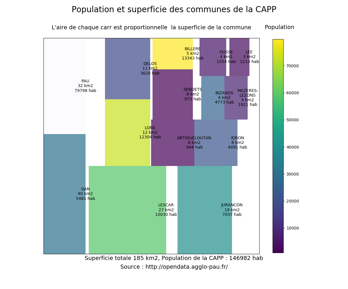
| #!/usr/bin/env python3 | |
| # coding: utf-8 | |
| import matplotlib | |
| import matplotlib.pyplot as plt | |
| import pandas as pd | |
| import squarify | |
| import platform | |
| # print versions | |
| print("python : ", platform.python_version()) | |
| print("pandas : ", pd.__version__) | |
| print("matplotlib : ", matplotlib.__version__) | |
| print("squarify : 0.4.3") | |
| # quantities plotted | |
| # squarre area is the town surface area (superf) | |
| # color scale is the town population in 2011 (p11_pop) | |
| # read data from csv file | |
| # data from CAPP opendata http://opendata.agglo-pau.fr/index.php/fiche?idQ=27 | |
| df = pd.read_csv("Evolution_et_structure_de_la_population/Evolution_structure_population.csv", sep=";") | |
| df = df.set_index("libgeo") | |
| df = df[["superf", "p11_pop"]] | |
| df2 = df.sort_values(by="superf", ascending=False) | |
| # treemap parameters | |
| x = 0. | |
| y = 0. | |
| width = 100. | |
| height = 100. | |
| cmap = matplotlib.cm.viridis | |
| # color scale on the population | |
| # min and max values without Pau | |
| mini, maxi = df2.drop("PAU").p11_pop.min(), df2.drop("PAU").p11_pop.max() | |
| norm = matplotlib.colors.Normalize(vmin=mini, vmax=maxi) | |
| colors = [cmap(norm(value)) for value in df2.p11_pop] | |
| colors[1] = "#FBFCFE" | |
| # labels for squares | |
| labels = ["%s\n%d km2\n%d hab" % (label) for label in zip(df2.index, df2.superf, df2.p11_pop)] | |
| labels[11] = "MAZERES-\nLEZONS\n%d km2\n%d hab" % (df2["superf"]["MAZERES-LEZONS"], df2["p11_pop"]["MAZERES-LEZONS"]) | |
| # make plot | |
| fig = plt.figure(figsize=(12, 10)) | |
| fig.suptitle("Population et superficie des communes de la CAPP", fontsize=20) | |
| ax = fig.add_subplot(111, aspect="equal") | |
| ax = squarify.plot(df2.superf, color=colors, label=labels, ax=ax, alpha=.7) | |
| # use this if you want to draw a border between rectangles | |
| # you have to give both linewidth and edgecolor | |
| # ax = squarify.plot(df2.superf, color=colors, label=labels, ax=ax, alpha=.7, | |
| # bar_kwargs=dict(linewidth=1, edgecolor="#222222")) | |
| ax.set_xticks([]) | |
| ax.set_yticks([]) | |
| ax.set_title("L'aire de chaque carré est proportionnelle à la superficie de la commune\n", fontsize=14) | |
| # color bar | |
| # create dummy invisible image with a color map | |
| img = plt.imshow([df2.p11_pop], cmap=cmap) | |
| img.set_visible(False) | |
| fig.colorbar(img, orientation="vertical", shrink=.96) | |
| fig.text(.76, .9, "Population", fontsize=14) | |
| fig.text(.5, 0.1, | |
| "Superficie totale %d km2, Population de la CAPP : %d hab" % (df2.superf.sum(), df2.p11_pop.sum()), | |
| fontsize=14, | |
| ha="center") | |
| fig.text(.5, 0.07, | |
| "Source : http://opendata.agglo-pau.fr/", | |
| fontsize=14, | |
| ha="center") | |
| plt.savefig("capp_treemaps.png") | |
| plt.show() |
Hi, this is some thing useful. However, learning from your example, my boxes in the plot doesn't have any border. Did I miss something?
Hi how did you get the border?
@dannikaaa squarify.plot() allows you to add extra parameters tomatplotlib.pyplot.bar
ex:
squarify.plot(..., linewidth=2, edgecolor="#ffffff")
In my hands, I need to pass linewidth and edgecolor in the dict bar_kwargs:
squarify.plot(...., bar_kwargs={'linewidth':2, 'edgecolor':'#000000'})
A very nice example. Solved a lot of confusion regarding squarify treemaps.
Can someone tell me how to enable textwrap inside the box?
The argument: squarify.plot(...,text_kwargs={'wrap':True},...) doesn't work for me.
The example uses the trick of using formatted labels
labels = ["%s\n%d km2\n%d hab" % (label) for label in zip(df2.index, df2.superf, df2.p11_pop)]
Hi,
Thank you all for you comments. I answer a long long time after the first comment, I am sorry.
Hereafter are the versions of key packages:
pandas     :  1.0.1
matplotlib :  3.1.3
squarify   :  0.4.3
Here is the picture I got today with the above mentioned versions:

I add a commentary in the code from the message of @cameronabrams to draw rectangle borders.
Without knowledge of how the data looks like this example is pretty useless.
@Michael-E-Rose , The link to the data was provided on the figure, I am pretty sure I cannot distribute the data by myself. This is a direct link to the data on the open data website of Pau aglomeration: https://opendata.agglo-pau.fr/index.php/fiche?idQ=27
@ashuein I think that you cannot use the wrap option here. If you want to wrap text you need a width. Actually, matplotlib will wrap text inside the Axes area. Thus here you cannot wrap into rectangles. Look at this page autowrap.
A very nice example. Solved a lot of confusion regarding squarify treemaps.
Can someone tell me how to enable textwrap inside the box?
The argument:
squarify.plot(...,text_kwargs={'wrap':True},...)doesn't work for me.The example uses the trick of using formatted labels
labels = ["%s\n%d km2\n%d hab" % (label) for label in zip(df2.index, df2.superf, df2.p11_pop)]
This is a solution: Let's say the labels are ['Hi', 'This is a very long label']. If you use the f' string and the \n , it will move the rest of the label in a new line: ['Hi', f'This is a \n very long label'].
I've tried replicating your example with the data from the link, code runs fine but the treemap has overlapping rectangles and labels, and is generally unreadable/not useful. Mind sharing your versions? using python 2.7 and matplotlib 2.0.2